library(tidyverse)Importing and Visualising data
Exploratory data analysis
28 November 2025
The ggplot format
ggplot(data = penguins,
       mapping = aes(x = flipper_len,
                     y = body_mass)) +
  geom_point()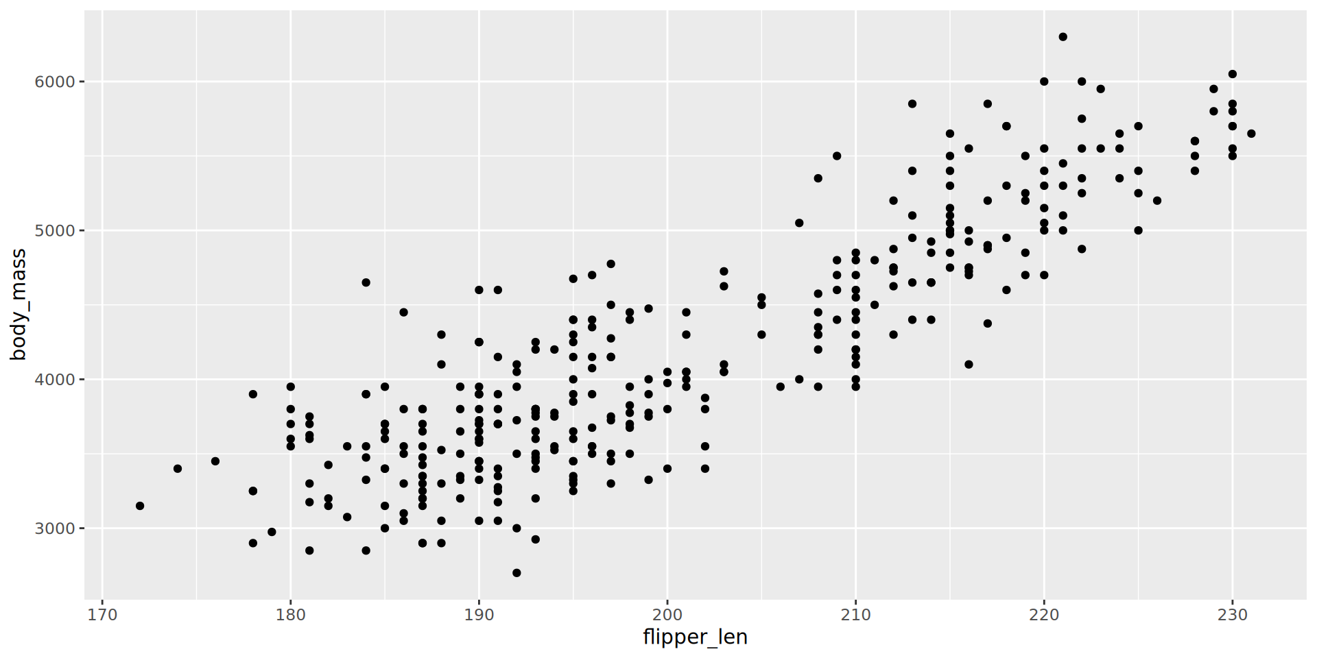
Titles, labels and theme
ggplot(data = penguins,
       mapping = aes(x = bill_len,
                     y = bill_dep)) +
  labs(title = "Bill length and depth in penguins",
       x = "Bill length (mm)",
       y = "Bill depth (mm)") +
  theme_minimal() +
  geom_point()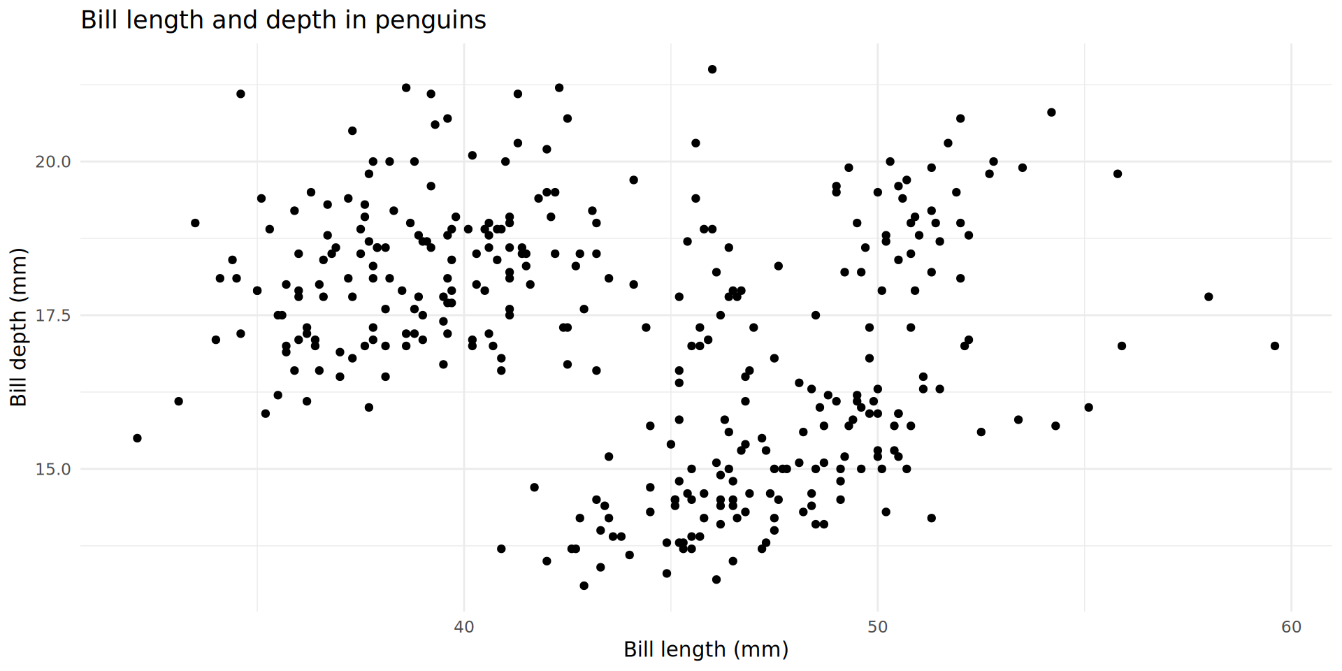
ggplot(data = penguins,
       mapping = aes(x = bill_len,
                     y = bill_dep,
                     colour = species)) +
    labs(title = "Bill length and depth in penguins",
       x = "Bill length (mm)",
       y = "Bill depth (mm)",
       colour = "Species") +
  theme_minimal() +
  geom_point()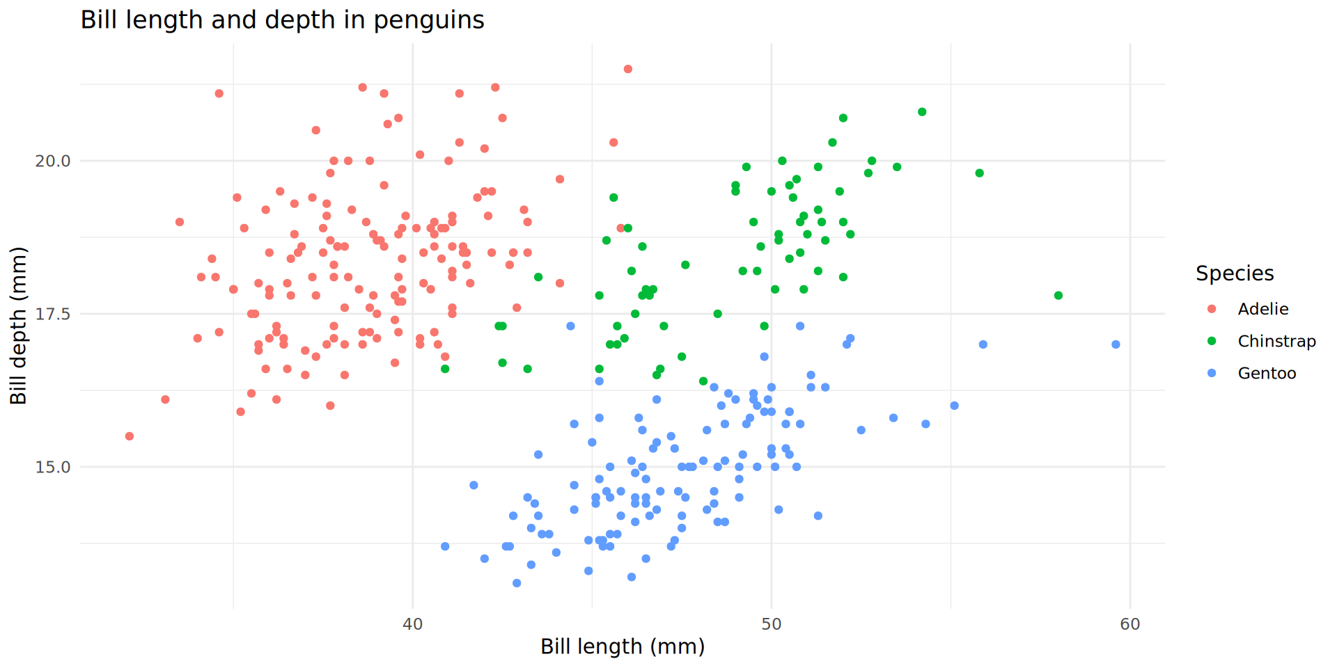
Complex arguments for geom_point()
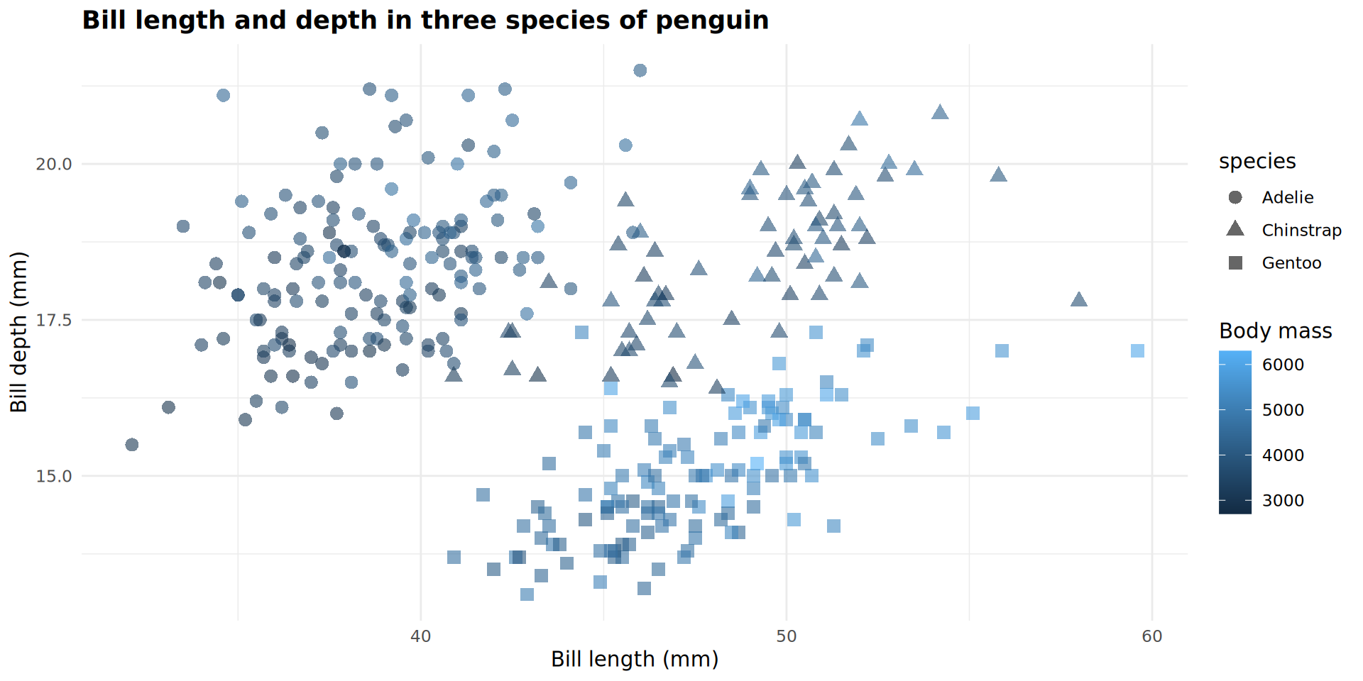
It’s your turn!
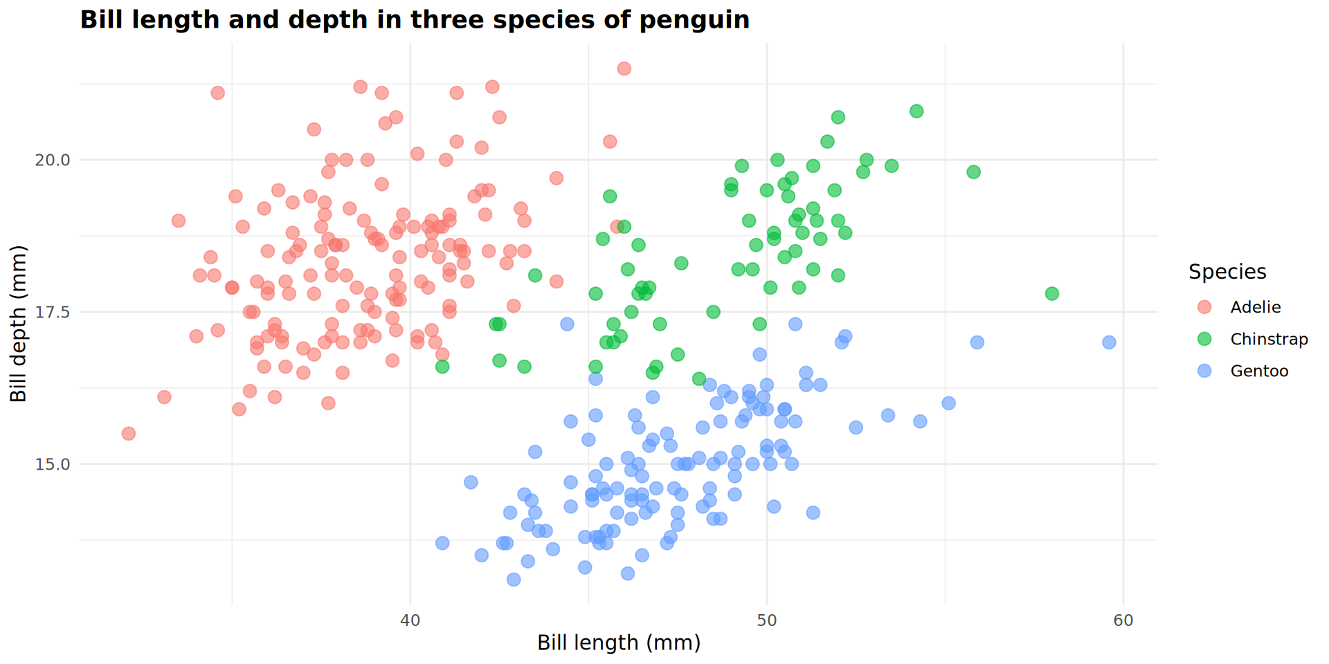
Exercise 3
How was this plot created? Use code from the previous slides and modify it yourself to duplicate this plot.

Solution and explanation
ggplot(data = penguins,
       mapping = aes(x = bill_len,
                     y = bill_dep,
                     colour = body_mass,
                     shape = species)) +
    labs(title = "Bill length and depth in three species of penguin",
       x = "Bill length (mm)",
       y = "Bill depth (mm)",
       colour = "Body mass") +
  theme_minimal() +
  theme(plot.title = element_text(face = "bold")) +
  geom_point(size = 3,
             alpha = 0.6)
Plot objects
p_flipper_len
Plot objects
p_flipper_len +
  geom_boxplot()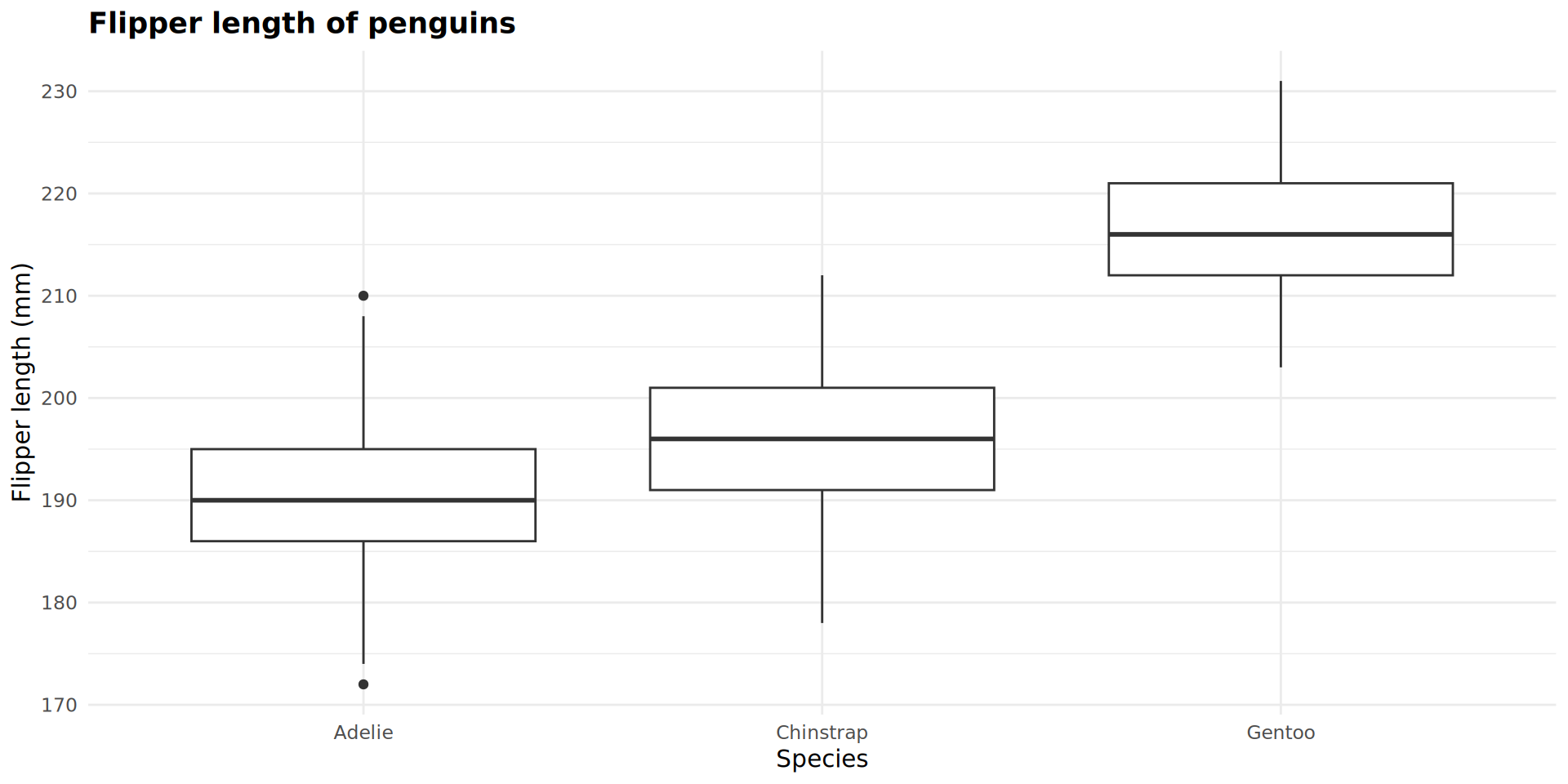
Plot objects
p_flipper_len +
  geom_boxplot() +
  geom_jitter()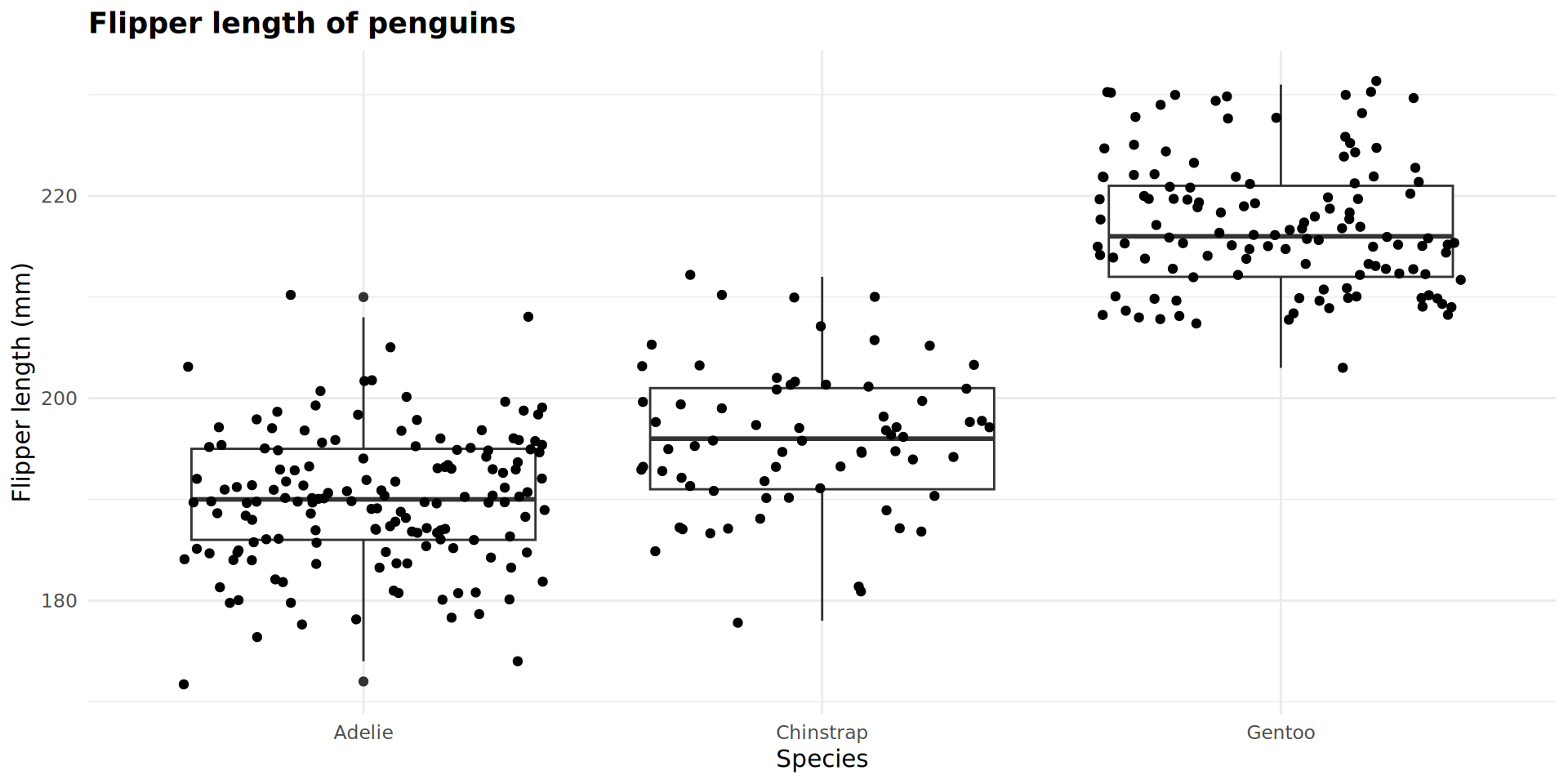
Combining geoms
p_flipper_len +
  geom_boxplot(outlier.alpha = 0) +
  geom_jitter(size = 3,
              width = 0.25,
              alpha = 0.5)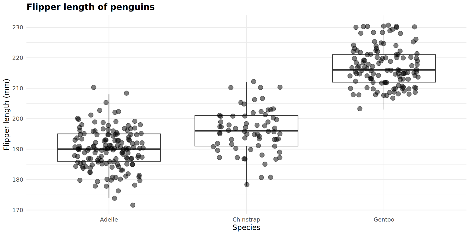
p_flipper_len +
  geom_boxplot(outlier.alpha = 0) +
  geom_jitter(mapping = aes(colour = species),
              size = 3,
              width = 0.25,
              alpha = 0.5)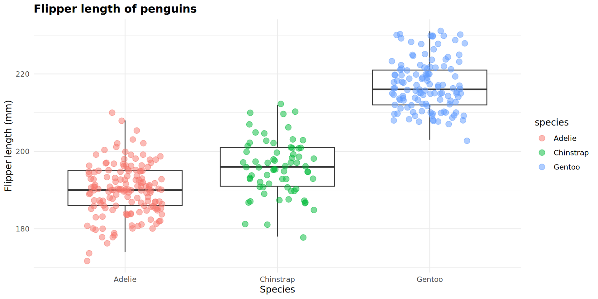
Use aes() when specifying data that is coming from an object.
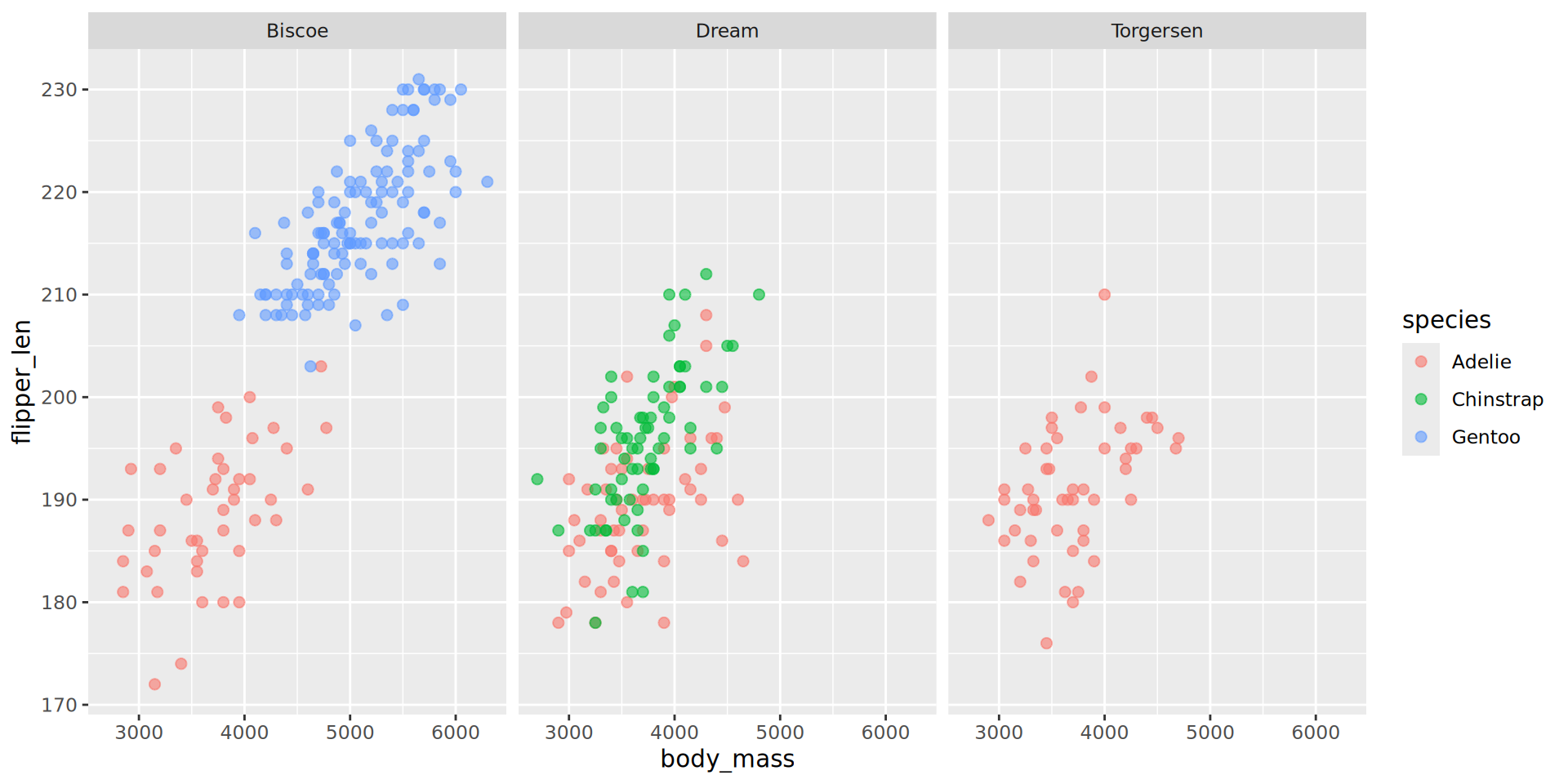
p_bm_fl +
geom_point(size = 2,
alpha = 0.6) +
facet_grid(sex ~ island) 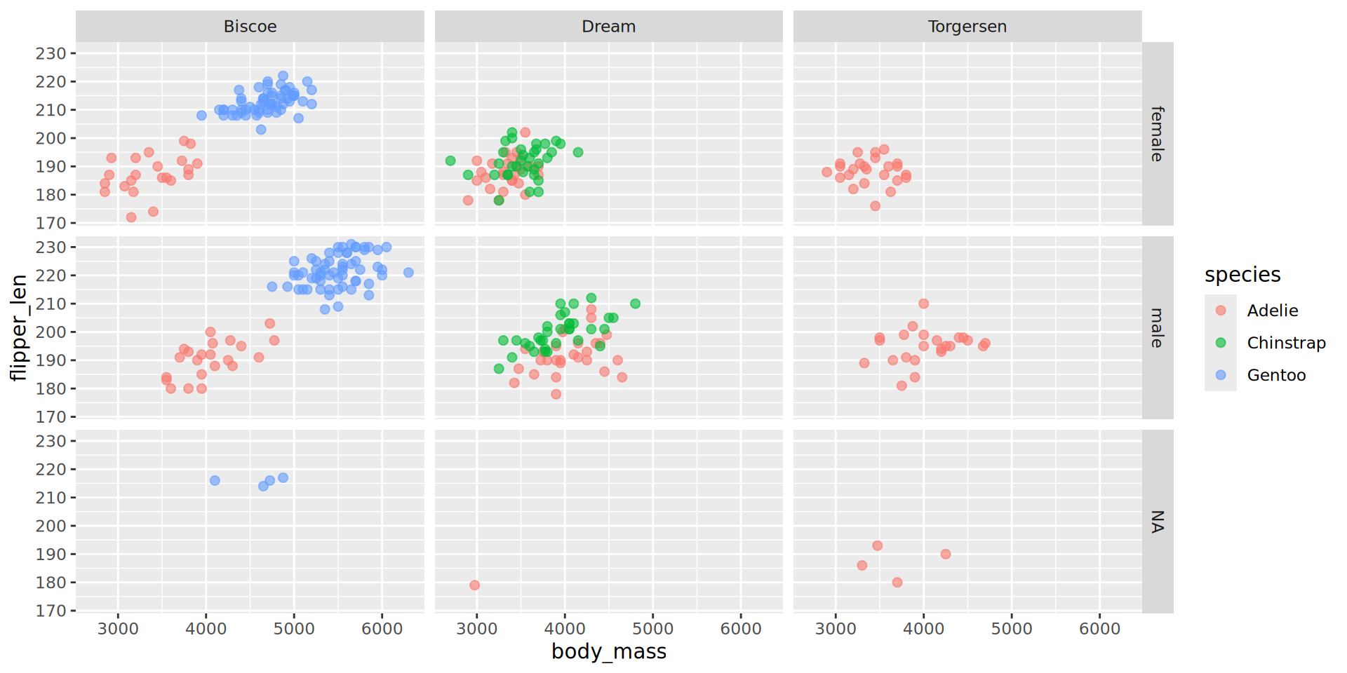
Combining plots with patchwork
Combine p1 and p2 with ‘arithmetic’ operators:
p1 + p2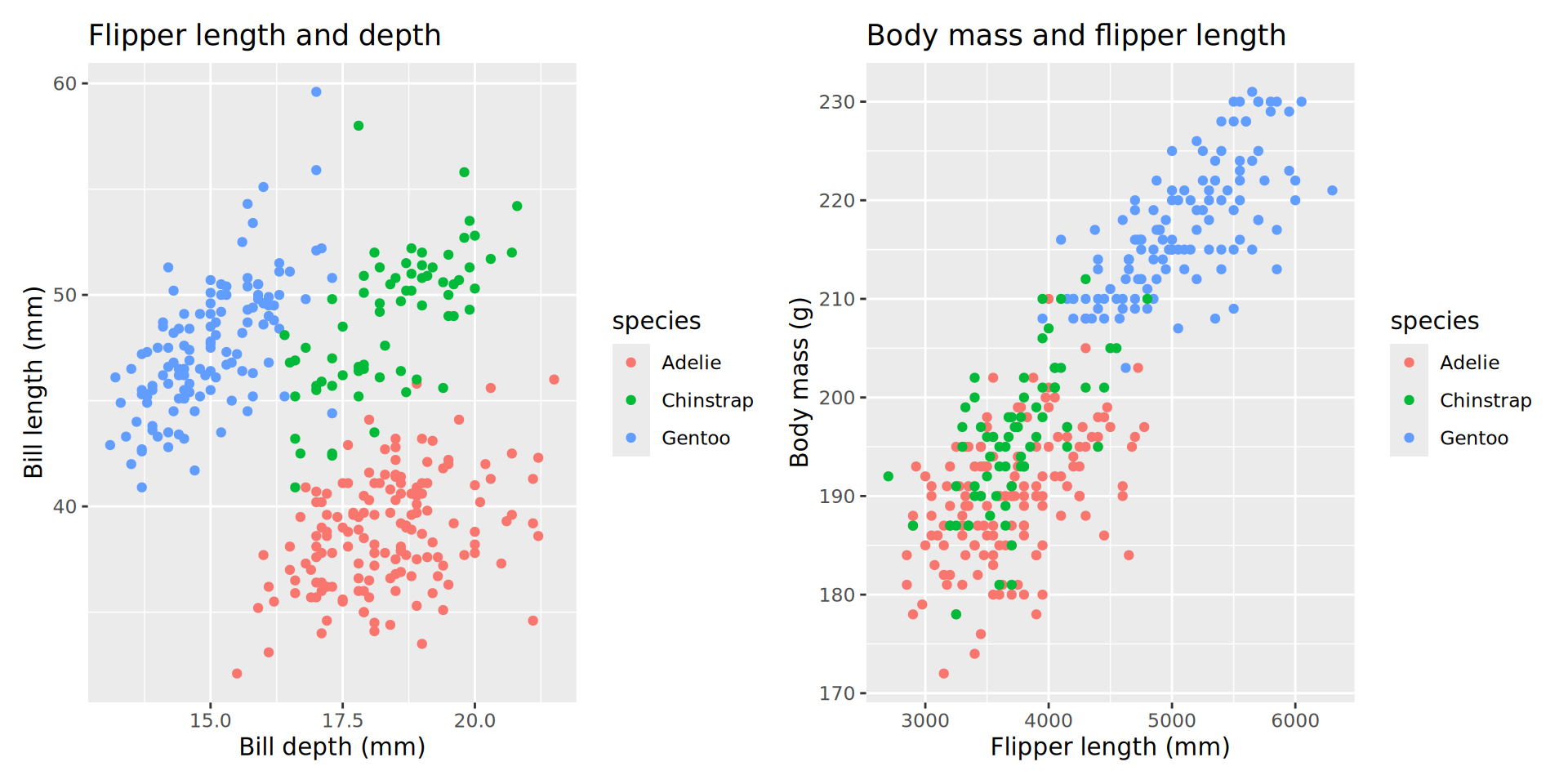
p1 / p2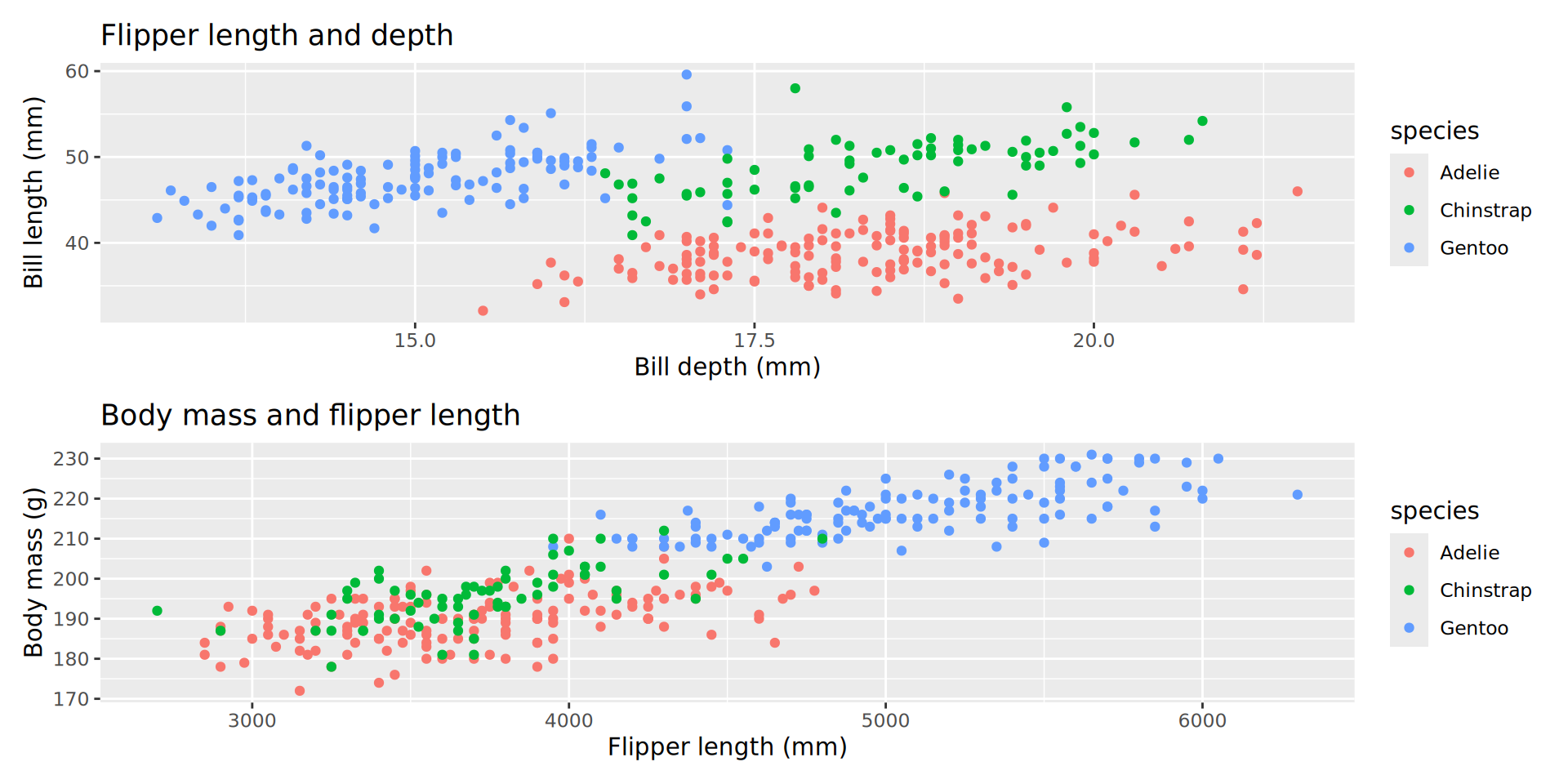
Adding trendlines
p_bm_fl +
  geom_point(size = 2,
             alpha = 0.6) +
facet_wrap(~ island) +
geom_smooth(
mapping = aes(group = island),
method = "lm",
colour = "darkgrey")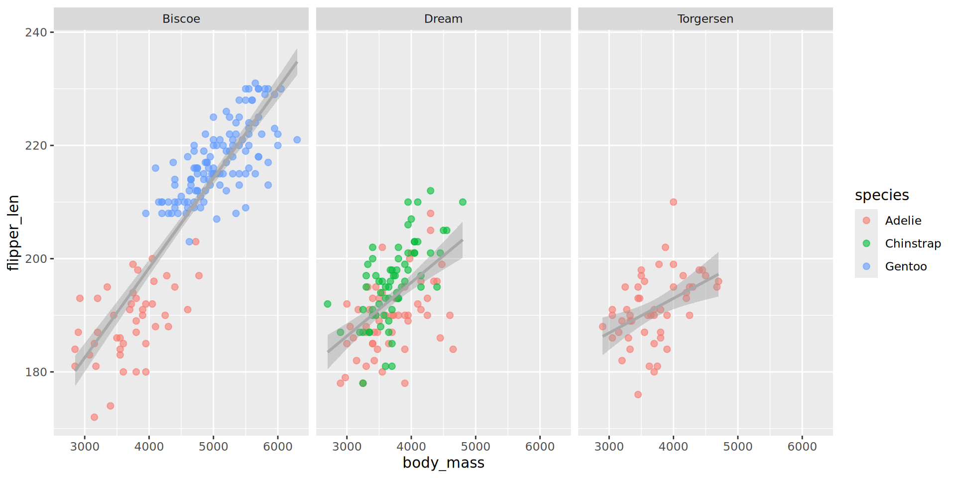
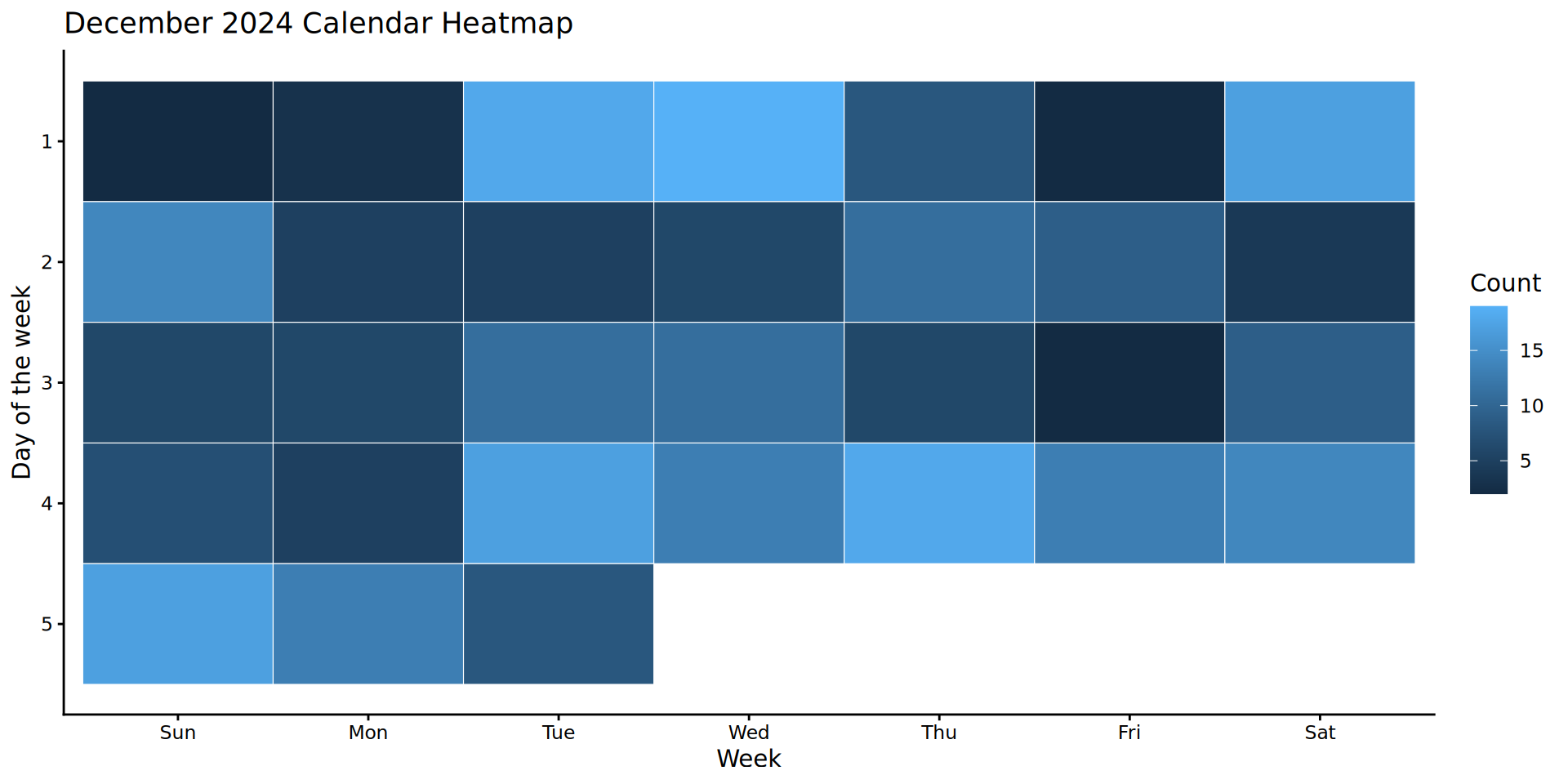
Starting with geom_tile()
ggplot(data = month_data,
       mapping = aes(x = week,
                      y = wday,
                      fill = count)) +
  geom_tile()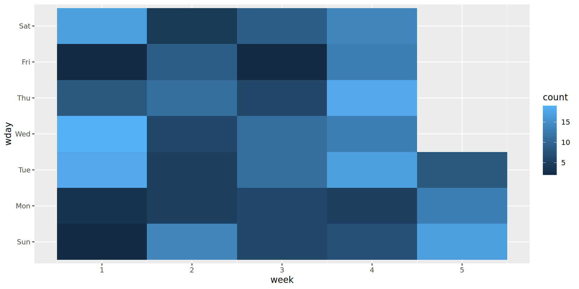
What are the issues with this plot?
Solution
Line chart with geom_line()
ggplot(stocks |>  filter(stock == "Stock C"),
        aes(x = date,
            y = price)) +
  geom_line() +
  labs(title = "Stock C Price Over Time",
        x = "Date",
        y = "Price") +
  theme_minimal()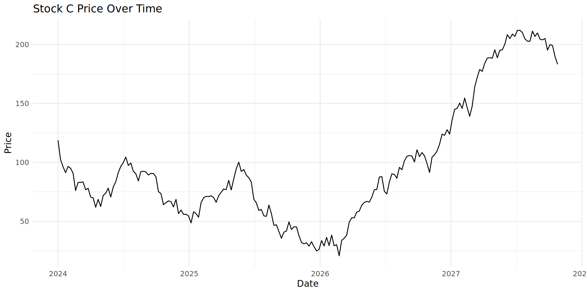
Combining geom_line() and geom_fill()
geom_area() adds a filled or shaded area. The plot looks much less empty.
ggplot(stocks  |>  filter(stock == "Stock B"),
        aes(x = date, y = price)) +
  geom_area(fill = "black",
            alpha = 0.4) +
  geom_line(color = "black",
            linewidth = 0.5) +  # Keeps the line for clarity
  labs(title = "Stock B Price Over Time (Area Chart)",
        x = "Date",
        y = "Price") +
  theme_minimal()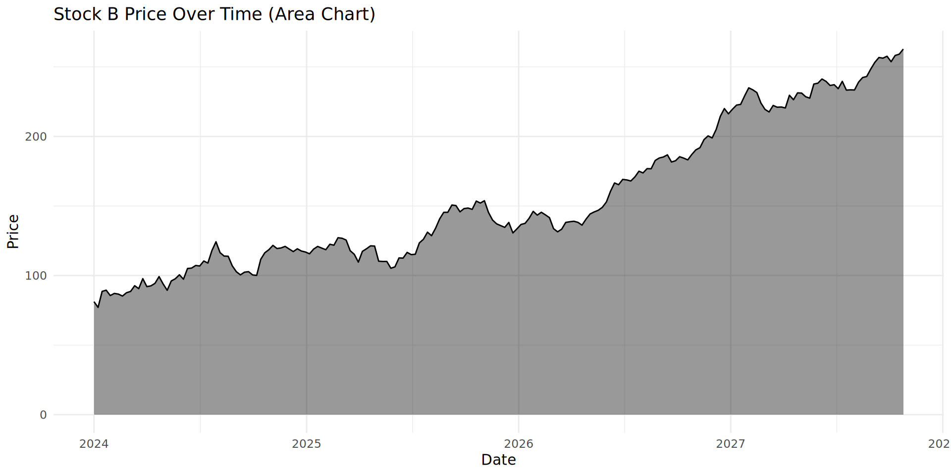
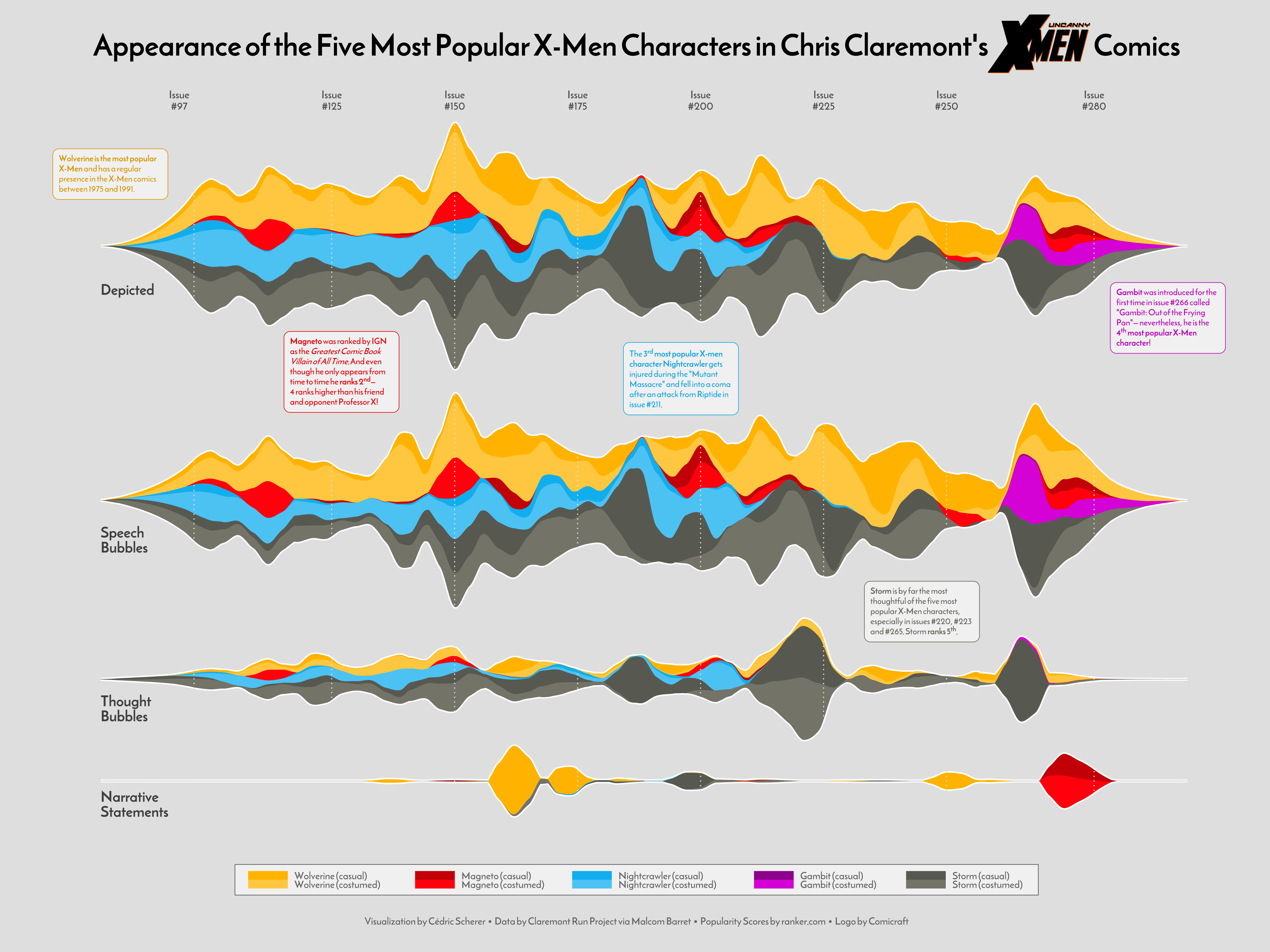
A popular option: the stacked area chart
Look at this example from an excellent data visualiser Cédric Scherer::
Creating a stacked area chart
ggplot(stocks, aes(x = date,
                    y = price,
                    fill = stock)) +
  geom_area(alpha = 0.6) +  # Fill areas with transparency
  labs(title = "Stacked Area Chart of Stock Prices Over Time",
       x = "Date",
       y = "Price",
       fill = "Stock") +
  theme_minimal()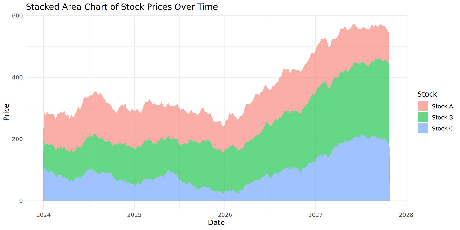
Critically analysing our stocks

What is happening with our stock values?
Stock B and C are increasing over time. However, Stock A is not changing.
It is difficult to accurately estimate Stock A’s change in value over time because of the stacked nature of the plot.
We recommend you do not use stacked area plots, despite their popularity.
Perfumes with fewer ratings have high variation in rating value
ggplot(data = parfumo_data_clean,
      mapping = aes(x = Rating_Count,
                    y = Rating_Value)) +
  geom_point()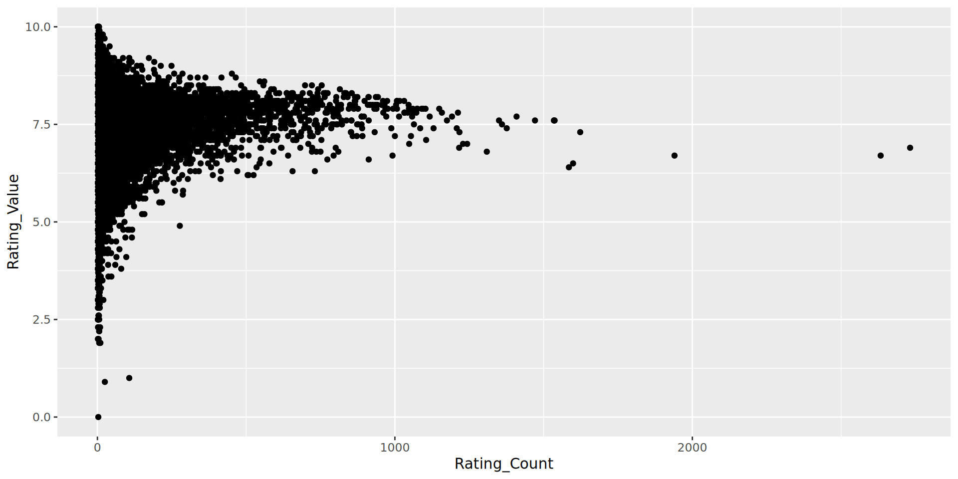
- Comment on the fact that there are no perfumes with more than 1000 ratings and a rating of less than 5. What could cause this?
An aside: being aware of other relationships
Hypothesis: There will be a significant relationship between Rating_Count and Release_Year.
ggplot(data = parfumo_data_clean,
        mapping = aes(x = Release_Year, y = Rating_Count)) +
  geom_point()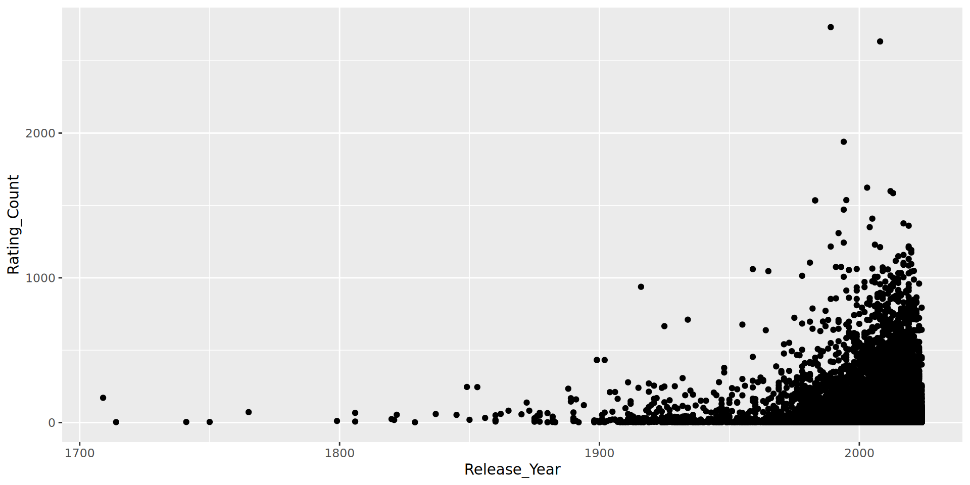
This is important because if we are filtering based on a Rating_Count threshold, we need to be aware this is reducing the likelihood of older Brands appearing.
note: I have suppressed the warnings about NAs, and will continue to do so for all future plots.
Building a visualisation - sketching
ggplot(data = perfume_brand_data,
       mapping = aes(x = Rating_Value,
                      y = Brand)) +
  geom_boxplot()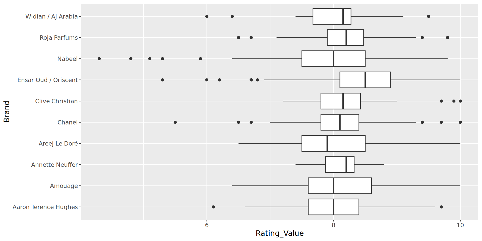
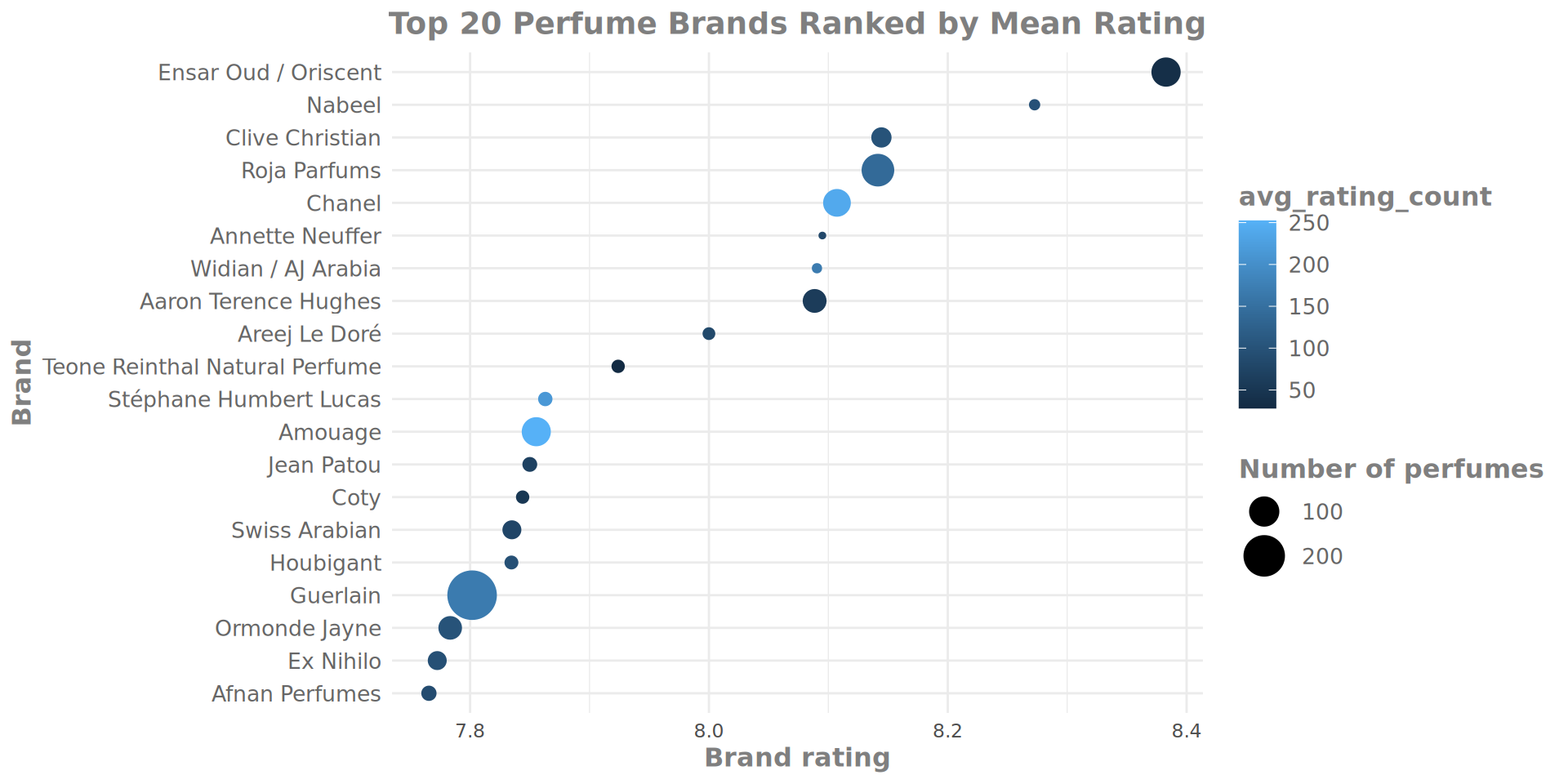
geom_point and the brand rating average
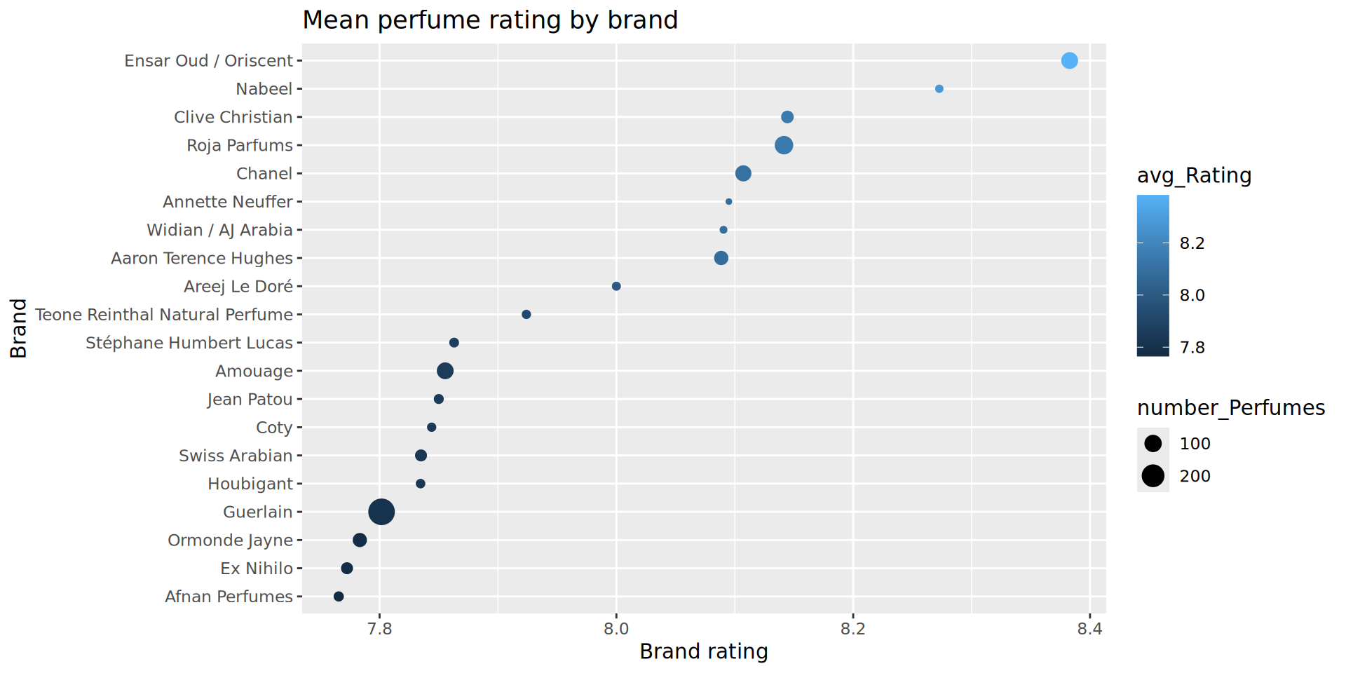
Refined
Before we stop
Open online books
H. Wickham R for data science
H. Wickham ggplot book
Jenny Bryan Happy git with R
Please fill our feed back form!
