Distributions
Associations, correlation, PCA
Wednesday, 11 March 2026
Session aims
Learning objectives
- Exploring a single distribution
- Associations
- Correlation plots
- Principal component analysis
Exploratory plots
We aim to find a basis - No lables and titles
Material
Chapter Statistical summaries in ggplot2: Elegant Graphics for Data Analysis (3e)
Consult the books for reference
We can only cover a fraction in class!
What are we visualising?
Amounts
x-y relationships
Trends
Proportions
Distributions
Uncertainty
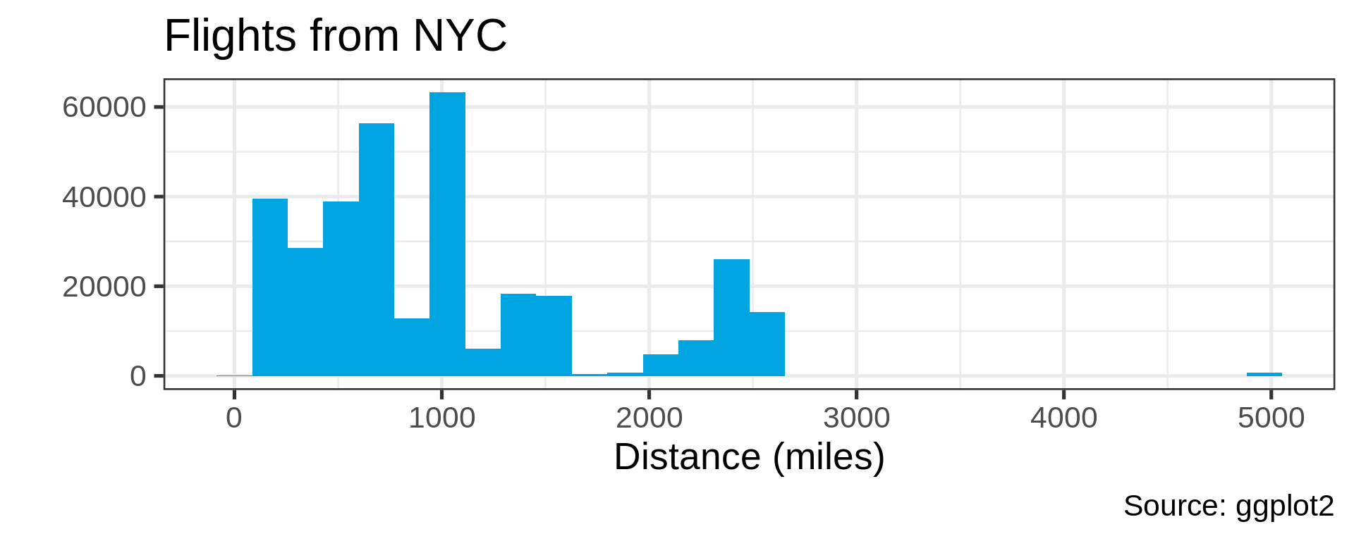
Distributions
Many distributions are not “normal”
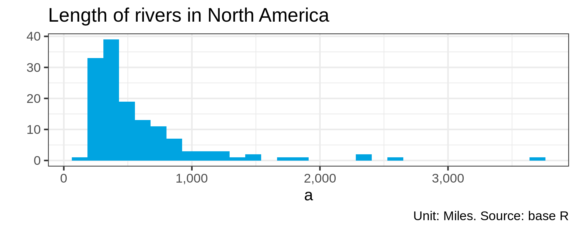
Power law distributions
- Common in natural data with network characteristic
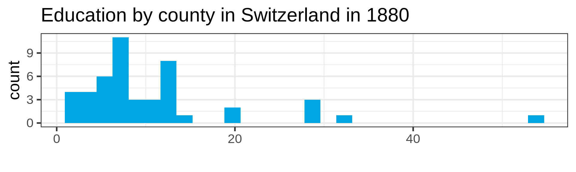
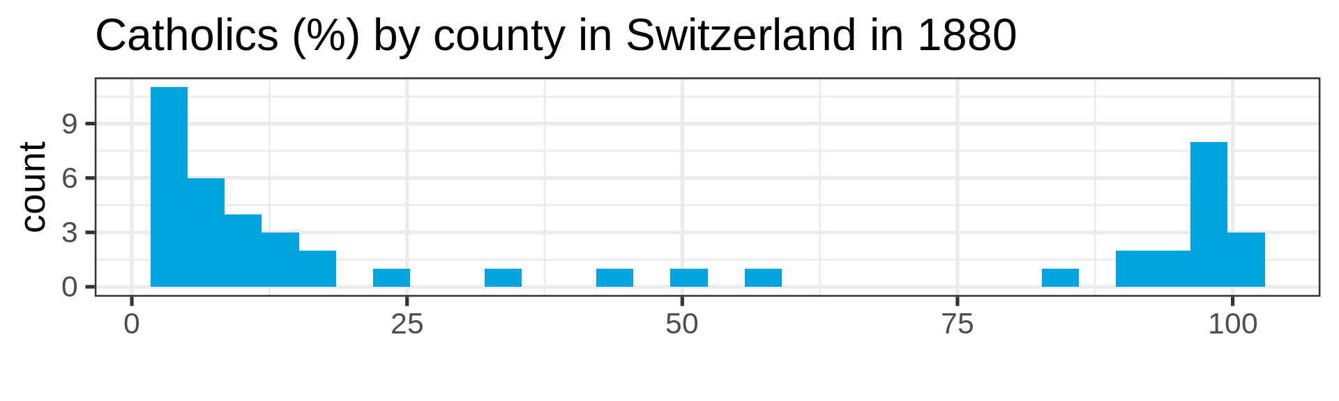
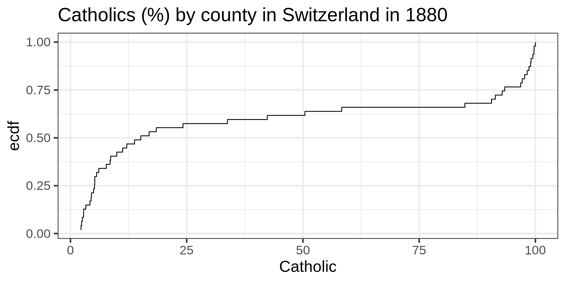
Also not so normal
Empirical cumulative distribution functions
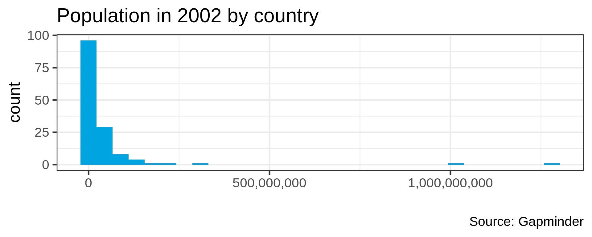
gapminder_2002 <- gapminder |> filter(year == 2002)

ggplot(gapminder_2002) +
  aes(x = pop) +
  stat_ecdf(geom = "step", pad = FALSE) +
  labs(title = "Global population by country" )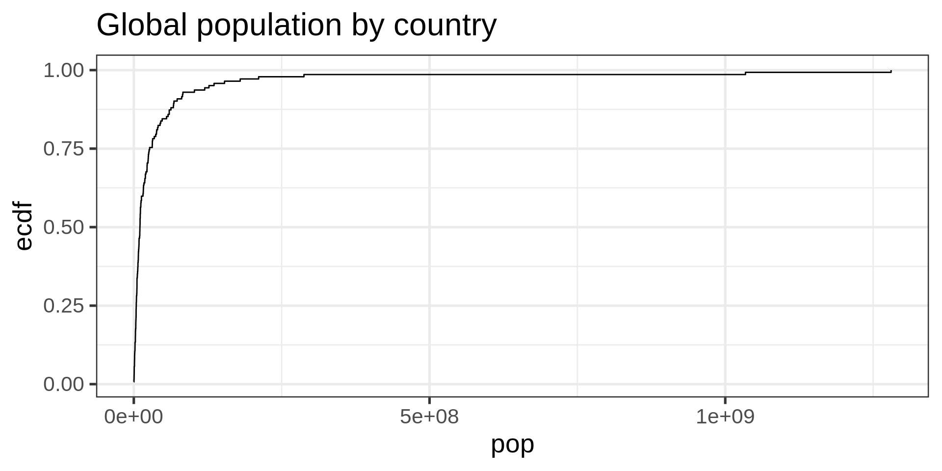
ECDF
No tuning parameter, possibly harder to interpret than a histogram
Log-transform
ggplot(gapminder_2002,
       aes(pop)) +
  geom_histogram(fill = "#00A4E1"  ) +
  scale_x_log10(labels = scales::comma) +
  labs(title = "Number of countries by population",
       x= "",
       y = NULL)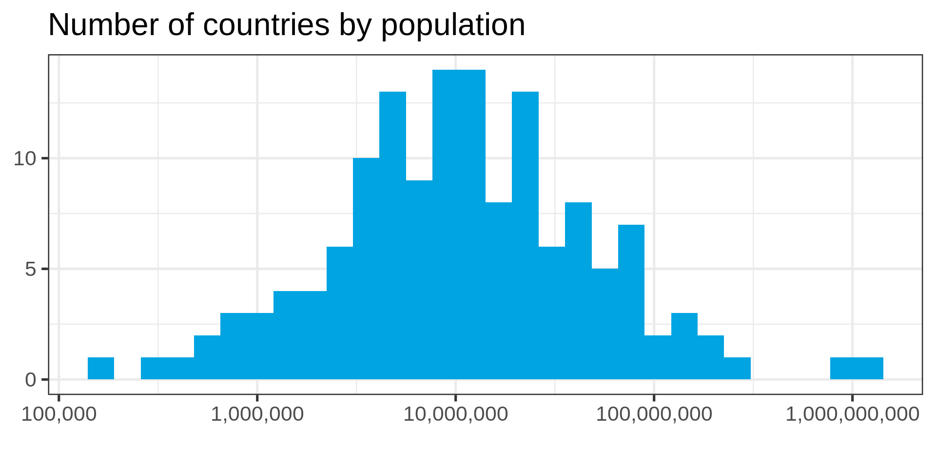
Tip
Use the log-transform in your plotting library. Don’t require your audience to compute!
gapminder_2002 |>
  mutate(log_pop = log10(pop)) |>
  ggplot(aes(log_pop)) +
  geom_histogram(fill = "#00A4E1") +
  labs(title = "Number of countries by population",
       x= "Population (log_10)",
       y = NULL)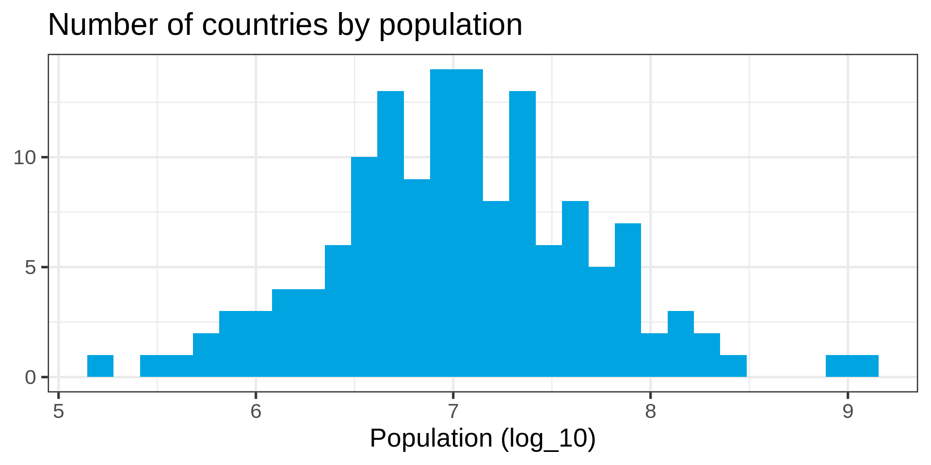
Transformed ECDF
ggplot(gapminder_2002) +
  aes(x = pop) +
  stat_ecdf(geom = "step", pad = FALSE) +
scale_x_log10() 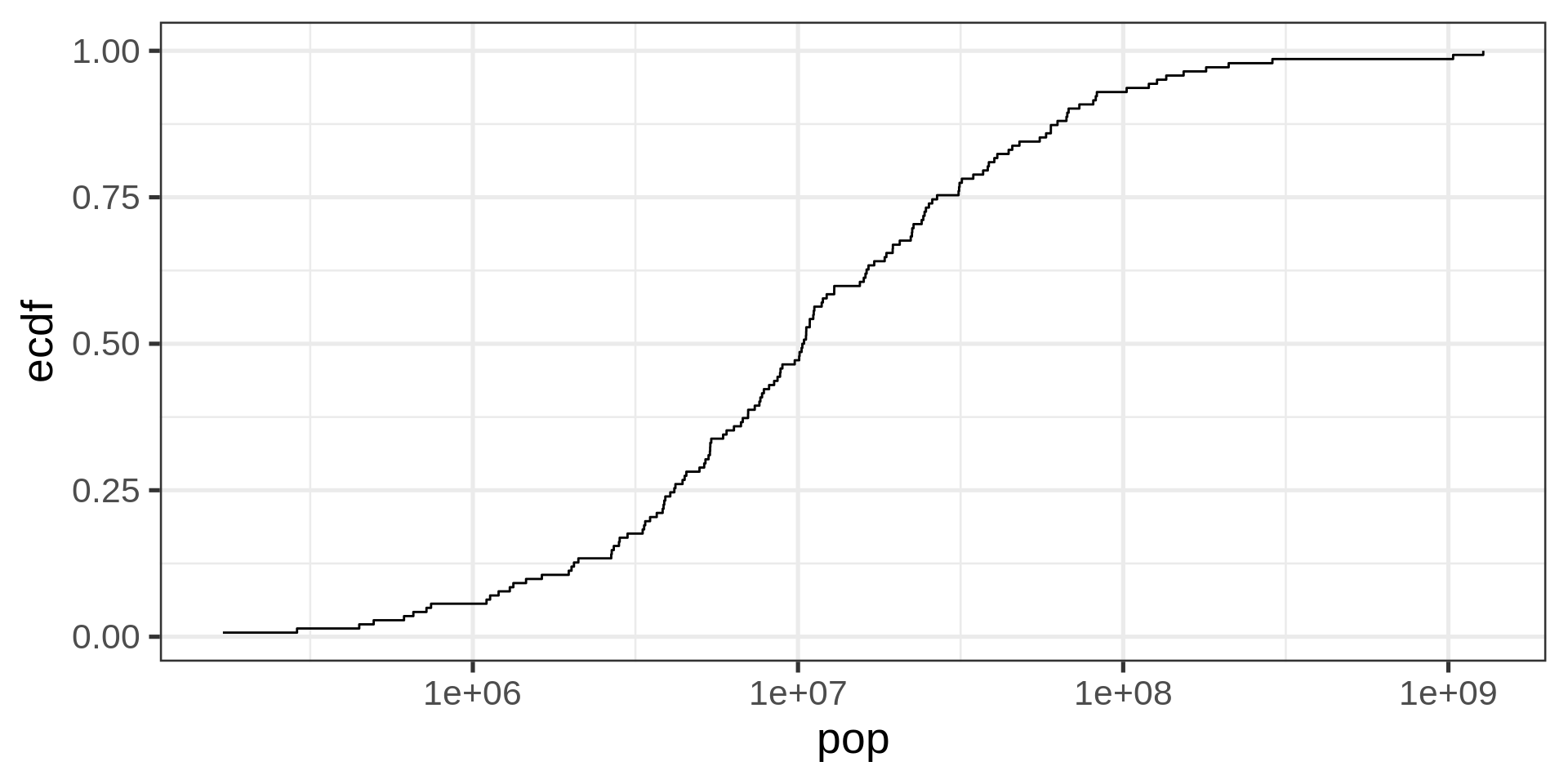
Plotting a normal distribution
s <- seq(0,10,0.025)

theoretical <-
  tibble(x = s,
         y = dnorm(s,
                   mean(log10(gapminder_2002$pop)),
                   sd = sd(log10(gapminder_2002$pop))))

ggplot(theoretical) +
  aes(x, y) +
  geom_point() +
  geom_vline(xintercept =
             mean(log10(gapminder_2002$pop)),
             color = "#00a4e1",
size = 2) 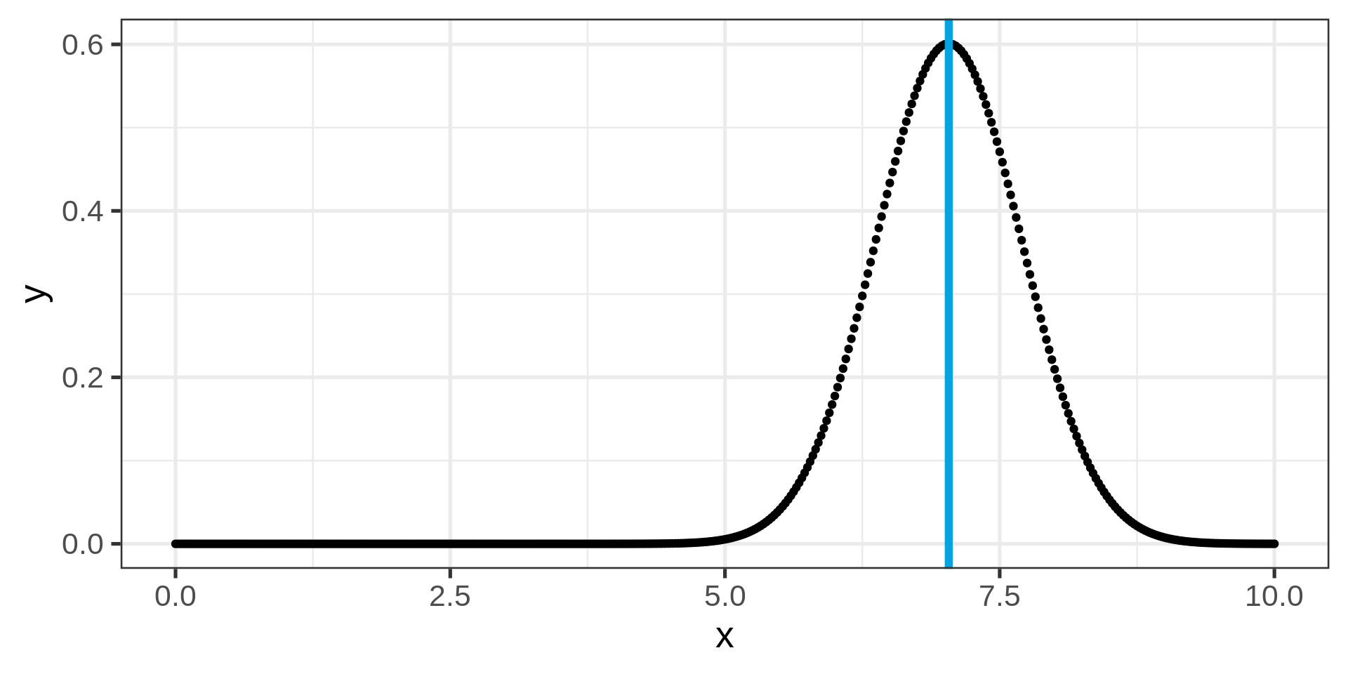
A randomized histogram
pop_random <-
  tibble(rnd = rnorm(
    n = 1000,
    mean = mean(log10(gapminder_2002$pop)),
    sd = sd(log10(gapminder_2002$pop))
  ) ,
  pop_a = 10 ** rnd)

ggplot(pop_random) +
  aes(pop_a) +
  geom_histogram(fill = "#00A4E1") +
  scale_x_log10()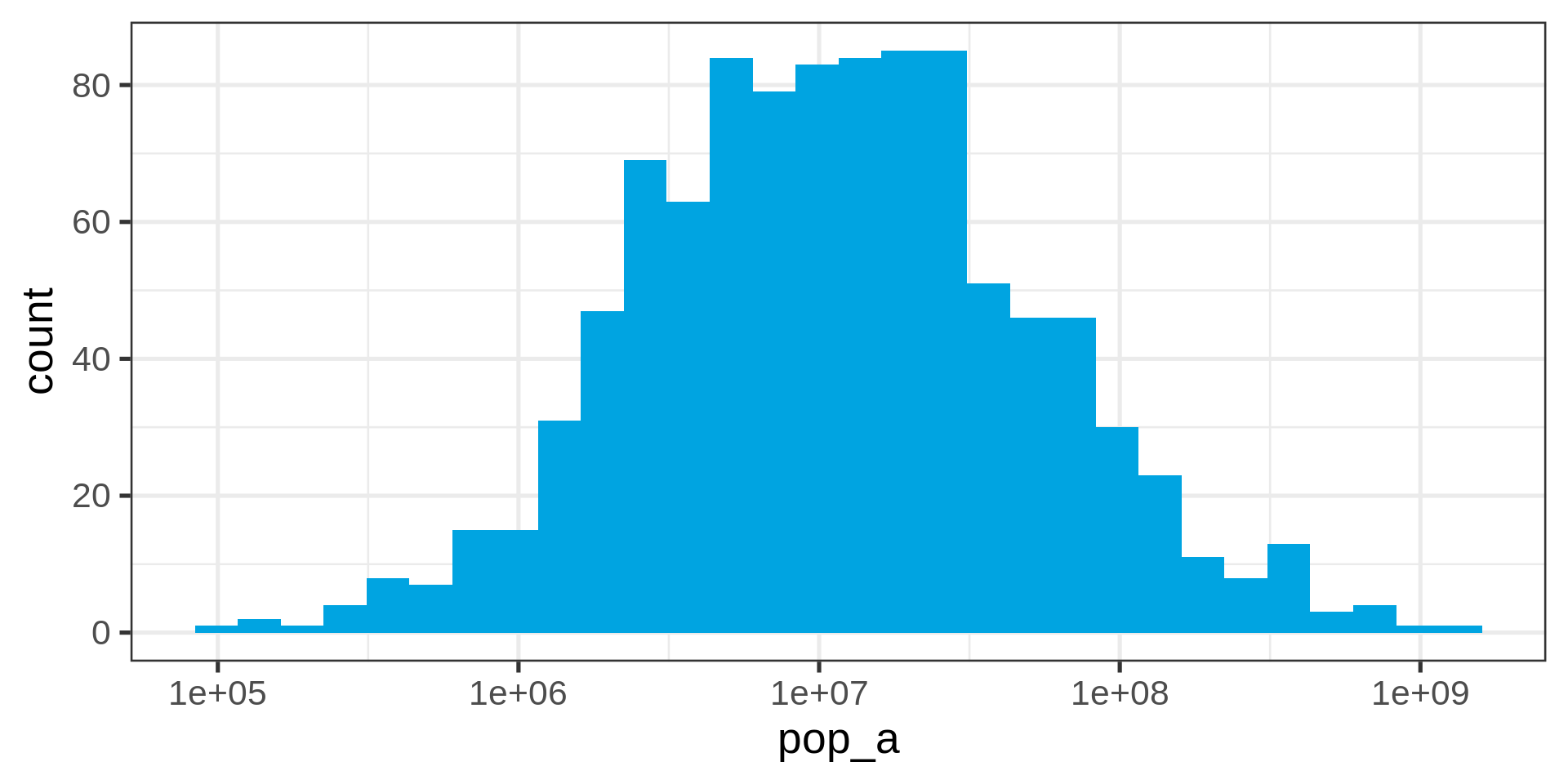
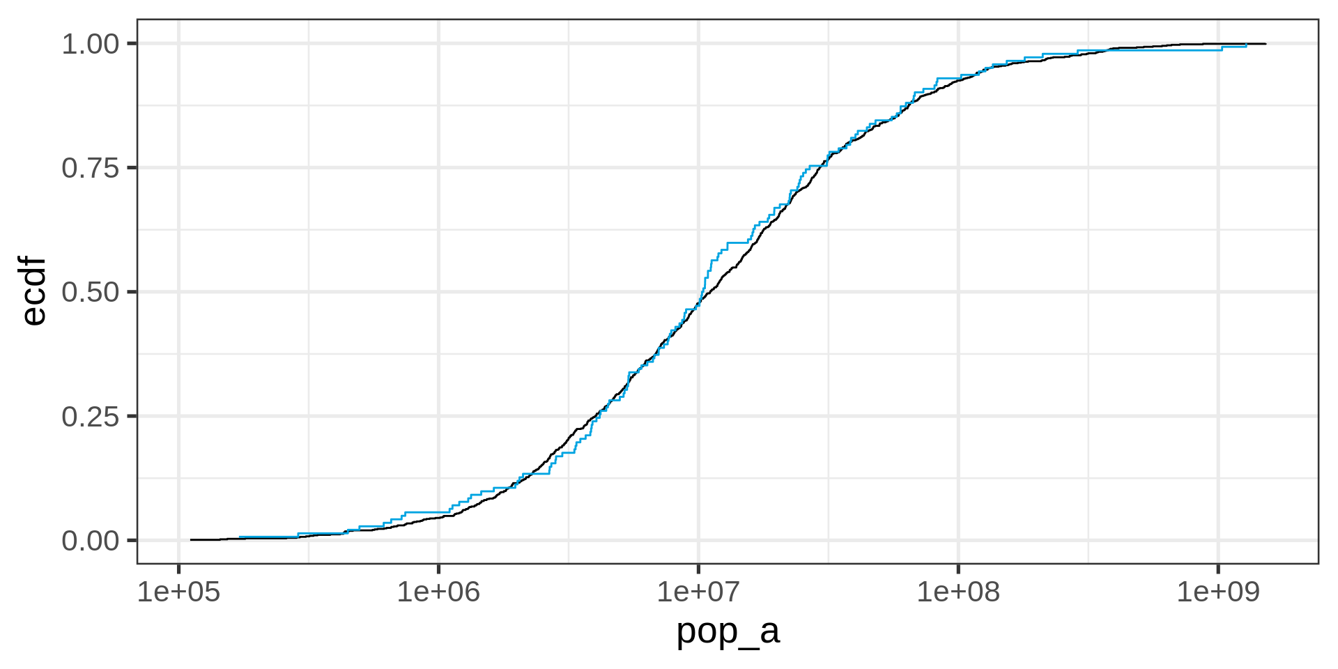
Overlaying empirical and theoretical distribution
ggplot(pop_random) +
  aes(x = pop_a) +
  # theoretical distribution from dnorm(x, mean , sd)
  stat_ecdf(geom = "step", pad = FALSE) +
  scale_x_log10() +
  stat_ecdf(
    data = gapminder_2002,
    aes(x = pop),
    geom = "step",
    pad = FALSE,
    colour = "#00a4e1"
  )
Quantile-quantile plot
ggplot(gapminder_2002,
       aes(sample = log10(pop))) +
  stat_qq() +
  stat_qq_line()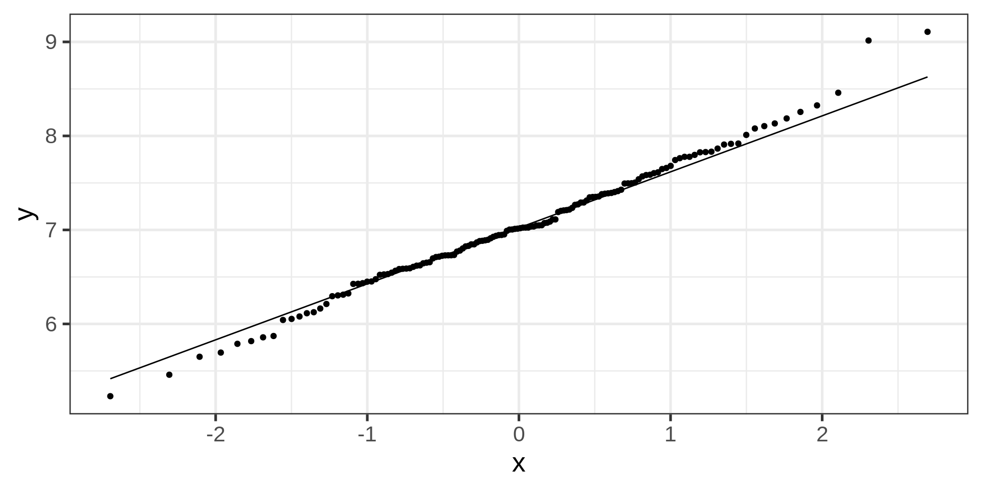
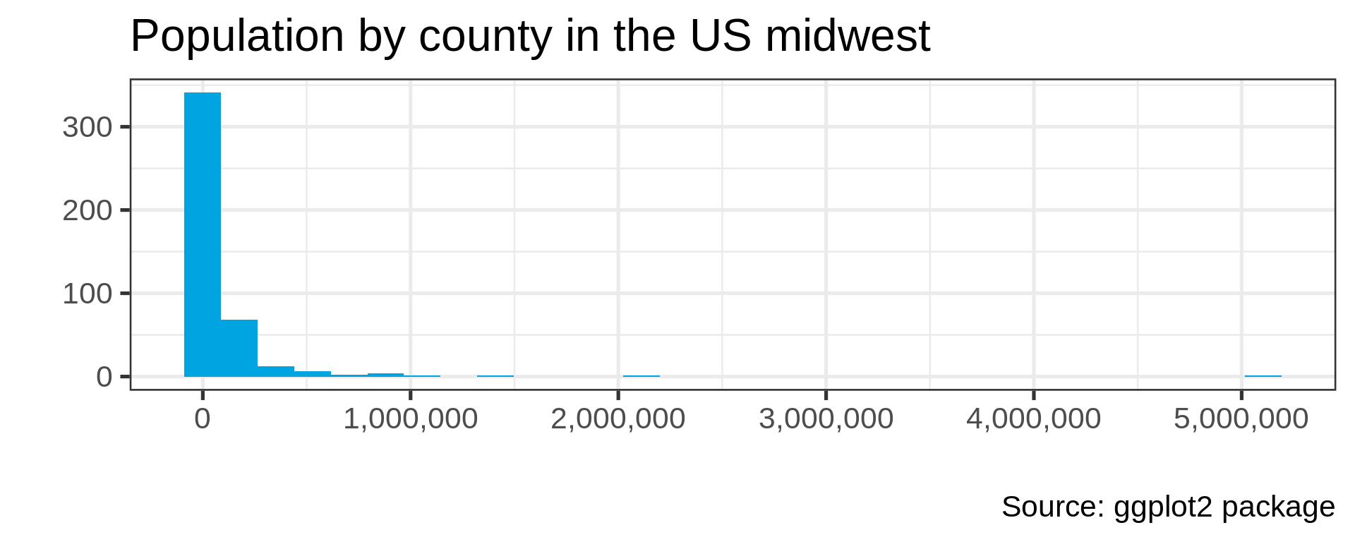
Boxplots
gapminder |>
  ggplot(aes(x = year, y = pop)) +
geom_boxplot() 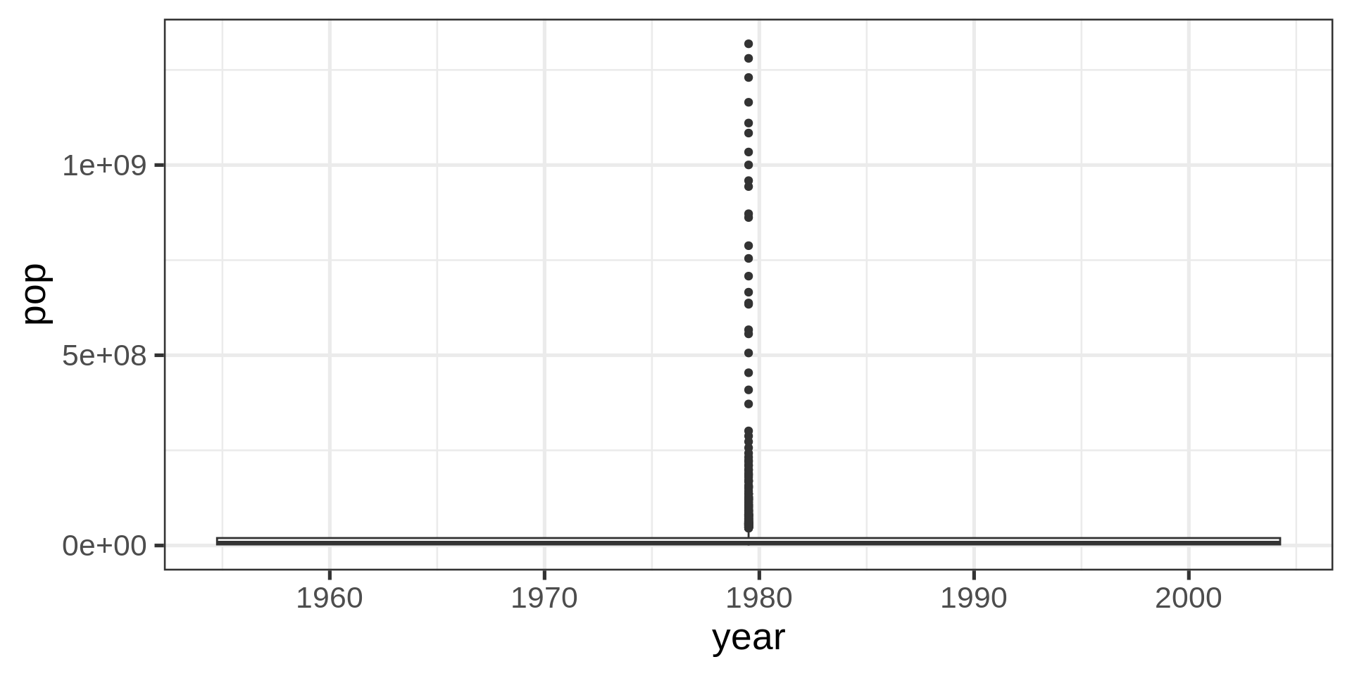
What are we missing?
glimpse(gapminder)Rows: 1,704
Columns: 6
$ country <fct> "Afghanistan", "Afghanistan", "Afghanistan", "Afghanistan", …
$ continent <fct> Asia, Asia, Asia, Asia, Asia, Asia, Asia, Asia, Asia, Asia, …
$ year <int> 1952, 1957, 1962, 1967, 1972, 1977, 1982, 1987, 1992, 1997, …
$ lifeExp <dbl> 28.801, 30.332, 31.997, 34.020, 36.088, 38.438, 39.854, 40.8…
$ pop <int> 8425333, 9240934, 10267083, 11537966, 13079460, 14880372, 12…
$ gdpPercap <dbl> 779.4453, 820.8530, 853.1007, 836.1971, 739.9811, 786.1134, …Year as date
gapminder |>
  ggplot(aes(as.Date(as.character(year), format= "%Y"),  pop)) +
geom_boxplot() 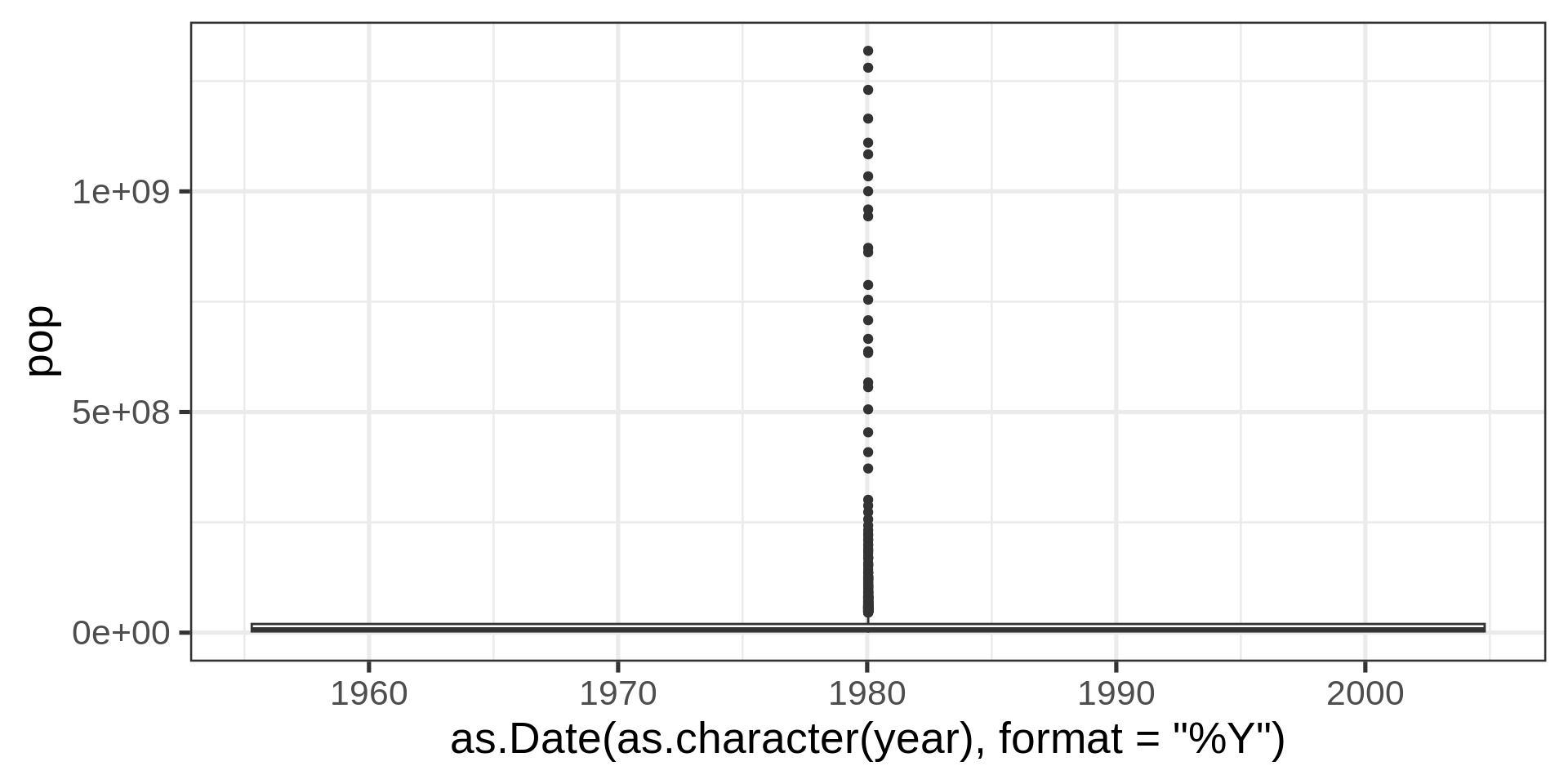
With factors
gapminder |>
  ggplot(aes(as.factor(year),  pop)) +
geom_boxplot() 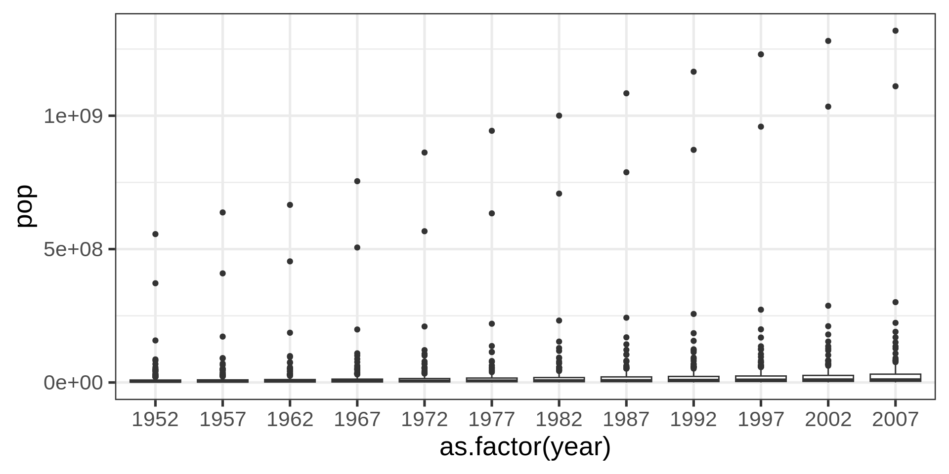
Better with transform
gapminder |>
  ggplot(aes(as.factor(year),  pop)) +
  geom_boxplot() +
  scale_y_log10()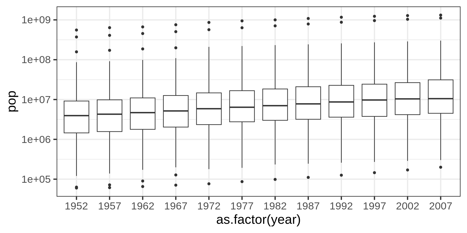
Even better?
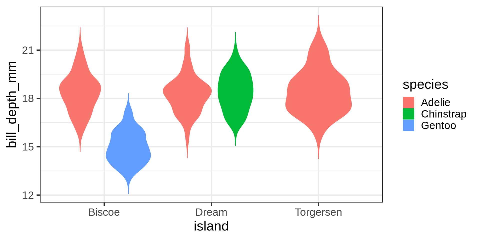
gapminder |>
  ggplot(aes(as.factor(year),  pop)) +
  geom_violin() +
  scale_y_log10()  +
  stat_summary(fun = "mean",
               geom = "crossbar",
               colour = "#00a4e1")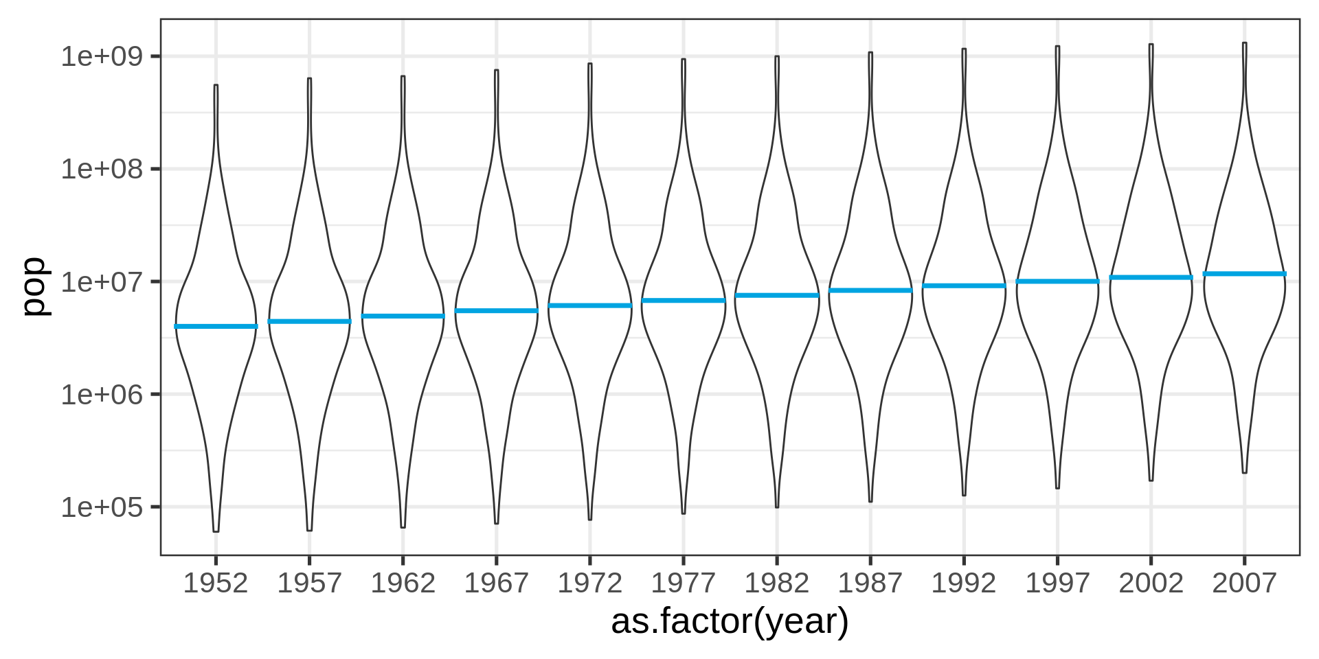
Beeswarm plot
library(ggbeeswarm)
gapminder |>
  ggplot(aes(as.factor(year),  pop)) +
    geom_violin() +
    geom_beeswarm(size = 0.5, colour = "#DC021B") +
scale_y_log10() 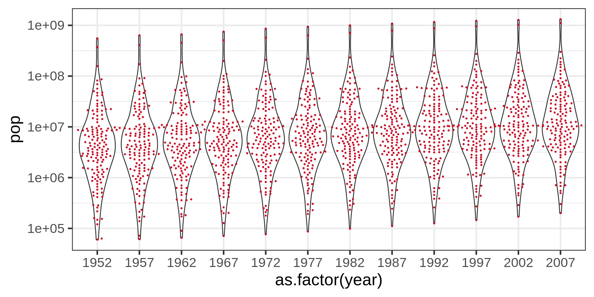
Red dots
Red color plots in the lecture material represent undesirable solutions to the plotting problem.
Ridge plot (densities)
library(ggridges)
gapminder |>
  # filtering self-join for countries with
  # less than 10M people in 1952
  semi_join(gapminder |>
               filter(year == 1952,
                      pop < 10000000) |>
  select(country), join_by(country)) |>
ggplot(aes(y = as.factor(year), x= pop)) +
  geom_density_ridges(fill = "#CDF6FF",
                      color = "#00a4e1") +
  scale_x_sqrt()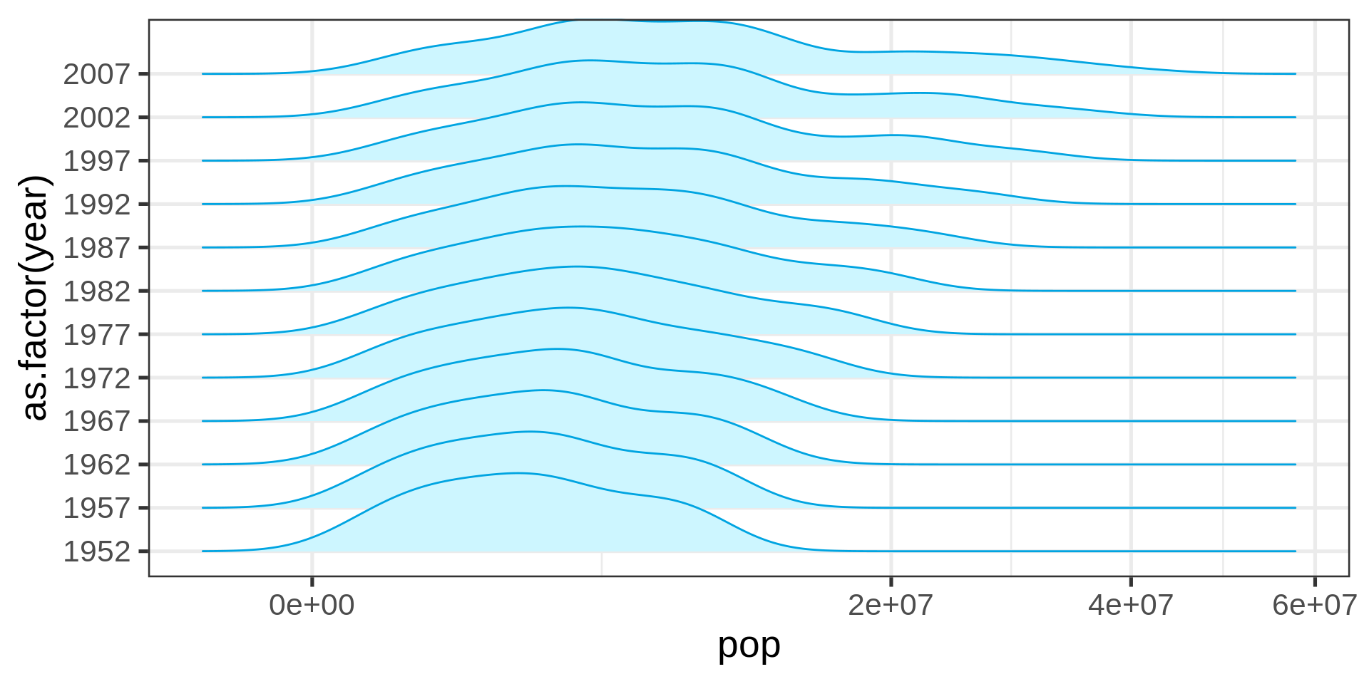
Ridge plots are a convenient shorthand for multiple distributions
The overlap can be controlled.
Scatter plot
ggplot(swiss) +
  aes(Education, Agriculture) +
  geom_point() +
  labs(x = "Independent variable",
       y = "Dependent variable")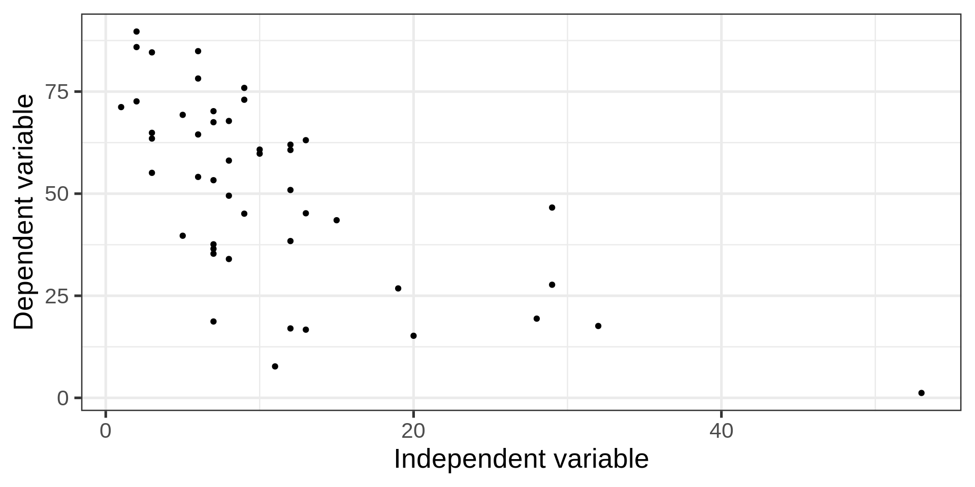
Back to the penguins
Code
ggplot(penguins, aes(x = bill_len,
                     y = bill_dep,
                     colour = sex)) +
  geom_point()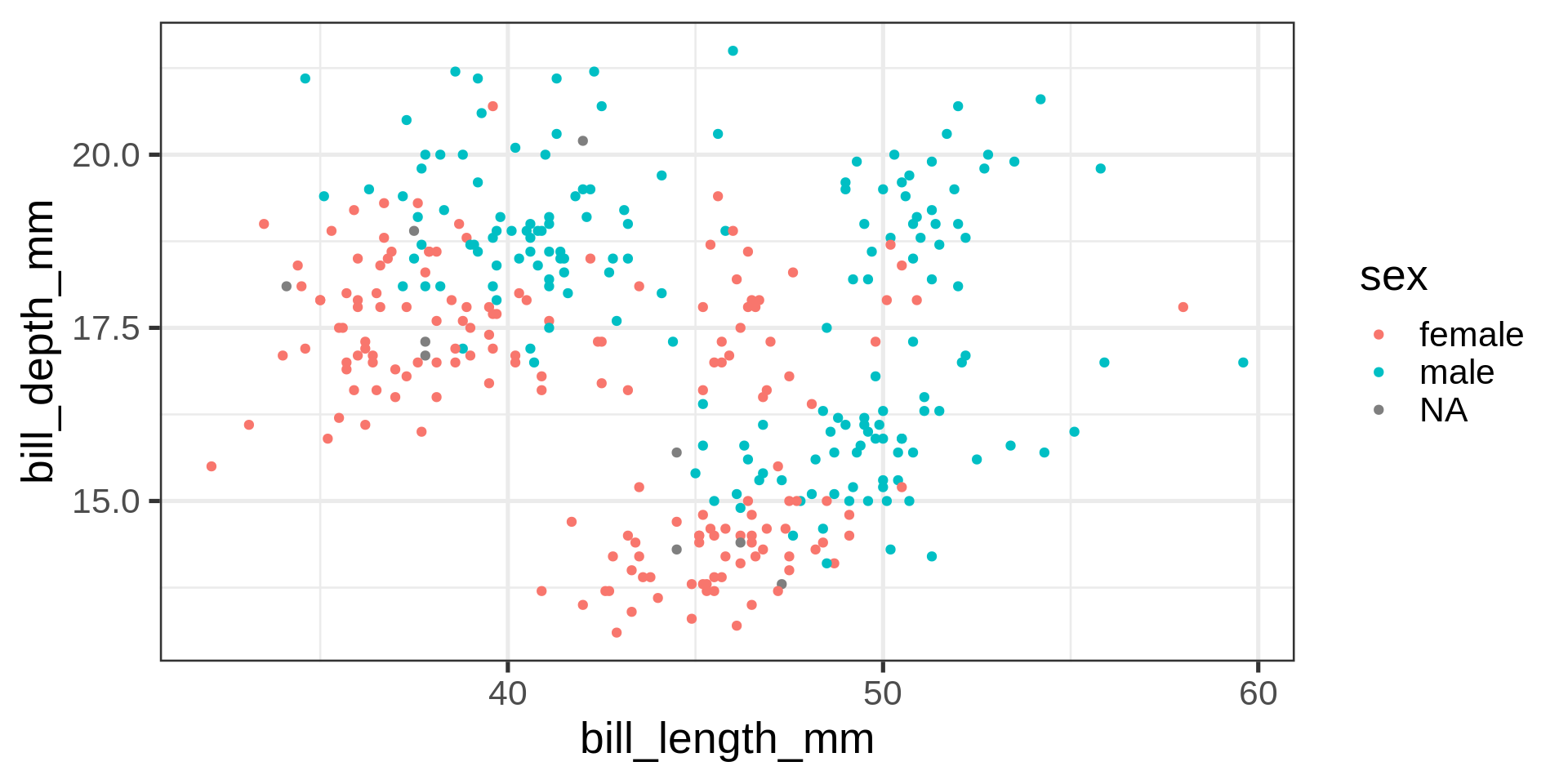
How to add bodymass and flipper length to this plot?
Adding another dimension
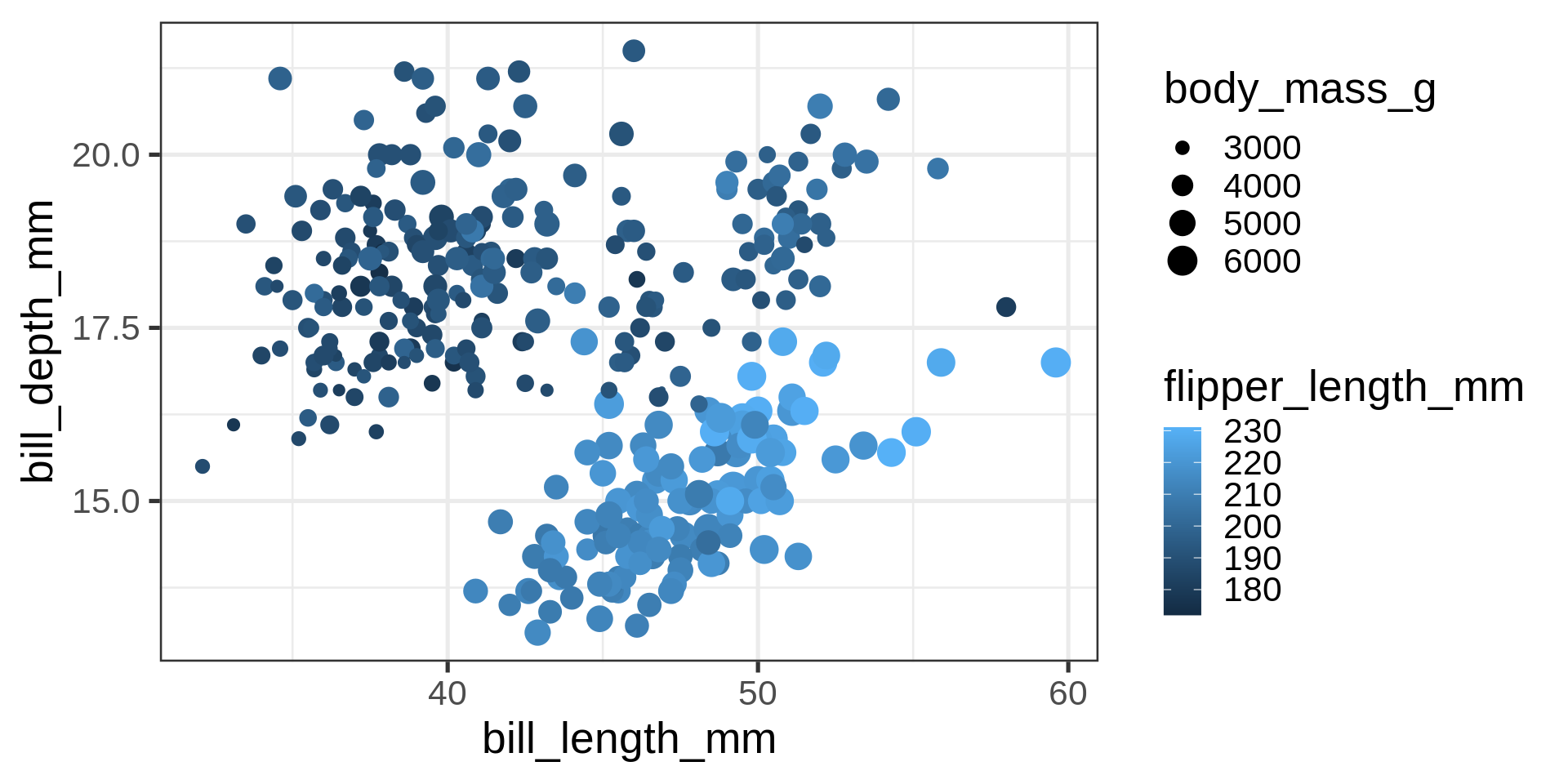
What is the relation between bodymass and bill depth?
Caution
Now four numeric variables. Not a good solution for mapping numeric variables to size and colour for analytical purposes.
Correlograms
penguins_clean <- penguins |> tidyr::drop_na()

  GGally::ggpairs(penguins_clean,
                  columns = c(3:6,8),
                  progress = FALSE)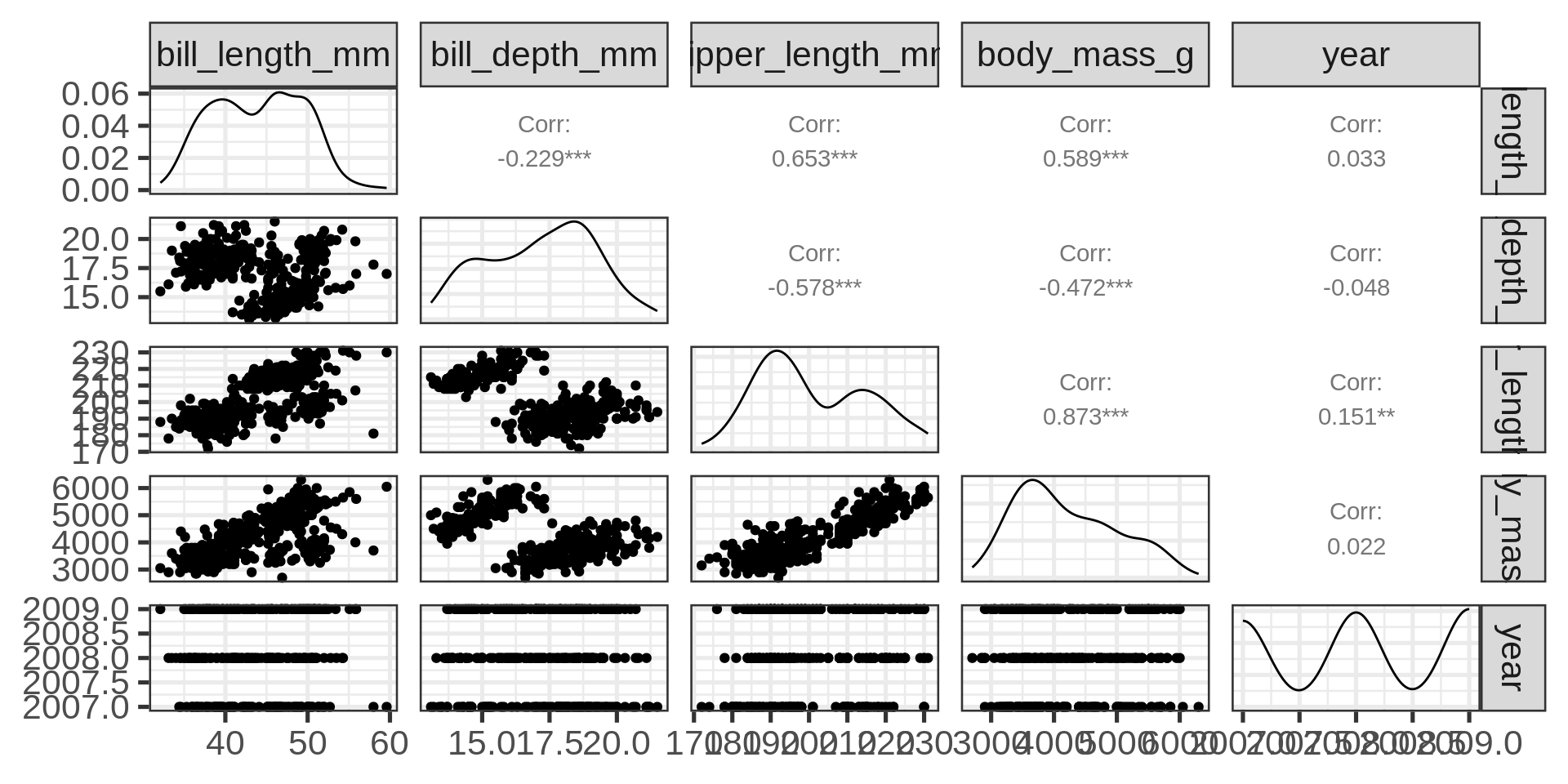
Complete features of GGally::ggpairs()
GGally::ggpairs(penguins,
                mapping = aes(colour = species),
                progress = FALSE) +
  theme_bw(base_size = 8)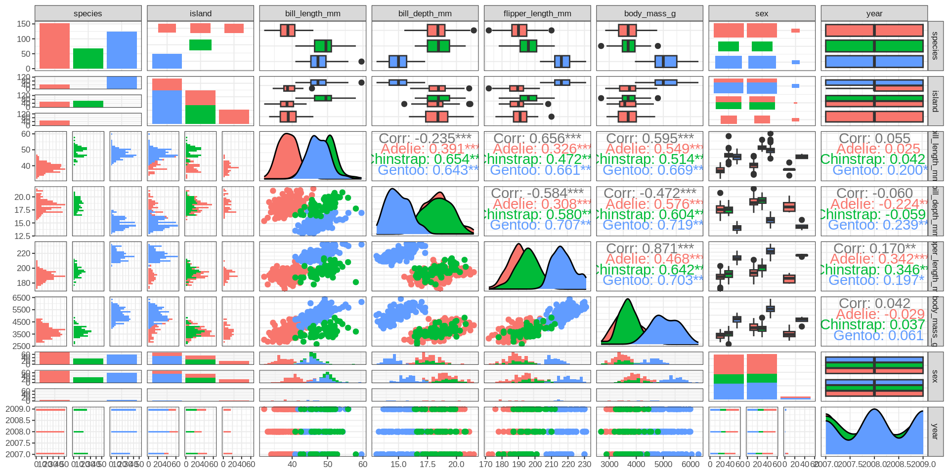
Heatmap
GGally::ggcorr(penguins_clean ) +
  guides(fill=guide_legend(title="All penguins")) -> peng_corr
peng_corr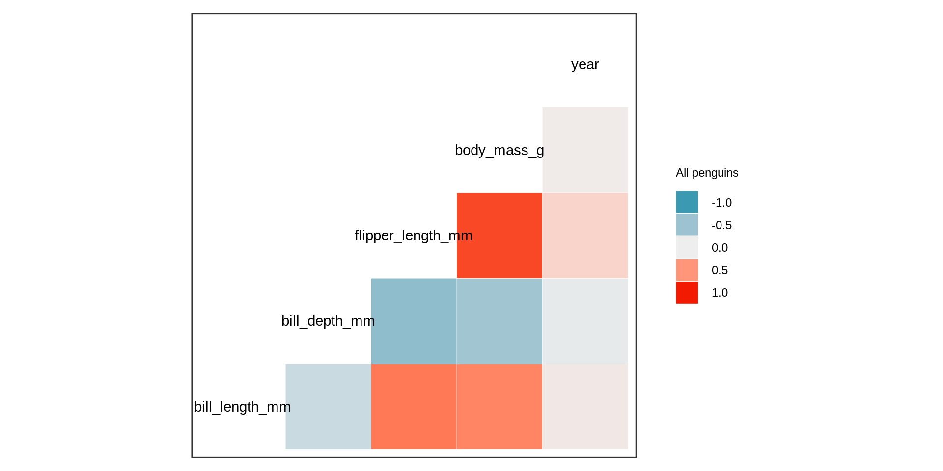
Remember
Simpson paradox
Simpson’s paradox
Code
penguins_clean |>
  nest(.by = species) |>
  mutate(corrplot = map2(data, species, \(x, s) GGally::ggcorr(x, name =s))) |>
  pull(corrplot) |>
  patchwork::wrap_plots() -> pls

pls + (peng_corr + theme(plot.background = element_rect(colour = "red", linewidth = 2)))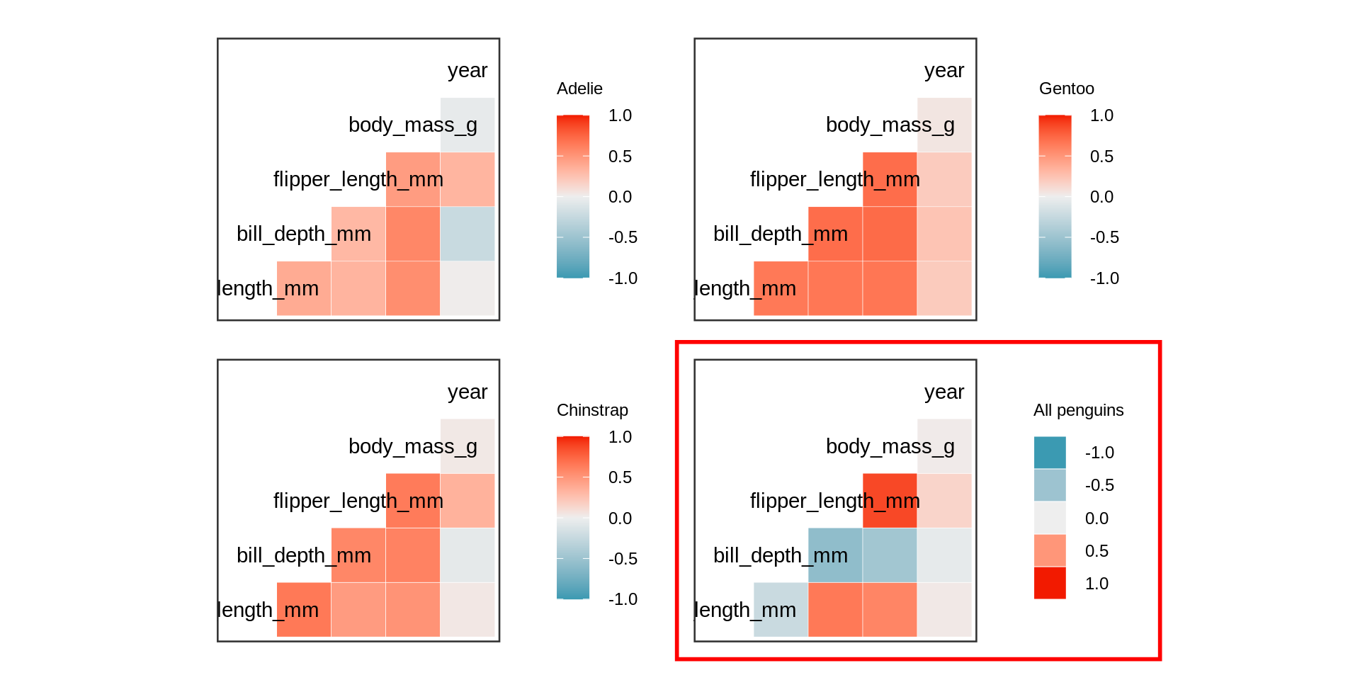
All numeric variables except for year are highly correlated if the individual species are respected.
Principal component analysis in R
library(broom)
pca |>
  # add original dataset back in
  augment(adelie) |>
  ggplot(aes(x = .fittedPC1,
             y = .fittedPC2,
             shape = island,
             color = sex)) +
geom_point(size = 3, alpha = 0.7) 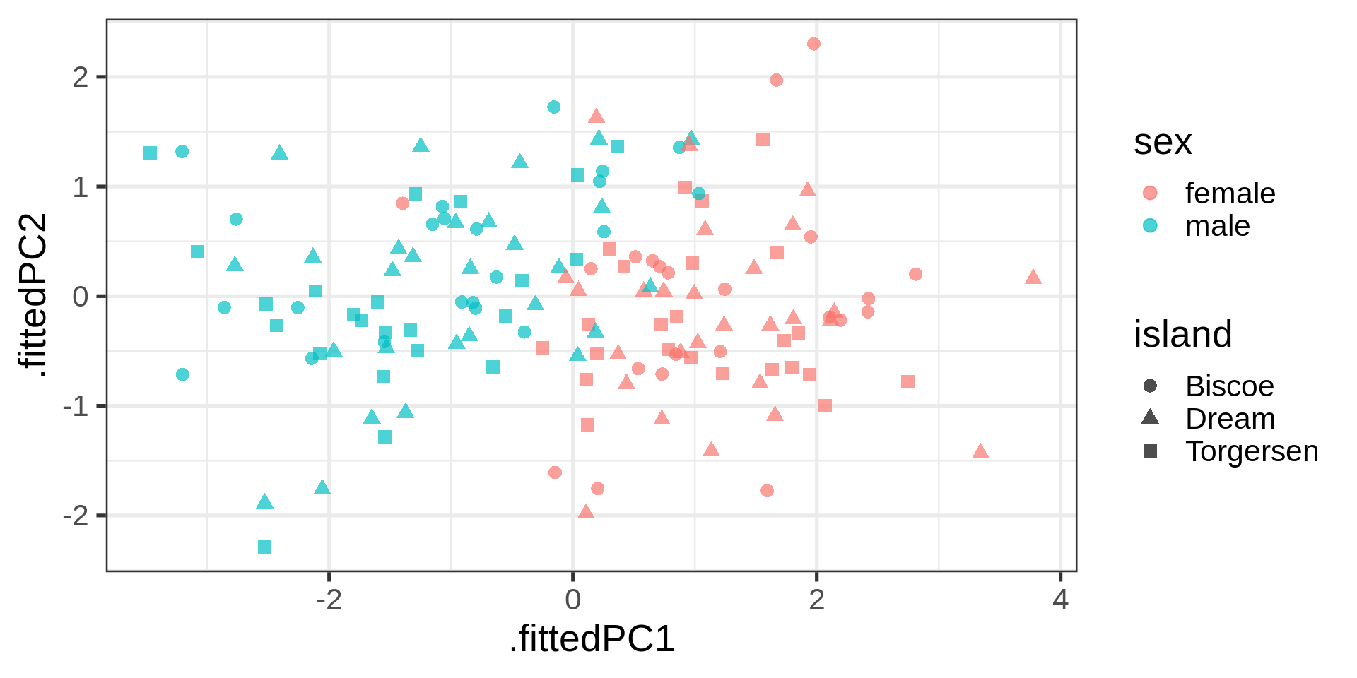
Plotting the loading
# Nice arrow style
arrow_style <- arrow(
angle = 20,
ends = "first",
type = "closed",
length = grid::unit(8, "pt")
)
# plot rotation matrix
pca |>
tidy(matrix = "rotation") |>
pivot_wider(names_from = "PC", names_prefix = "PC", values_from = "value") |>
ggplot(aes(PC1, PC2)) +
geom_segment(xend = 0, yend = 0, arrow = arrow_style) +
ggrepel::geom_text_repel(
aes(label = column),
hjust = 0.2, nudge_x = -0.05,
color = "#00a4e1"
) +
# Plot padding is often
xlim(-0.75, .25) + ylim(-1, 0.5) 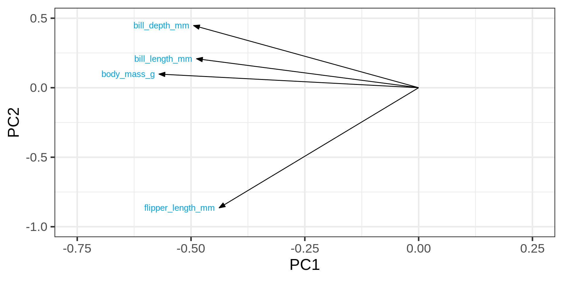
# coord_fixed() # fix aspect ratio to 1:1Variance explained
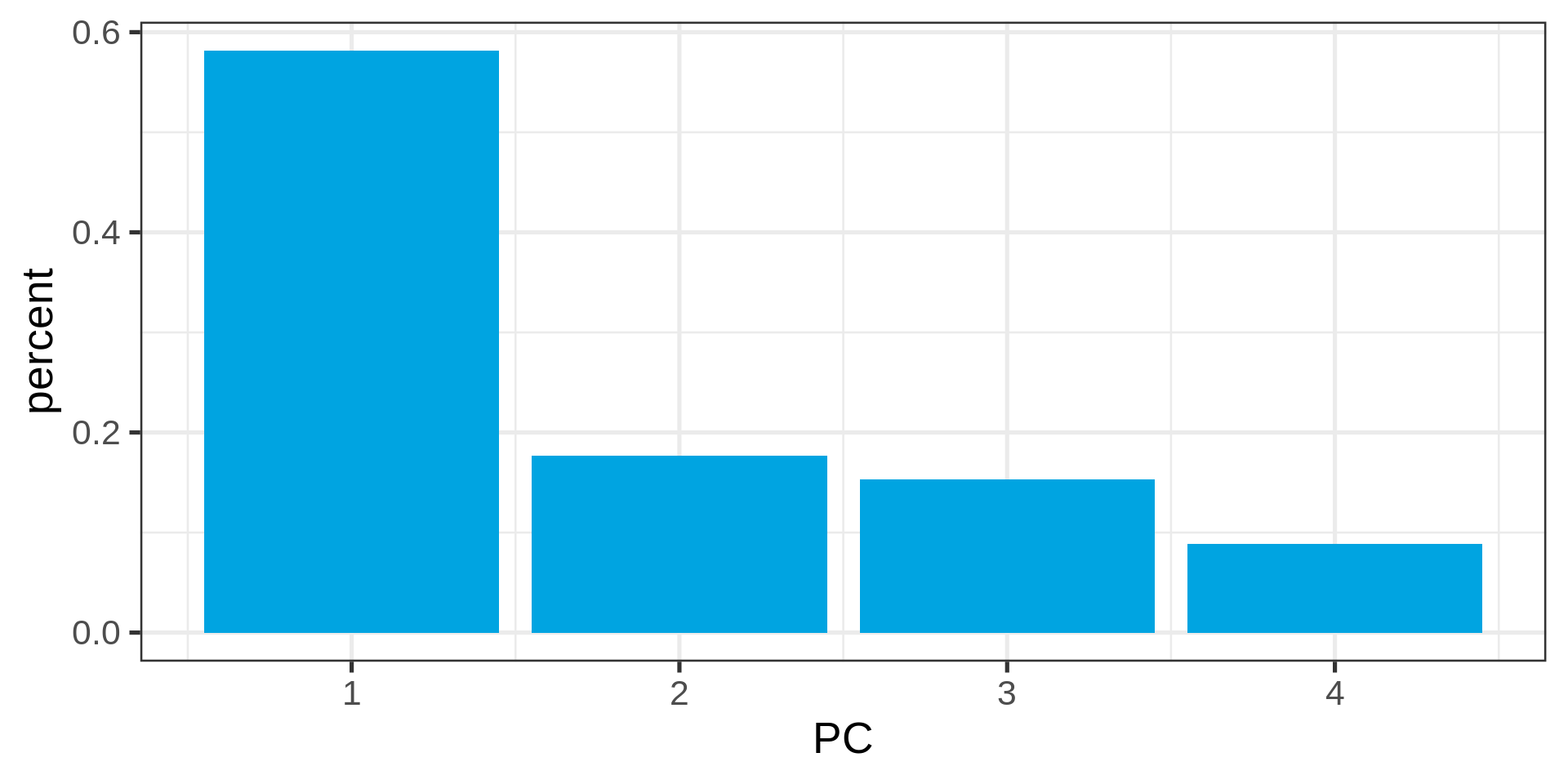
Eigenvalues
pca |>
  tidy(matrix = "eigenvalues")
# A tibble: 4 × 4
PC std.dev percent cumulative
<dbl> <dbl> <dbl> <dbl>
1 1 1.53 0.581 0.581
2 2 0.840 0.177 0.758
3 3 0.783 0.153 0.911
4 4 0.595 0.0886 1 Eigenvalues as bar chart
pca |>
  tidy(matrix = "eigenvalues") %>%
  ggplot(aes(PC, percent)) +
  geom_col(fill = "#00a4e1")