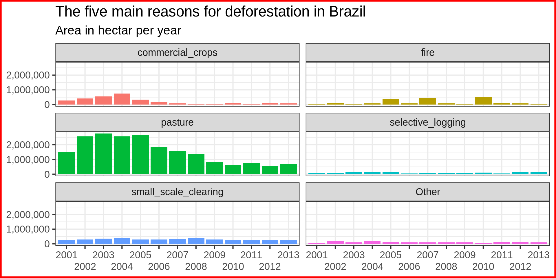
Code
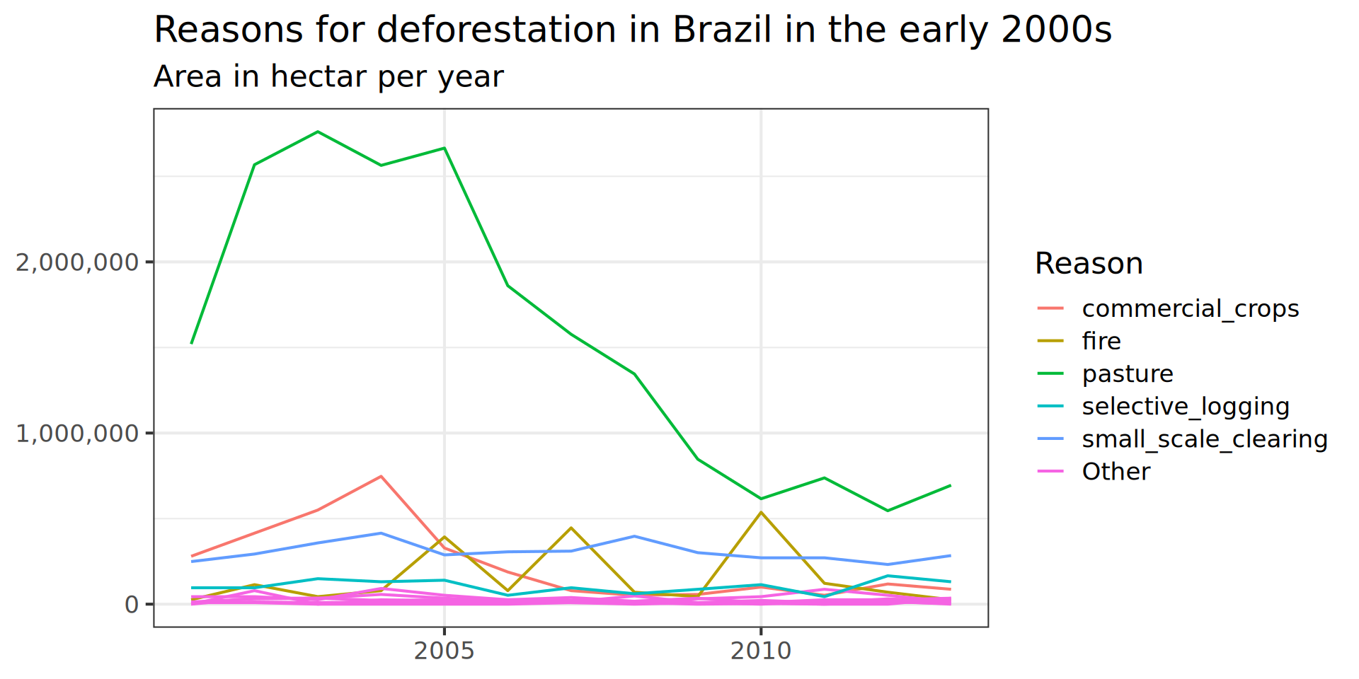
brazil_loss_long_complete |>
ggplot(aes(x = as.factor(year), y = area_ha, colour = fct_lump(reasons, n = 5, w = area_ha))) +
# fill = fct_lump(reasons, n = 5, w = area_ha))) +
geom_line(aes( group = reasons)) +
labs(title = "Reasons for deforestation in Brazil in the early 2000s",
subtitle = "Area in hectar per year",
fill = NULL,
colour = "Reason",
x = NULL,
y = NULL) +
#vars(fct_lump(reasons, n = 5, w = area_ha))
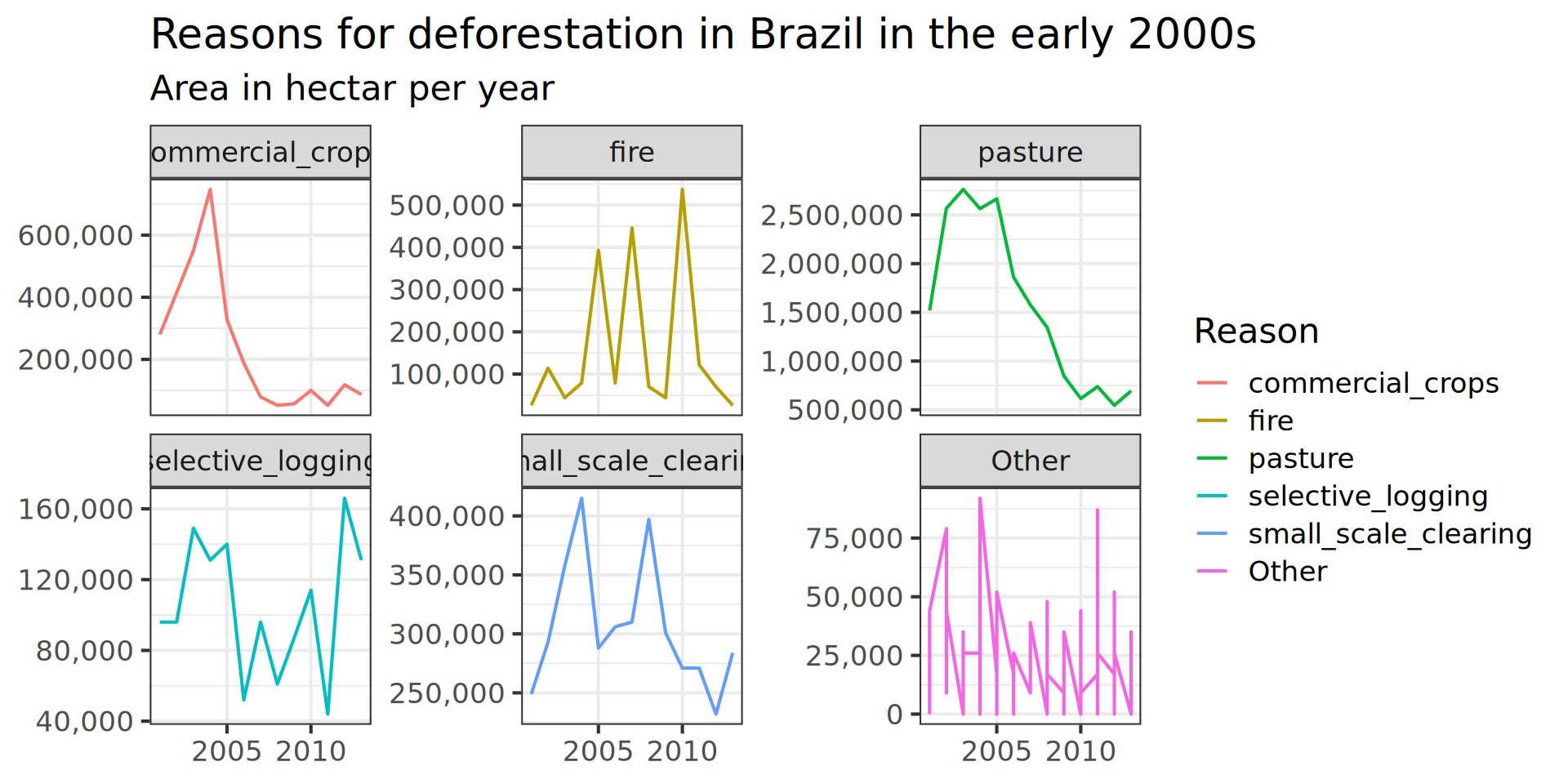
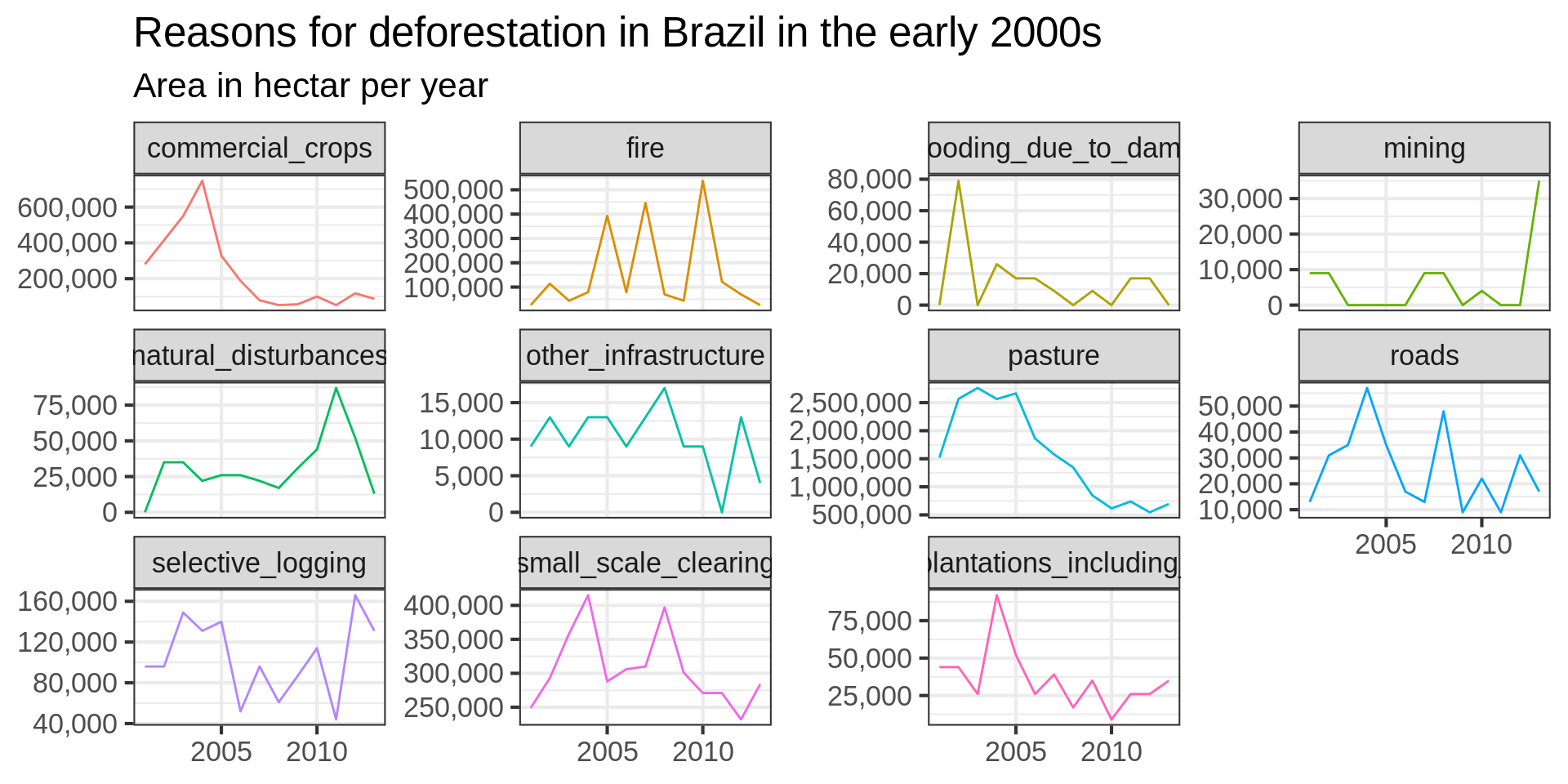
# facet_wrap(vars(reasons), scales = "free_y") +
scale_x_discrete(
breaks = seq(from = 2000, to = 2015, by = 5)) +
scale_y_continuous(labels = scales::comma) +
theme(base_size = 6)