import matplotlib.pyplot as plt

# And while we're at it - for data input
import plotly.express as pxData visualisation in Python
Matplotlib and Seaborn
2026-03-18
Python has many plotting libraries
Matplotlib
Probably the best known library for Python, started to be developed in 2003.
Aims to emulate the commands of the
MATLABsoftware, which was the scientific standard back then.Several features, such as the global style of MATLAB, were introduced to make the transition to
matplotlibeasier for MATLAB users.
A first plot
t = range(0, 20, 1)
plt.plot(t, t, 'r--',
         t, [x**1.3 for x in t], 'bs',
         t, [(.7*x)**1.7 for x in t], 'g^')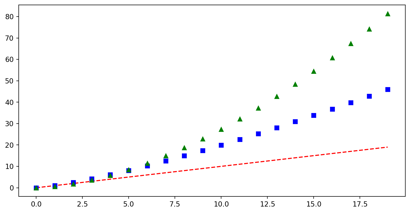
Basic plotting
- Lists as input
- No axis labels
- Shorthand codes for labels
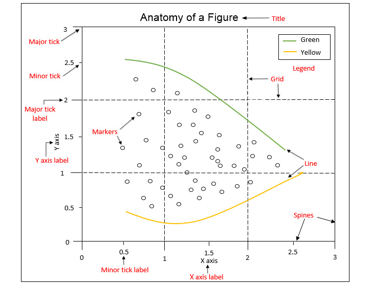
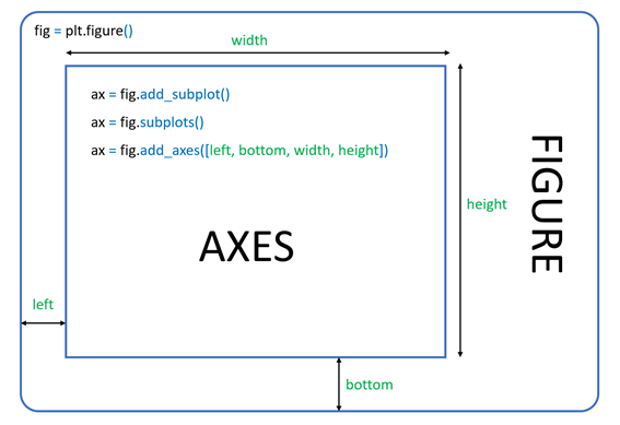
Structure of plots in Matplotlib
All matplotlib objects are inherited from the Artist abstract base class.
Each plot is encapsulated in a Figure object.
The Figure is the top-level container of the visualization.
It can have multiple Axes, which are basically individual plots inside this top-level container.
Python objects control axes, tick marks, legends, titles, text boxes, the grid, and many other objects.
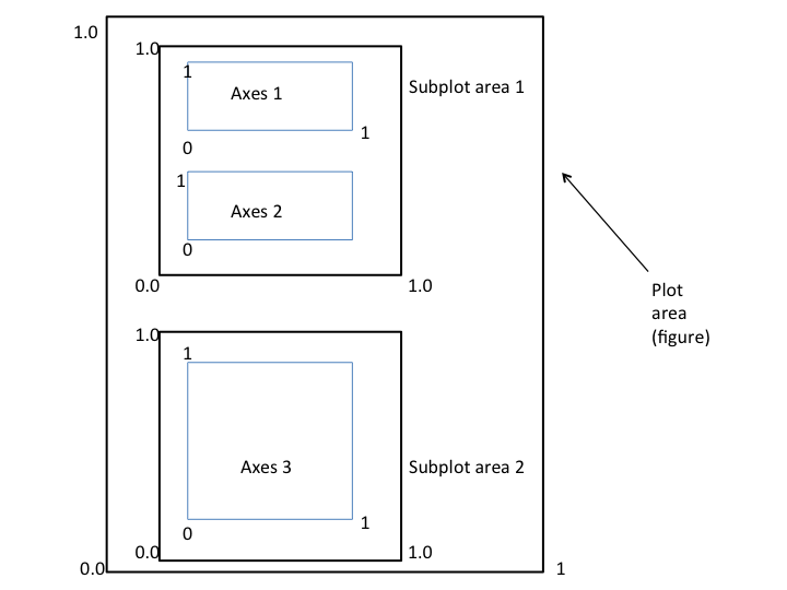
Figure structure
“Gapminder identifies systematic misconceptions about important global trends and proportions and uses reliable data to develop easy to understand teaching materials to rid people of their misconceptions.”
gapminder = px.data.gapminder()
gapminder.head()| country | continent | year | lifeExp | pop | gdpPercap | iso_alpha | iso_num | |
|---|---|---|---|---|---|---|---|---|
| 0 | Afghanistan | Asia | 1952 | 28.801 | 8425333 | 779.445314 | AFG | 4 |
| 1 | Afghanistan | Asia | 1957 | 30.332 | 9240934 | 820.853030 | AFG | 4 |
| 2 | Afghanistan | Asia | 1962 | 31.997 | 10267083 | 853.100710 | AFG | 4 |
| 3 | Afghanistan | Asia | 1967 | 34.020 | 11537966 | 836.197138 | AFG | 4 |
| 4 | Afghanistan | Asia | 1972 | 36.088 | 13079460 | 739.981106 | AFG | 4 |
Let’s explore just four basic chart types.
Bar Chart
data_2002 = gapminder[gapminder["year"] == 2002]
plt.barh(data_2002["continent"],
        data_2002["lifeExp"],
        label='lifeExp')
plt.legend()
plt.xlabel('lifeExp')
plt.title('Life expectancy by continent in 2002')
Text(0.5, 1.0, 'Life expectancy by continent in 2002')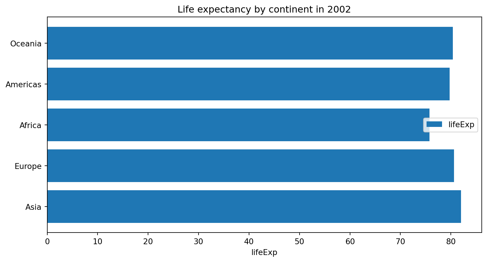
plt.bar(x, height, [width])- vertical bar plot.plt.barh()- horizontal bar plot
Anything wrong about this plot?
Line plot
for country in ["Nigeria", "Belgium",
"China", "Kuwait"]:
  plt.plot(
    gapminder[gapminder["country"] ==
    country]["year"],
    gapminder[gapminder["country"] ==
    country]["gdpPercap"],
    label = country)
plt.yscale('log')
plt.title("GDP per cap over the years", fontsize=24)
plt.ylabel('gdpPercap', fontsize=20)
plt.legend()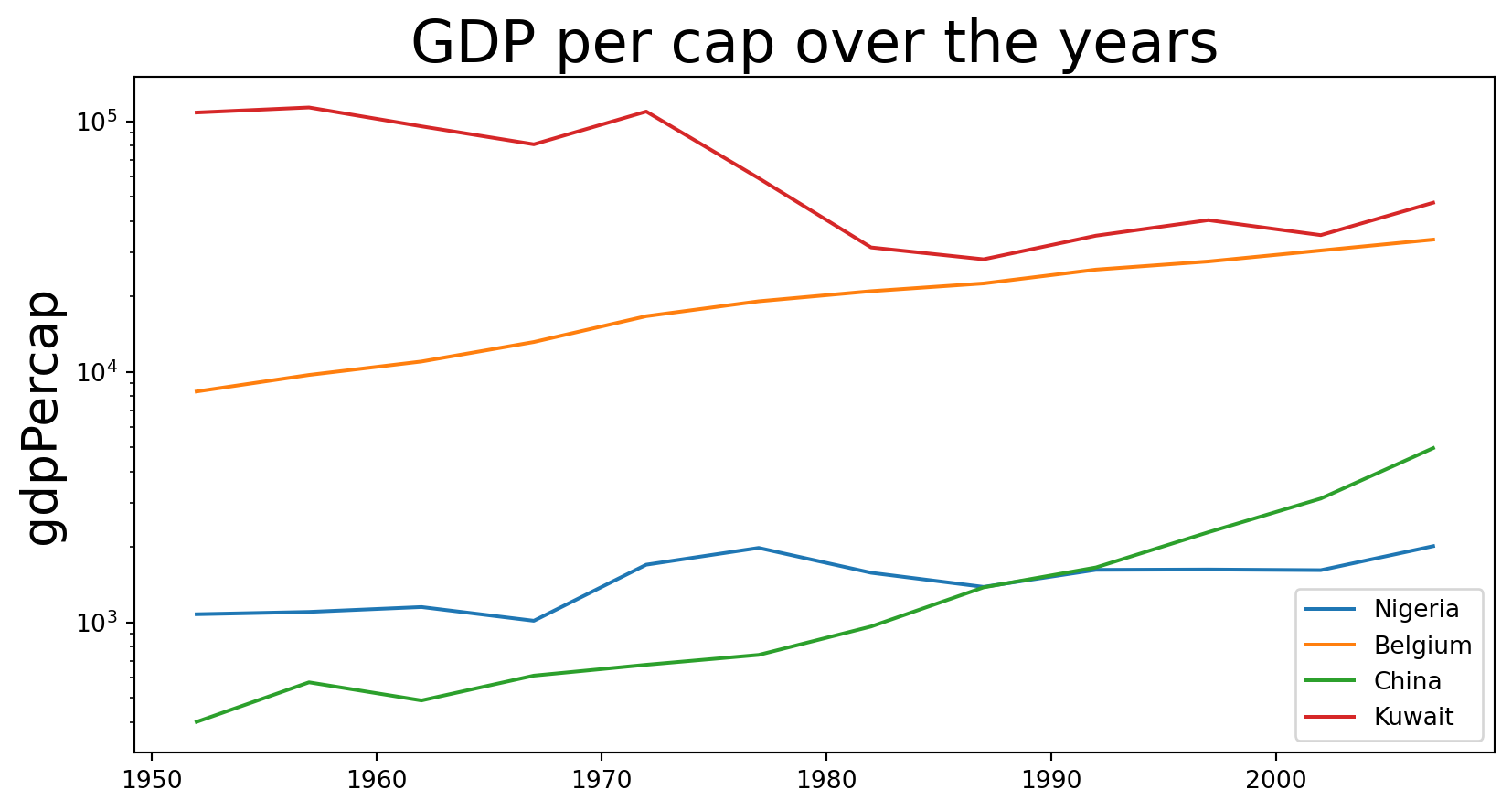
Legend place by algorithm
Scatter plot
plt.scatter(data_2002.lifeExp, data_2002.gdpPercap)
plt.title("Life expectancy vs GDP per capta", fontsize=16)
plt.ylabel('gdpPercap', fontsize=14)
plt.xlabel('lifeExp', fontsize=14)
plt.xscale('log')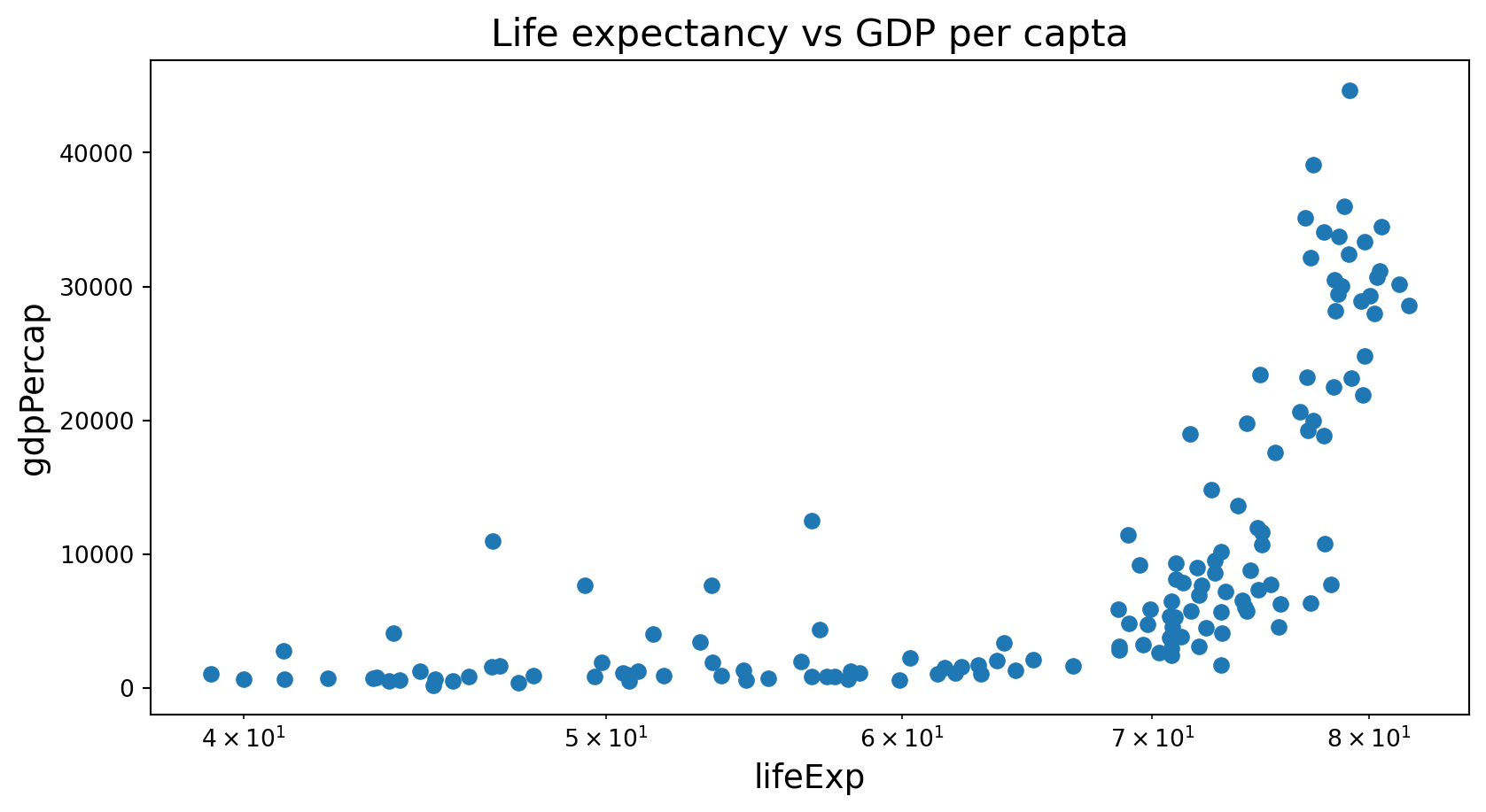
Histogram
plt.hist(data_2002["lifeExp"],bins = 20)
plt.title("Life expectancy in 2002", fontsize=16)
plt.xlabel('lifeExp', fontsize=14)
Text(0.5, 0, 'lifeExp')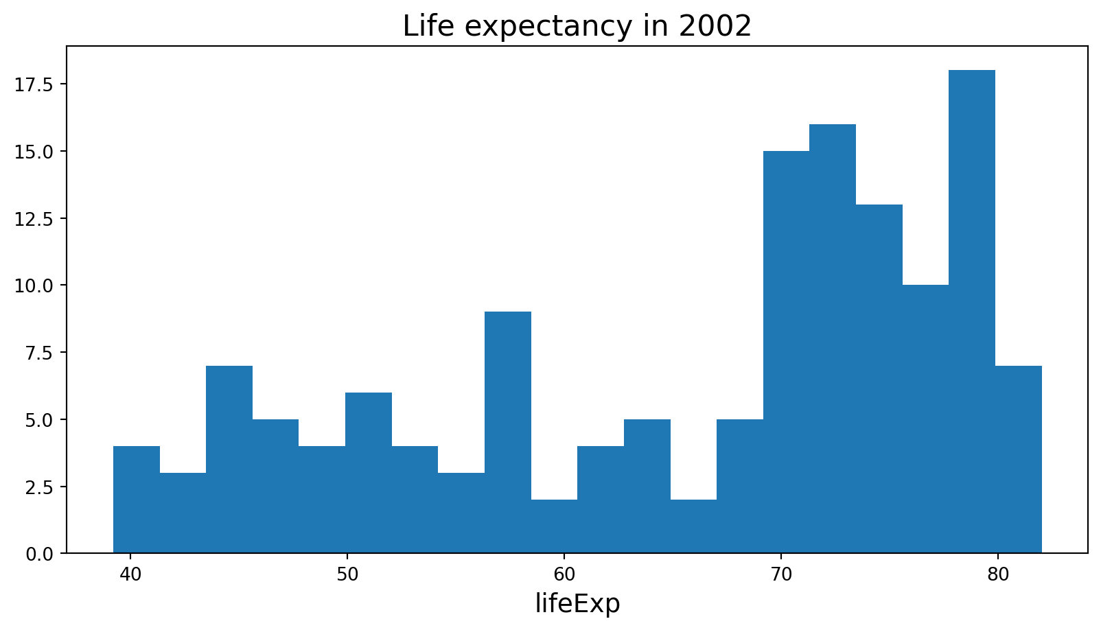
Histogram
A histogram is a bar plot where the axis representing the data variable is divided into a set of discrete bins.
The count of observations falling within each bin is shown using the height of the corresponding bar.
seabornis a Python data visualization library based onmatplotlib. It provides a high-level interface for drawing attractive and informative statistical graphics.It builds on top of
matplotliband integrates closely with pandas data structures.Less adjustments have to be done than in
matplotlib.
“If
matplotlib“tries to make easy things easy and hard things possible”,seaborntries to make a well-defined set of hard things easy to do.”
Overview of seaborn plotting functions
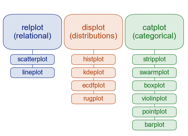
Figure-level vs. axes-level functions
In addition to the module classification, seaborn functions are sub-classified as:
- axes-level plot data onto a single
matplotlib.pyplot.Axesobject - figure-level interface with
matplotlibthrough aseabornobject that manages the figure.
Setup for Seaborn usage
Seaborn can be imported as below and is commonly aliased as sns.
import matplotlib.pyplot as plt
import seaborn as sns
import pandas as pd![]()
Palmer penguins
The data is available in GitHub. The goal is to provide a great data set for data exploration & visualization, as an alternative to the iris data set.

Histograms - histplot()
sns.displot(data = penguins,
               x = "flipper_length_mm",
             hue = "species")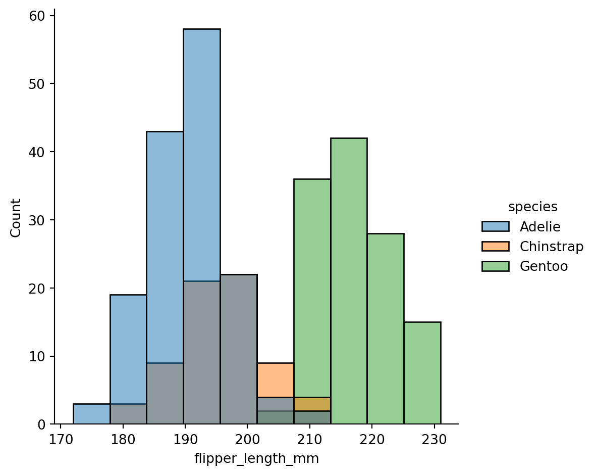
How would look like in matplotlib?
for spec in ["Adelie", "Chinstrap", "Gentoo"]:
  pdata = penguins[penguins["species"] ==
  spec]["flipper_length_mm"]
  plt.hist(pdata.reset_index(drop=True),
          alpha = 0.6,
          label = spec,
          bins = 10)
plt.ylabel('Count')
plt.xlabel('flipper_length_mm')
plt.legend()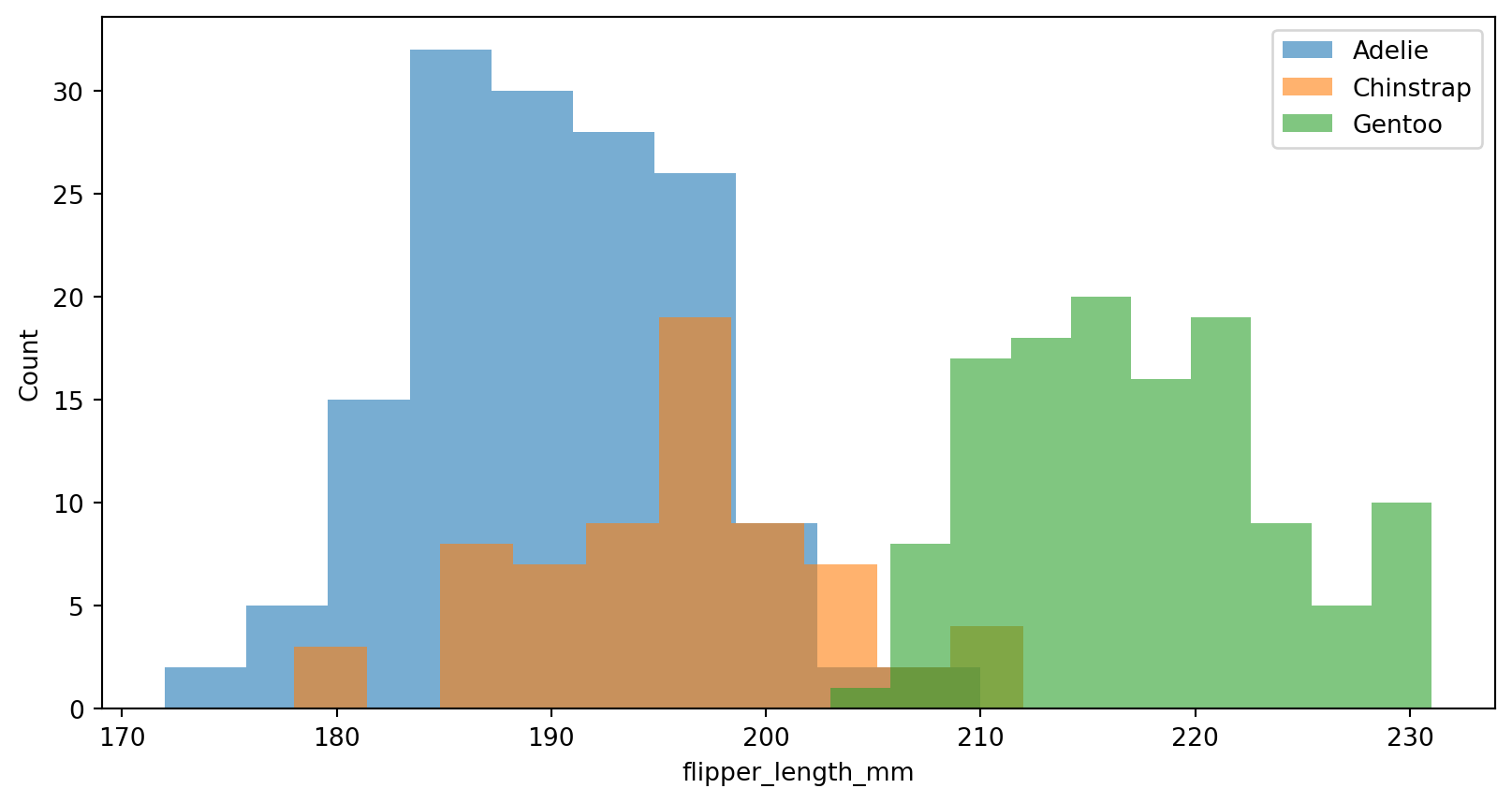
How would this look like in ggplot2?
#| eval: false
library(ggplot2)

ggplot(penguins,
      aes(x    = flipper_len,
          fill = species)) +
  geom_histogram(
    color = "#e9ecef",
    alpha = 0.6,
    position = 'identity',
    bins = 10
  ) +
  theme(legend.position = c(0.87, 0.75))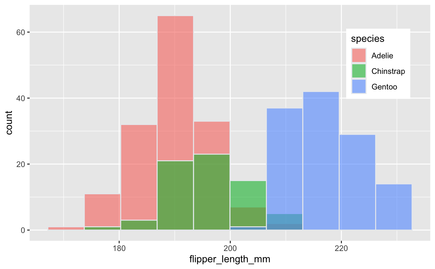
Normalized histogram statistics
When the subsets have unequal numbers of observations, comparing their distributions in terms of counts may not be ideal.
One solution is to normalize the counts using the
statparameter:
sns.displot(
  penguins,
  x = "flipper_length_mm",
  hue="species",
  stat="density",
  common_norm=False
  )
plt.show()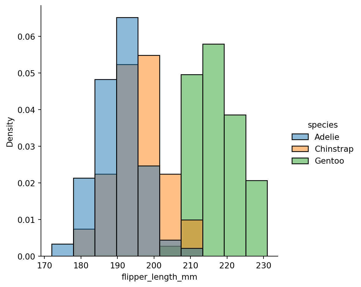
Kernel - kdeplot()
A histogram approximates the underlying probability density function that generated the data by binning and counting observations.
Kernel density estimation (KDE) presents a different solution to the same problem.
A KDE plot smooths the observations with a Gaussian kernel, producing a continuous density estimate.
sns.displot(data=penguins,
            x="flipper_length_mm",
            hue="species",
            kind="kde",
            bw_adjust=2,
            fill=True, alpha = 0.5)
plt.show()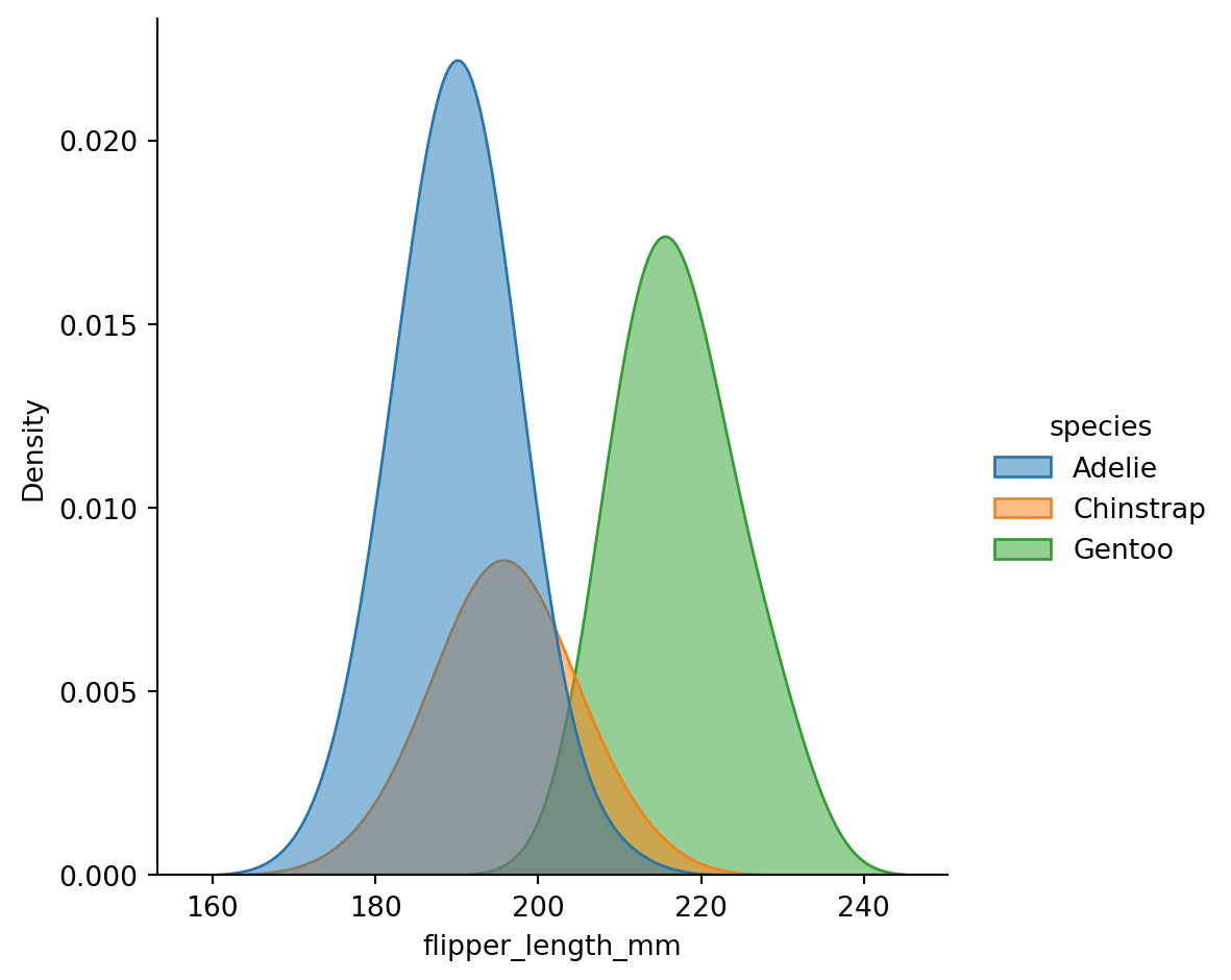
Empirical cumulative distribution - ecdfplot()
sns.displot(
  data=penguins,
  x="flipper_length_mm",
  hue="species",
  kind="ecdf"
  )
plt.show()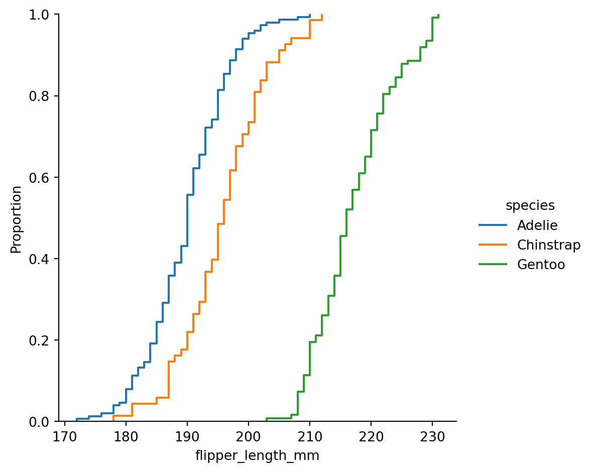
ECDF
This plot draws a monotonically-increasing curve through each datapoint such that the height of the curve reflects the proportion of observations with a smaller value.
Visualizing bivariate distributions
Assigning a second variable to
y, however, will plot a bivariate distribution.Analogous to a
heatmap()
sns.displot(penguins,
            x="bill_length_mm",
            y="bill_depth_mm",
            hue="species")
plt.show()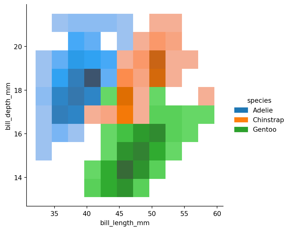
Scatter plots
sns.relplot(data=penguins,
            x="bill_length_mm",
            y="bill_depth_mm",
            hue = "species",
            style="species")
plt.show()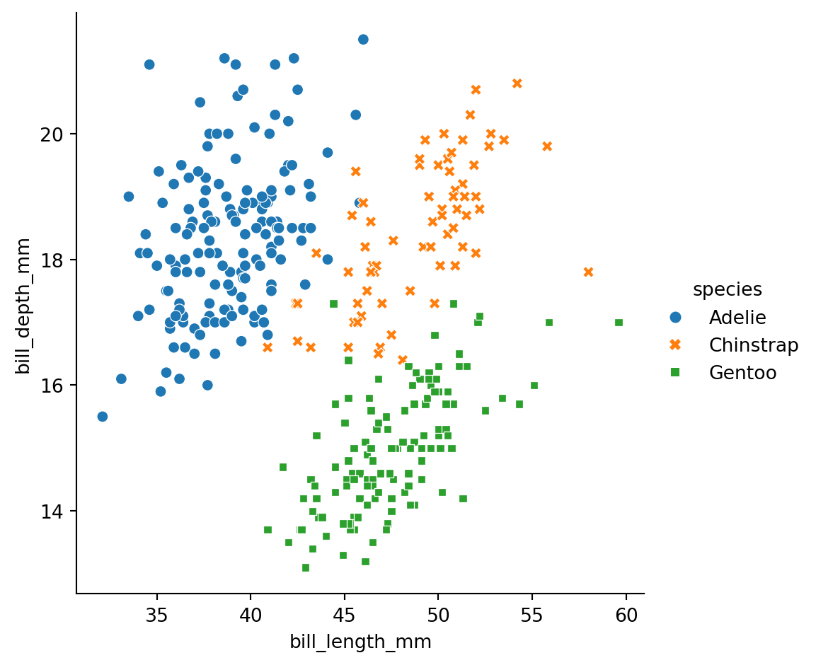
Line plots
sns.relplot(data=penguins,
            x="species",
            y="body_mass_g",
            hue= "sex",
            kind="line")
plt.show()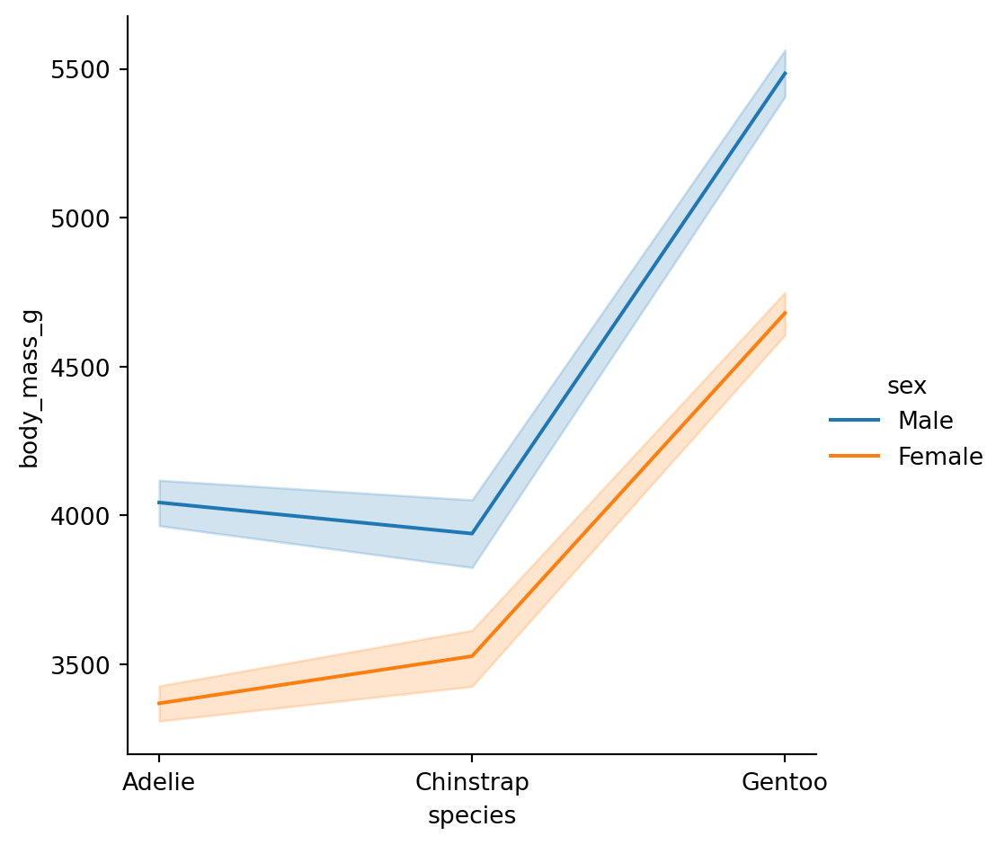
Note
The default behavior in seaborn is to aggregate the multiple measurements at each x value by plotting the mean and the 95% confidence interval around the mean.
Categorical scatterplots - striplot()
sns.catplot(data=penguins,
            x="species",
            y="body_mass_g")
plt.show()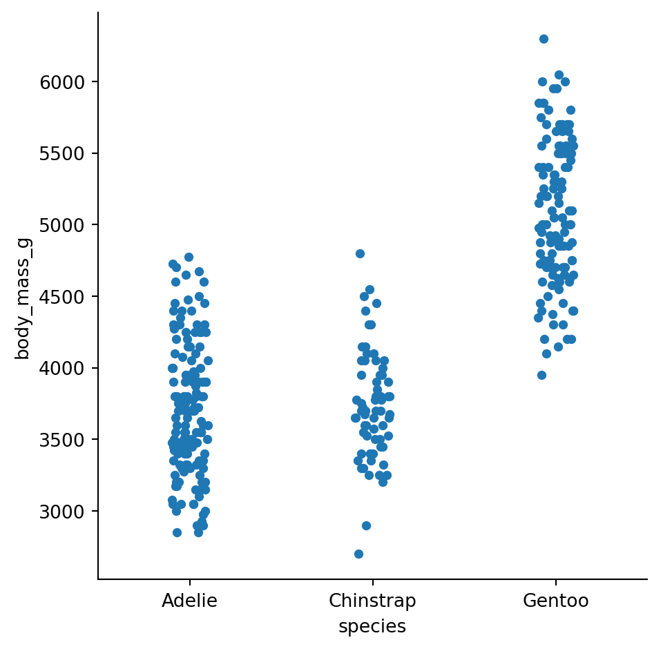
Categorical scatterplots swarmplot()
sns.catplot(data=penguins,
                  x="species",
                  y="body_mass_g",
                  hue = "sex",
                  kind= "swarm")
plt.show()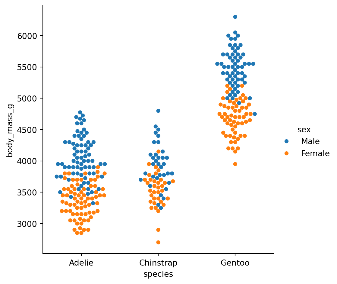
Boxplots
sns.catplot(data=penguins,
            x="species",
            y="flipper_length_mm",
            hue = "sex",
            kind="box")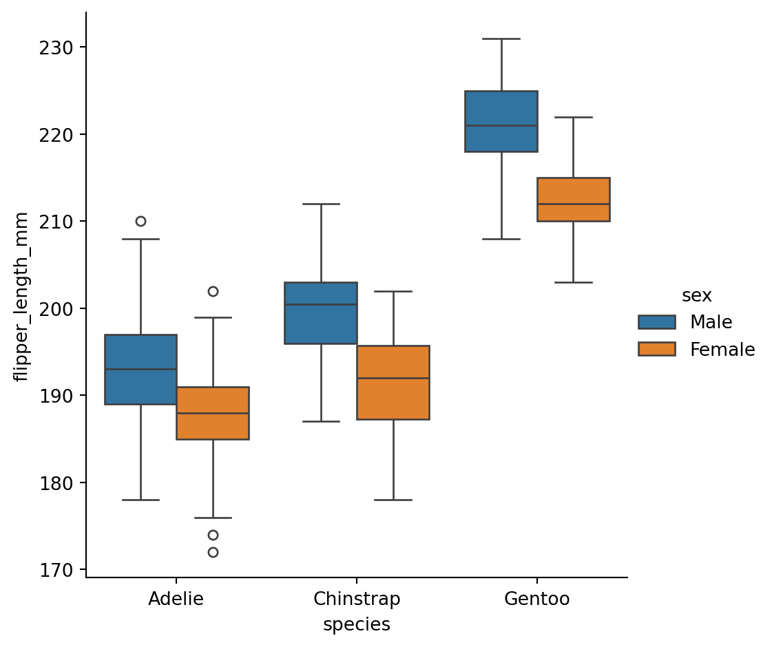
What’s in the box?
The three quartile values of the distribution along with extreme values, minimum and maximum data point.
Whiskers extend to points that lie within 1.5 IQRs of the lower and upper quartile. Observations that fall outside this range are displayed independently.
Violinplots
A violinplot() combines a boxplot with the kernel density estimation procedure.
sns.catplot(data=penguins,
            x="species",
            y="flipper_length_mm",
            hue = "sex",
            kind="violin")
plt.show()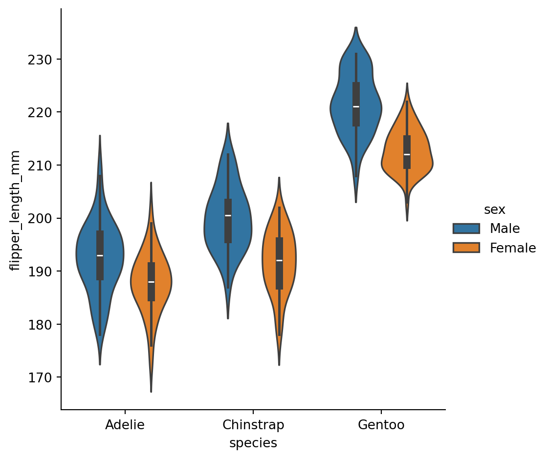
Categorical estimates
In some cases, an estimate of the central tendency of the values would be better than only showing a distribution.
Bar plots
A familiar style of plot that accomplishes this goal is a bar plot.
The
barplot()function operates on a full dataset and applies a function to obtain the estimate.
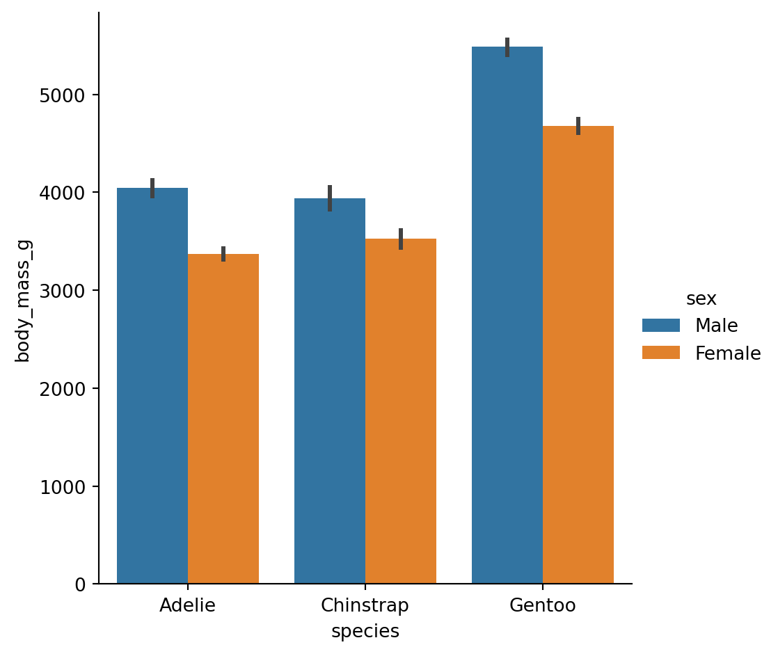
The danger of dynamite plots
sns.catplot(
  data = penguins,
  x = "species",
  y = "body_mass_g",
  hue = "sex",
  kind = "bar"
  )
plt.show()
Count plots
- A special case for the bar plot is when you want to show the number of observations in each category rather than computing a statistic for a second variable.
sns.catplot(data = penguins,
            x = "sex",
            hue = 'species',
            kind = "count")
plt.show()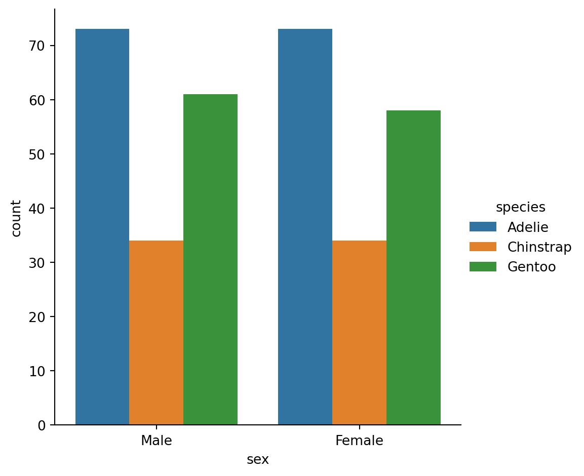
Point plots
An alternative style for visualizing the same information is offered by the
pointplot()function.It connects points from the same
huecategory which makes easy to see how the main relationship is changing as a function of thehuesemantic.
sns.catplot(data = penguins,
            x = "species",
            y = "flipper_length_mm",
            hue = 'sex',
            kind = "point")
plt.show()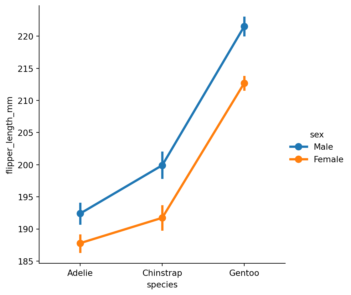
pointplot
sns.catplot(data = gapminder,
            x = "year",
            y = "lifeExp",
            hue = 'continent',
            kind = "point")
plt.show()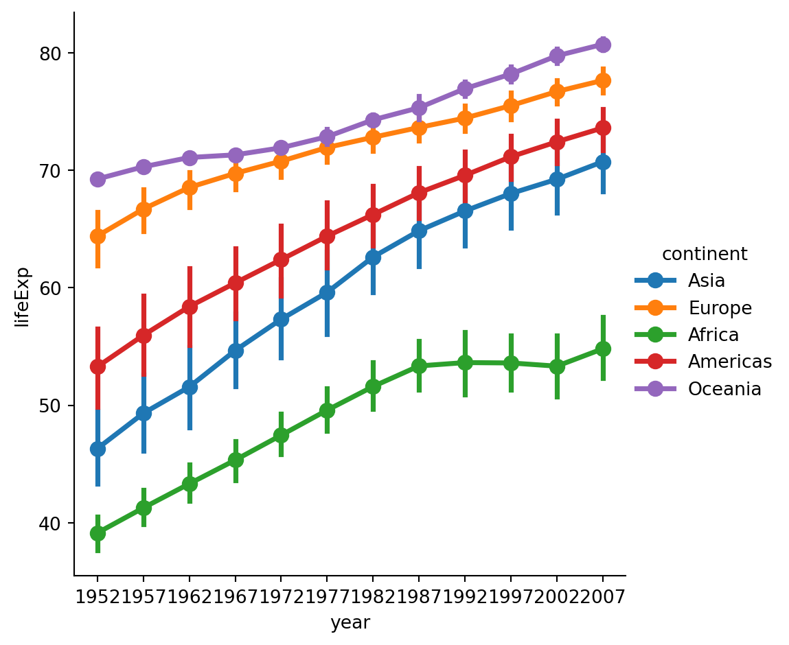
Figure vs axes level functions
Figure level
The figure-level functions can easily create figures with multiple subplots.
sns.displot(data=penguins,
            x="flipper_length_mm",
            hue="species",
            col="species")
plt.show()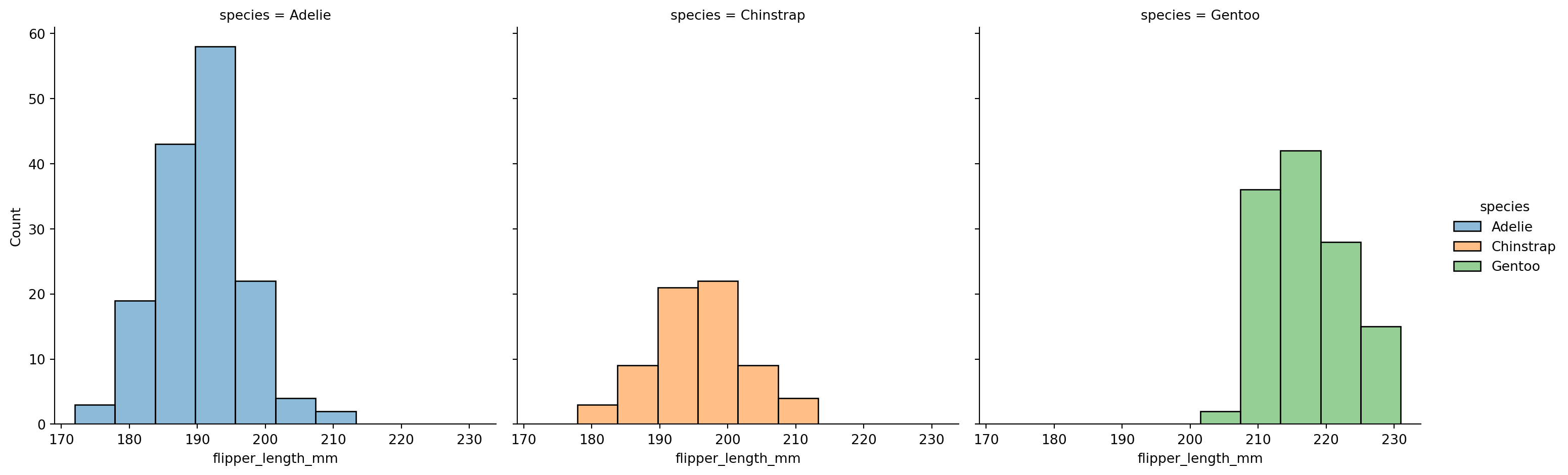
The kind-specific parameters don’t appear in the function signature or doc strings.
More complicated to set up fine adjustments.
Axes level
f, axs = plt.subplots(1, 2, figsize=(8, 4),
                      gridspec_kw=dict(width_ratios=[4, 3]))
sns.scatterplot(data=penguins,
                x="flipper_length_mm",
                y="bill_length_mm",
                hue="species",
                ax=axs[0])
sns.histplot(data=penguins,
              x="species",
              hue="species",
              shrink=.8,
              alpha=.8,
              legend=False,
              ax=axs[1])
f.tight_layout()
plt.show()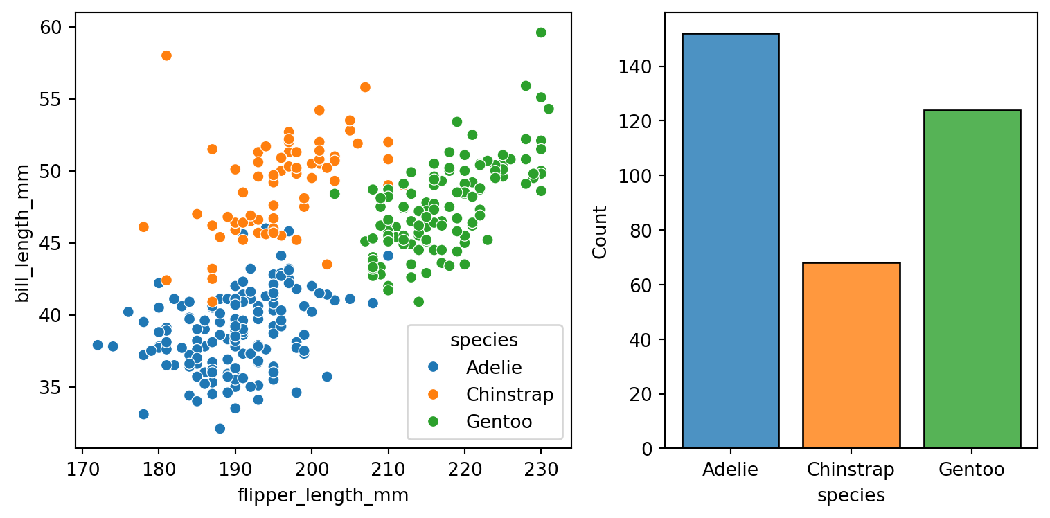
Axes-level functions don’t modify anything beyond the axes that they are drawn into.
Easier to compose into arbitrarily-complex matplotlib figures.
jointplot()
Plots the relationship or joint distribution of two variables while adding marginal axes that show the univariate distribution of each one separately:
sns.jointplot(data=penguins,
              x="flipper_length_mm",
              y="bill_length_mm",
              hue="species")
plt.show()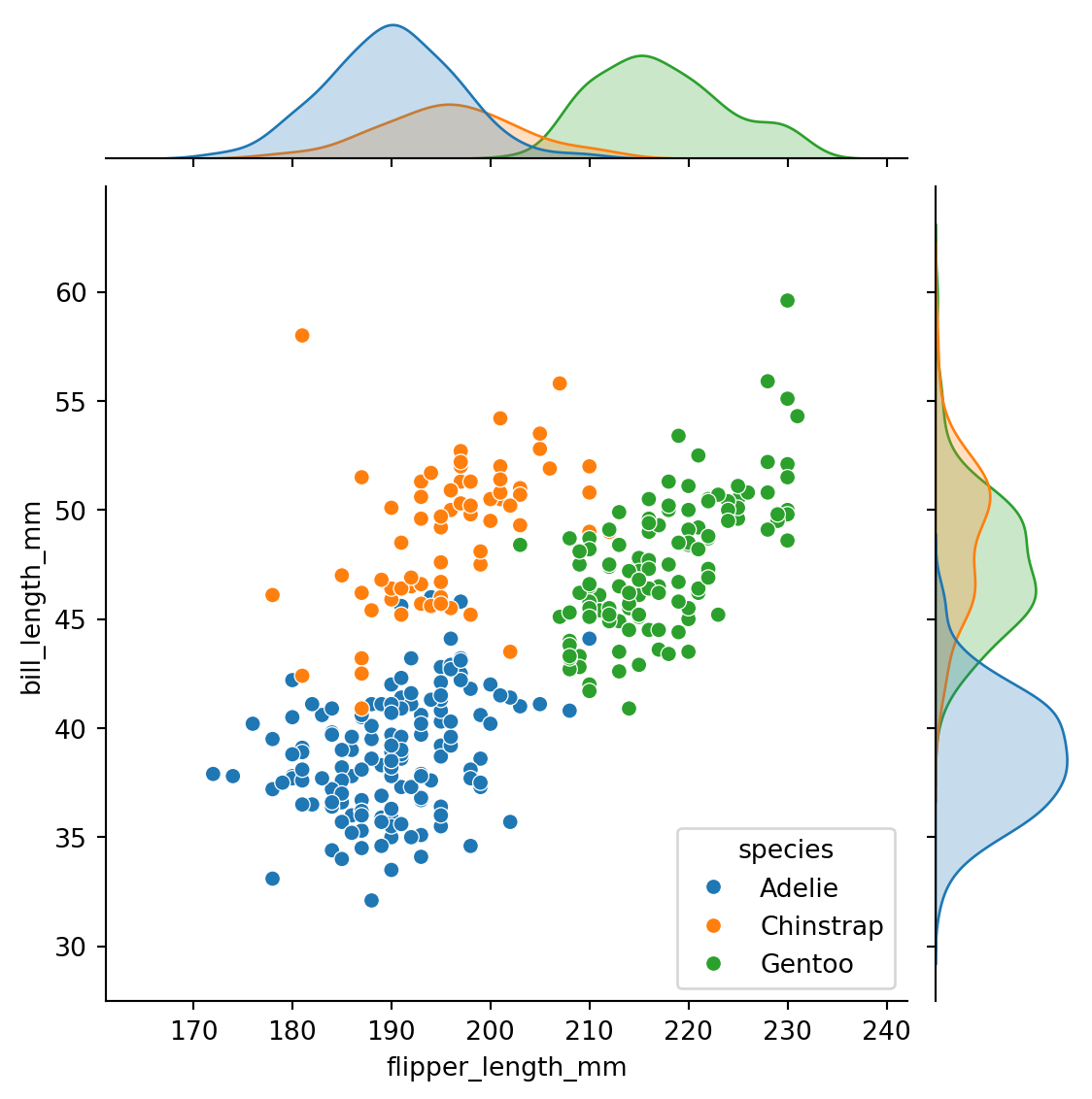
pairplot()
Combines joint and marginal views — but rather than focusing on a single relationship, it visualizes every pairwise combination of variables simultaneously.
sns.pairplot(data=penguins,
             hue="species")
plt.show()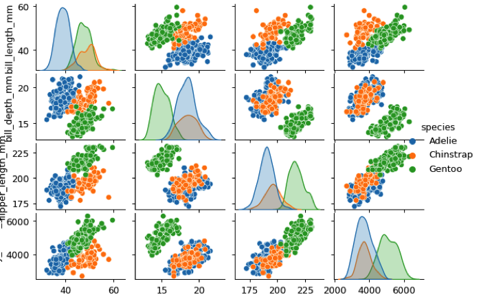
Figure styles
sns.set_style("whitegrid")
sns.scatterplot(data=penguins,
                x="bill_length_mm",
                y="bill_depth_mm",
                hue = "species",
                style="species")
plt.show()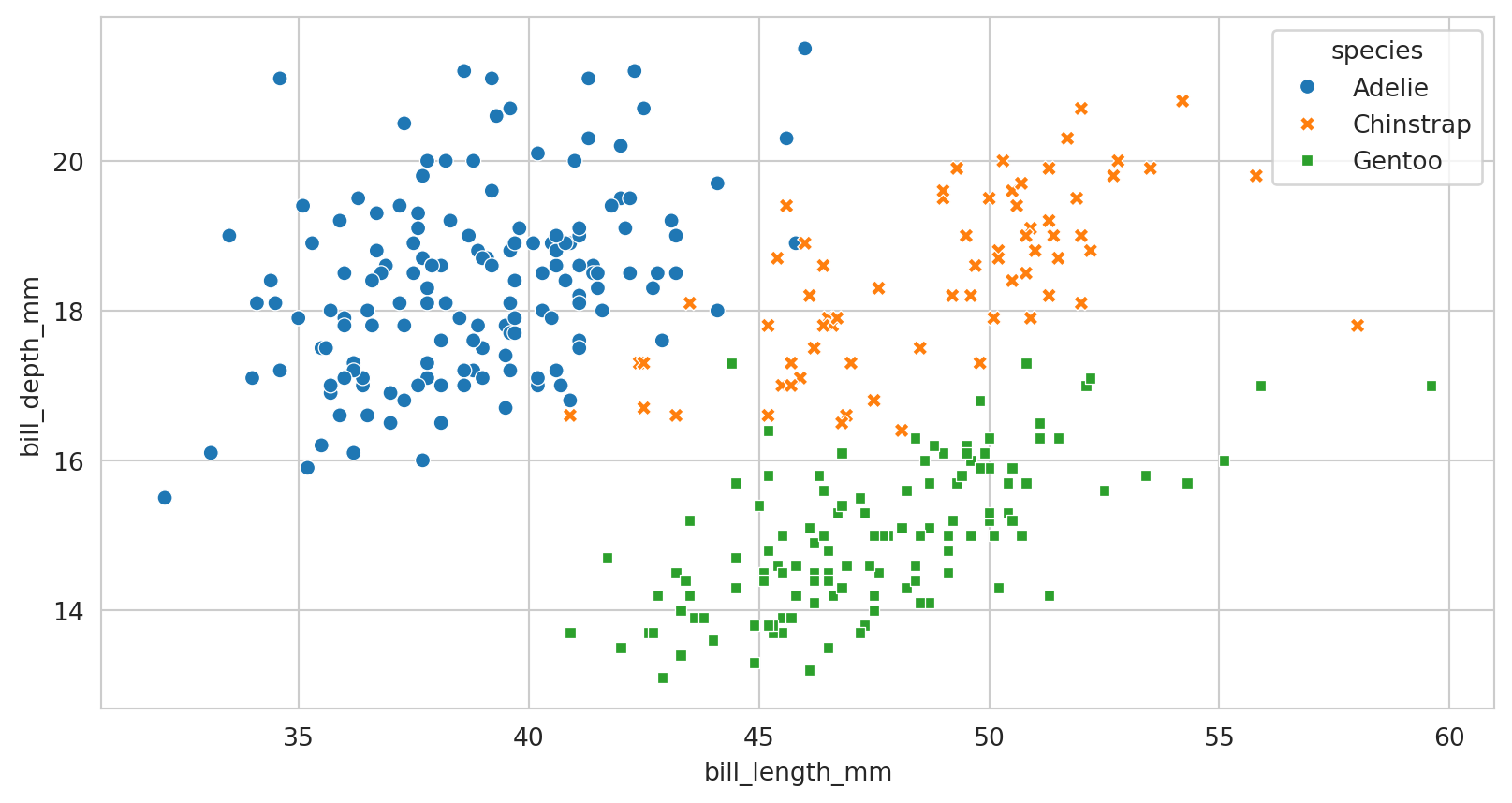
rc parameter in the style functions
Parameter mappings to override the values in the preset Seaborn-style dictionaries.
Figure styles - temporary
import numpy as np
f = plt.figure(figsize=(6, 6))
gs = f.add_gridspec(2, 2)
def sinplot(n=10, flip=1):
    x = np.linspace(0, 14, 100)
    for i in range(1, n + 1):
        plt.plot(x, np.sin(x + i * .5) * (n + 2 - i) * flip)
with sns.axes_style("darkgrid"):
    ax = f.add_subplot(gs[0, 0])
    sinplot(6)
with sns.axes_style("white"):
    ax = f.add_subplot(gs[0, 1])
    sinplot(6)
with sns.axes_style("ticks"):
    ax = f.add_subplot(gs[1, 0])
    sinplot(6)
with sns.axes_style("whitegrid"):
    ax = f.add_subplot(gs[1, 1])
    sinplot(6)
f.tight_layout()
plt.show()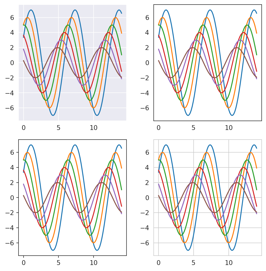
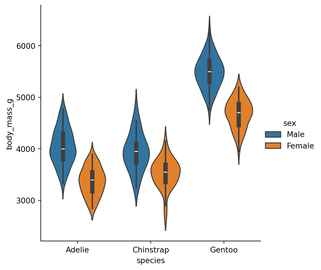
Controling spines
The white and ticks styles can benefit from removing the top and right axes spines:
sns.catplot(data=penguins,
            x="species",
            y="flipper_length_mm",
            hue = "sex",
            kind="violin")
sns.despine(left=True)
plt.show()
Context plots
Control the scale of plot elements. The four preset contexts, in order of relative size, are paper, notebook, talk, and poster.
sns.set_context("talk")
sns.catplot(data=penguins,
            x="species",
            y="flipper_length_mm",
            hue = "sex",
            kind="violin")
plt.show()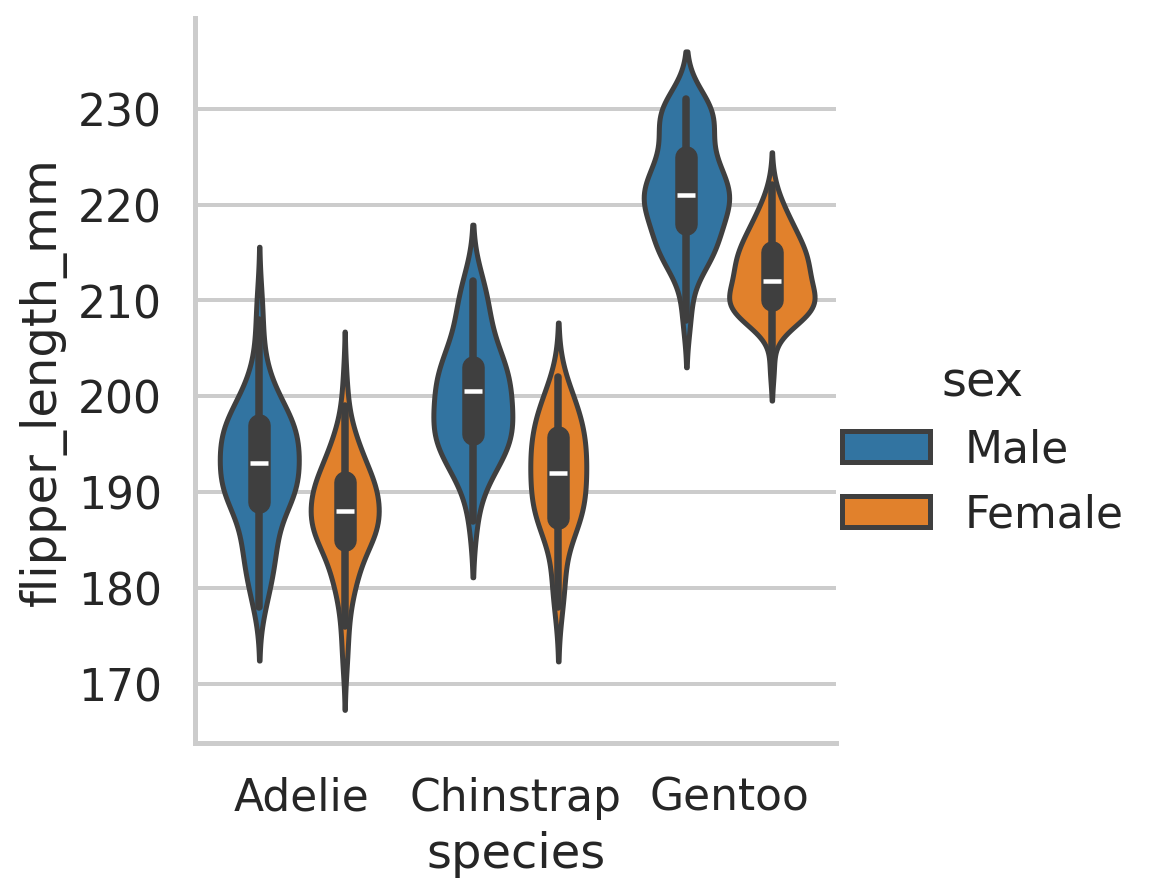
Context plots
sns.set_theme()
with sns.plotting_context("paper"):
  sns.catplot(data=penguins,
              x="species",
              y="flipper_length_mm",
              hue = "sex",
              kind="violin")
plt.show()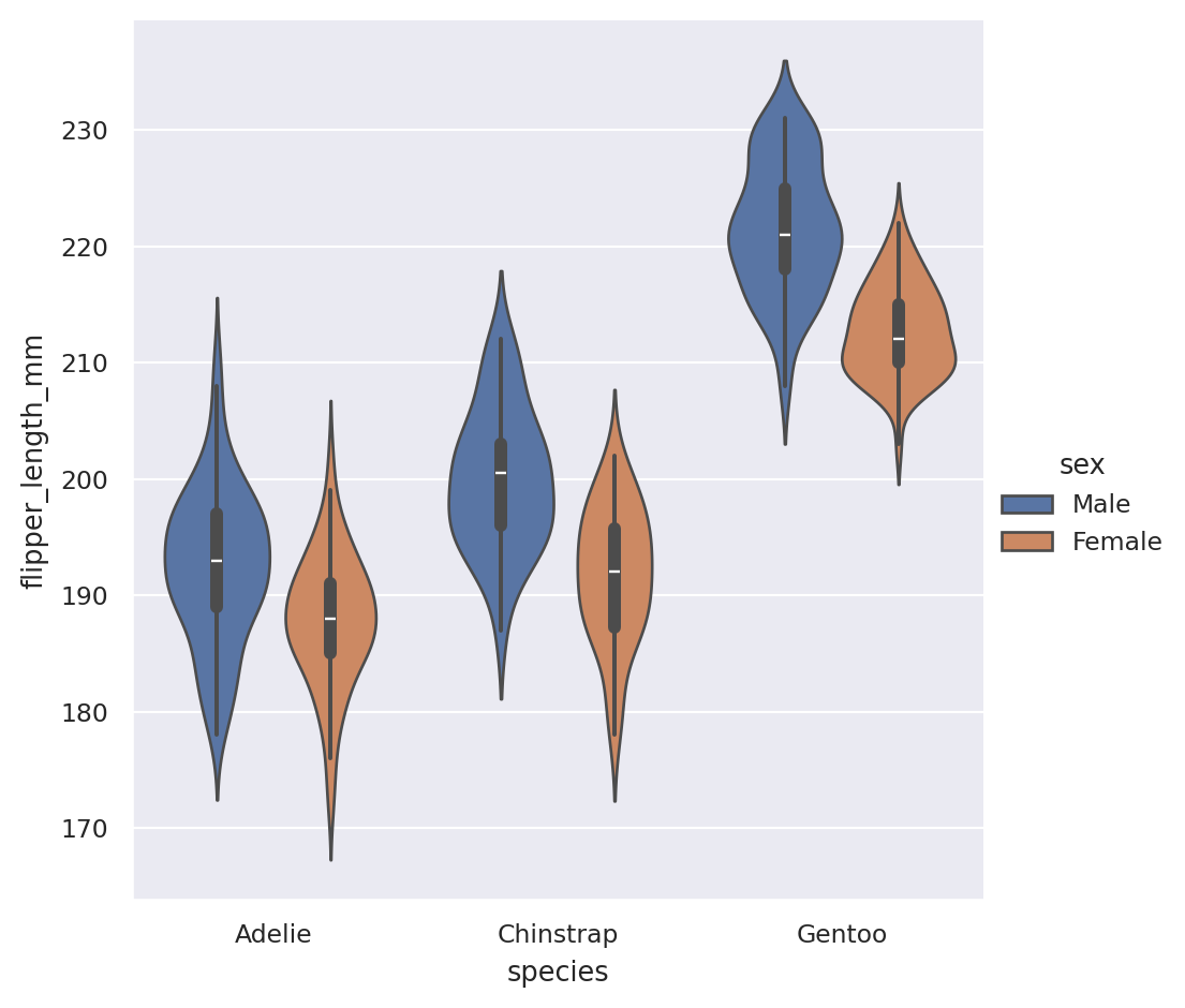
Color palettes
- Color can reveal patterns in data if used effectively or hide patterns if used poorly.
seaborn.color_palette([palette], [n_colors], [desat])
sns.set_theme()
sns.set_palette("dark")
sinplot(6)
plt.show()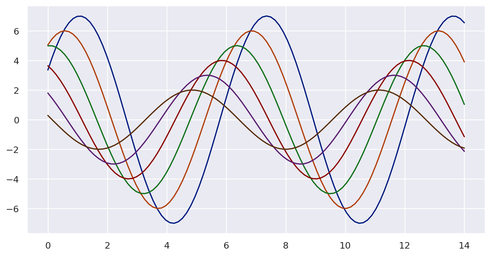
Categorical color palettes
Best suited for distinguishing categorical data that does not have an inherent ordering.
The color palette should have colors as distinct from one another as possible.
Six default themes in Seaborn:
deep,muted,bright,pastel,dark, andcolorblind.
palette1 = sns.color_palette("deep")
sns.palplot(palette1)
plt.show()
Sequential Color Palettes
- Appropriate for sequential data ranges from low to high values, or vice versa.
- Some suggest to use bright colors for low values and dark ones for high values; eventually it’s context-dependent.
custom_palette2 = sns.light_palette("magenta")
sns.palplot(custom_palette2)
plt.show()
Sequential palettes for heatmaps
x = np.arange(25).reshape(5, 5)
ax = sns.heatmap(x,
         cmap=sns.cubehelix_palette(
           as_cmap=True)
           )
plt.show()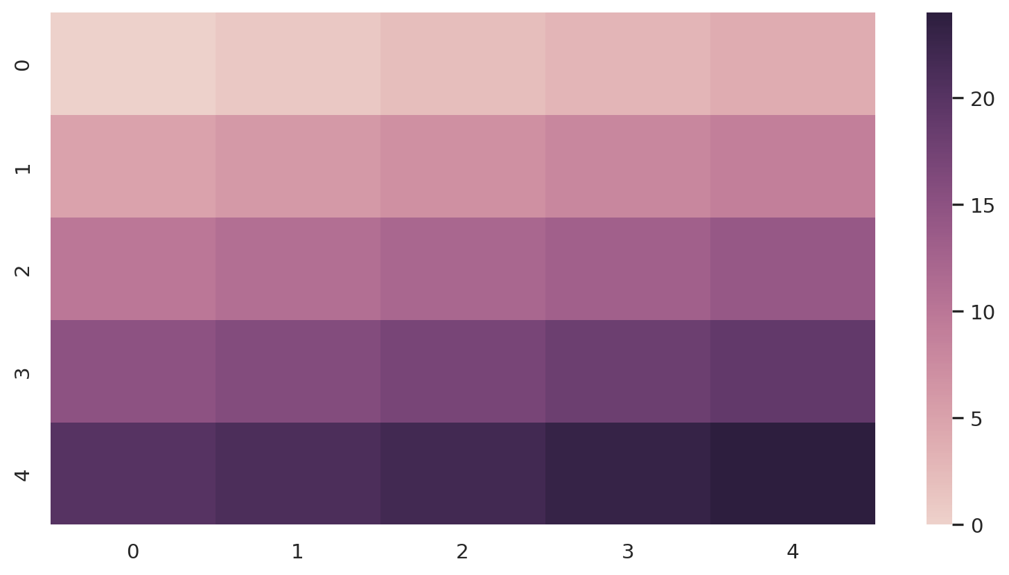
Diverging Color Palettes
- Used for data that consists of a well-defined midpoint.
- An emphasis is placed on both high and low values.
custom_palette4 = sns.color_palette("coolwarm", 7)
sns.palplot(custom_palette4)
plt.show()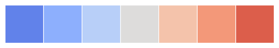
Using Python packages from R
reticulate
![]()
Comprehensive set of tools for interoperability between Python and R.
Calling Python from R in a variety of ways
Translation between R and Python objects
Flexible binding to different versions of Python including virtual environments and Conda environments.
Reticulate embeds a Python session within your R session, enabling seamless, high-performance interoperability.