| x1 | x2 | x3 | x4 | y1 | y2 | y3 | y4 |
|---|---|---|---|---|---|---|---|
| 10 | 10 | 10 | 8 | 8.04 | 9.14 | 7.46 | 6.58 |
| 8 | 8 | 8 | 8 | 6.95 | 8.14 | 6.77 | 5.76 |
| 13 | 13 | 13 | 8 | 7.58 | 8.74 | 12.74 | 7.71 |
| 9 | 9 | 9 | 8 | 8.81 | 8.77 | 7.11 | 8.84 |
| 11 | 11 | 11 | 8 | 8.33 | 9.26 | 7.81 | 8.47 |
| 14 | 14 | 14 | 8 | 9.96 | 8.10 | 8.84 | 7.04 |
| 6 | 6 | 6 | 8 | 7.24 | 6.13 | 6.08 | 5.25 |
| 4 | 4 | 4 | 19 | 4.26 | 3.10 | 5.39 | 12.50 |
| 12 | 12 | 12 | 8 | 10.84 | 9.13 | 8.15 | 5.56 |
| 7 | 7 | 7 | 8 | 4.82 | 7.26 | 6.42 | 7.91 |
| 5 | 5 | 5 | 8 | 5.68 | 4.74 | 5.73 | 6.89 |
Data visualisation guidelines
Why, what, how
Wednesday, 18 February 2026
Data visualisation – why?
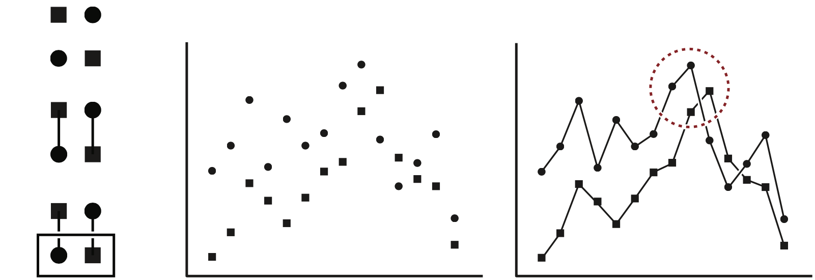
Anscombe’s quartet (https://en.wikipedia.org/wiki/Anscombe%27s_quartet)
| x1 | x2 | x3 | x4 | y1 | y2 | y3 | y4 |
|---|---|---|---|---|---|---|---|
| 10 | 10 | 10 | 8 | 8.04 | 9.14 | 7.46 | 6.58 |
| 8 | 8 | 8 | 8 | 6.95 | 8.14 | 6.77 | 5.76 |
| 13 | 13 | 13 | 8 | 7.58 | 8.74 | 12.74 | 7.71 |
| 9 | 9 | 9 | 8 | 8.81 | 8.77 | 7.11 | 8.84 |
| 11 | 11 | 11 | 8 | 8.33 | 9.26 | 7.81 | 8.47 |
| 14 | 14 | 14 | 8 | 9.96 | 8.10 | 8.84 | 7.04 |
| 6 | 6 | 6 | 8 | 7.24 | 6.13 | 6.08 | 5.25 |
| 4 | 4 | 4 | 19 | 4.26 | 3.10 | 5.39 | 12.50 |
| 12 | 12 | 12 | 8 | 10.84 | 9.13 | 8.15 | 5.56 |
| 7 | 7 | 7 | 8 | 4.82 | 7.26 | 6.42 | 7.91 |
| 5 | 5 | 5 | 8 | 5.68 | 4.74 | 5.73 | 6.89 |
Data visualisation – why not?
Data visualisation – tasks
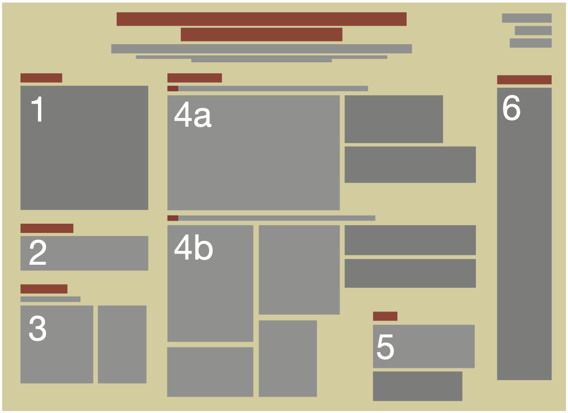
Visual channels (example - five variables)
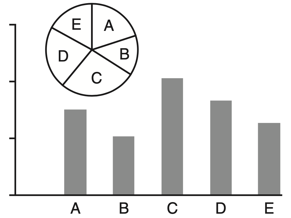
Visual channels (example - five variables)
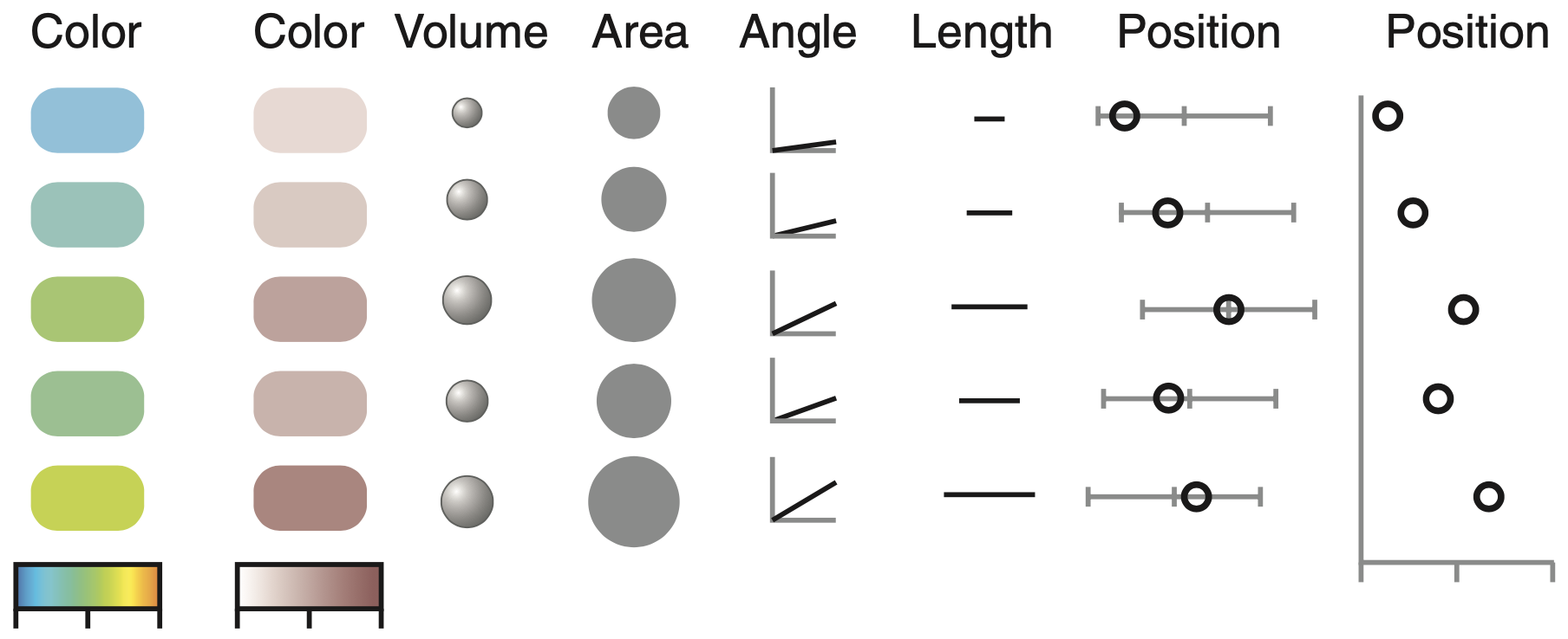
In practice: visual channel, diagram, figure
Anscombe’s quartet (https://en.wikipedia.org/wiki/Anscombe%27s_quartet)
| x1 | x2 | x3 | x4 | y1 | y2 | y3 | y4 |
|---|---|---|---|---|---|---|---|
| 10 | 10 | 10 | 8 | 8.04 | 9.14 | 7.46 | 6.58 |
| 8 | 8 | 8 | 8 | 6.95 | 8.14 | 6.77 | 5.76 |
| 13 | 13 | 13 | 8 | 7.58 | 8.74 | 12.74 | 7.71 |
| 9 | 9 | 9 | 8 | 8.81 | 8.77 | 7.11 | 8.84 |
| 11 | 11 | 11 | 8 | 8.33 | 9.26 | 7.81 | 8.47 |
| 14 | 14 | 14 | 8 | 9.96 | 8.10 | 8.84 | 7.04 |
| 6 | 6 | 6 | 8 | 7.24 | 6.13 | 6.08 | 5.25 |
| 4 | 4 | 4 | 19 | 4.26 | 3.10 | 5.39 | 12.50 |
| 12 | 12 | 12 | 8 | 10.84 | 9.13 | 8.15 | 5.56 |
| 7 | 7 | 7 | 8 | 4.82 | 7.26 | 6.42 | 7.91 |
| 5 | 5 | 5 | 8 | 5.68 | 4.74 | 5.73 | 6.89 |
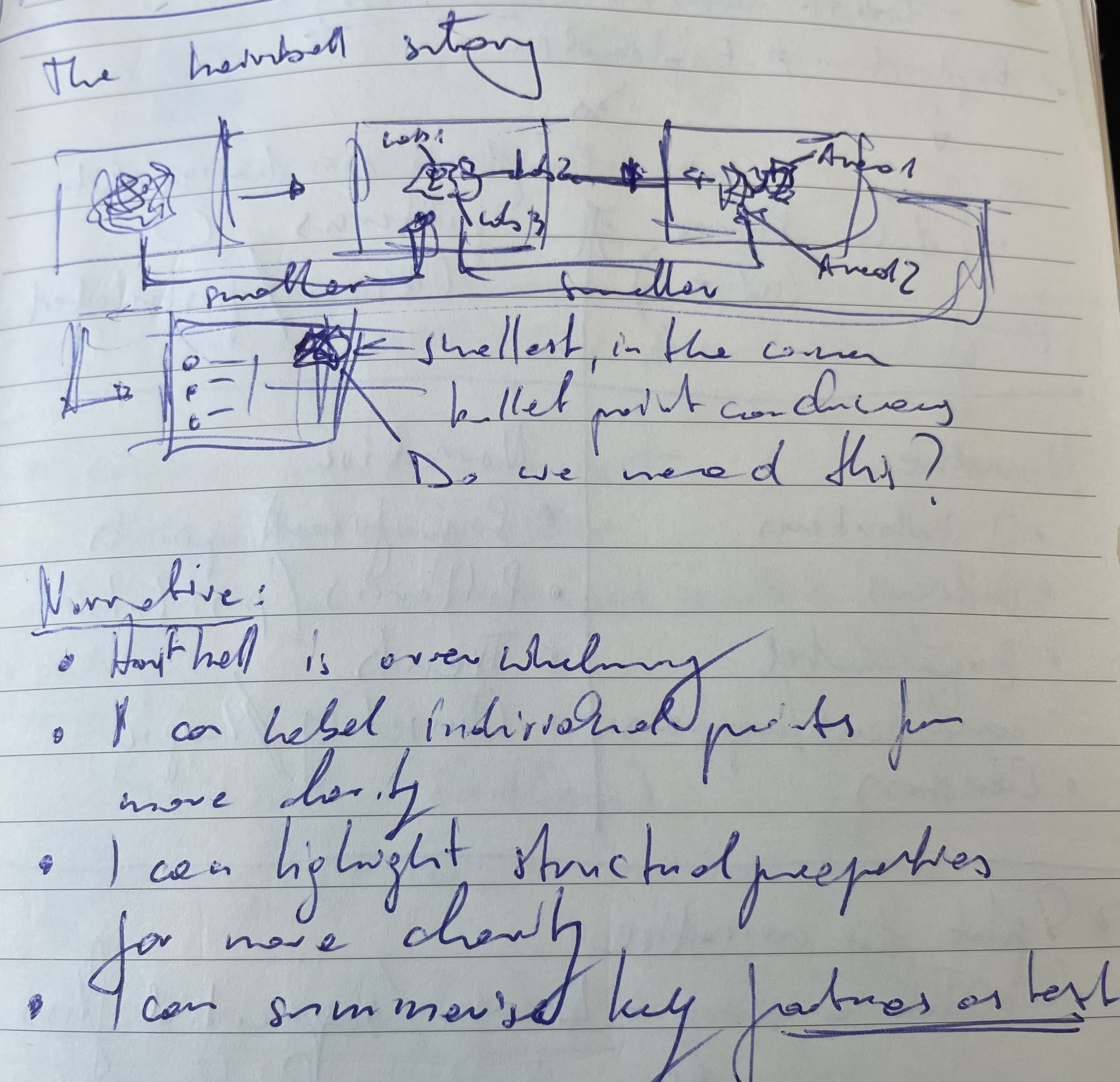
Narrative in data visualisation
 https://www.youtube.com/watch?v=OV5J6BfToSw
Narrative in data visualisation
- Decide on key points in your data
- Think of a logical sequence
they should follow - Draft with pen and paper
- Tell a story
☒ fabricate/obscure data
☑ be kind to your audience
Gestalt principles
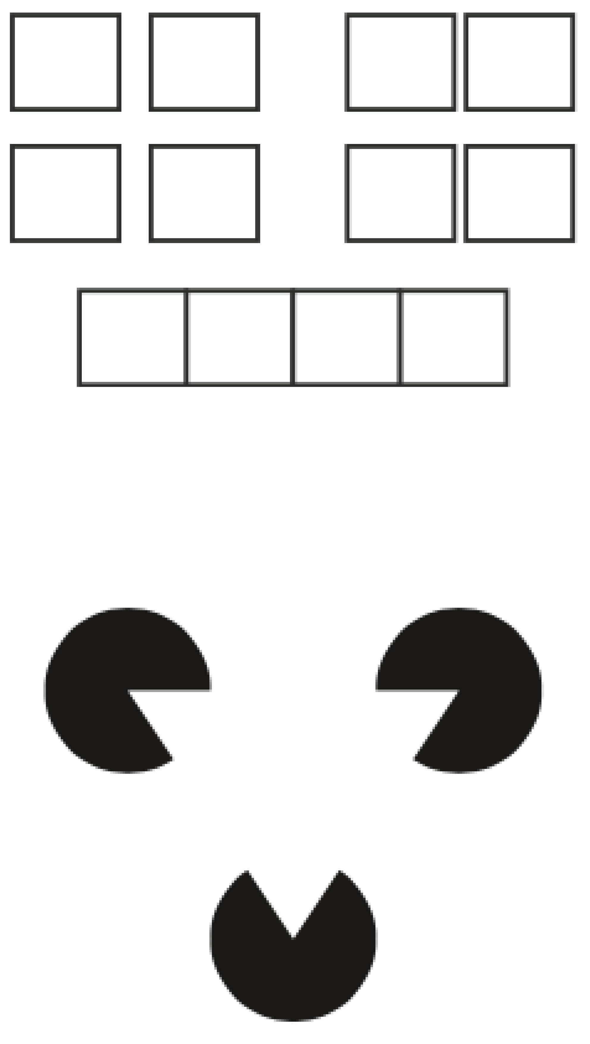
Gestalt principles - negative space
Gestalt principles - negative space
Basic pie chart
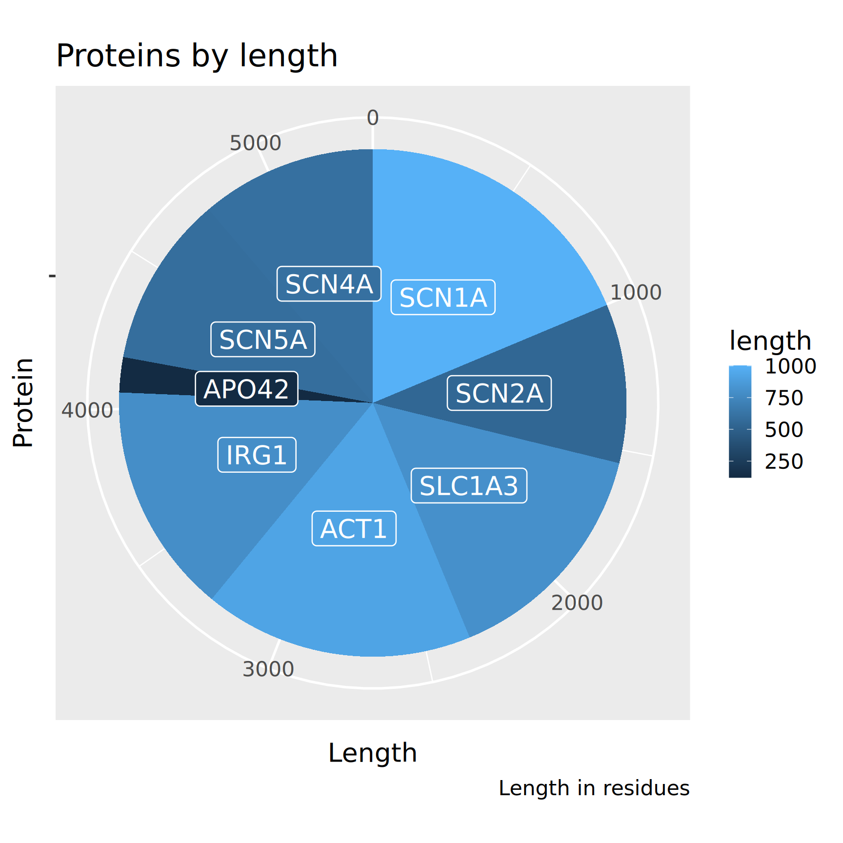
What is wrong here?
(visual channels)
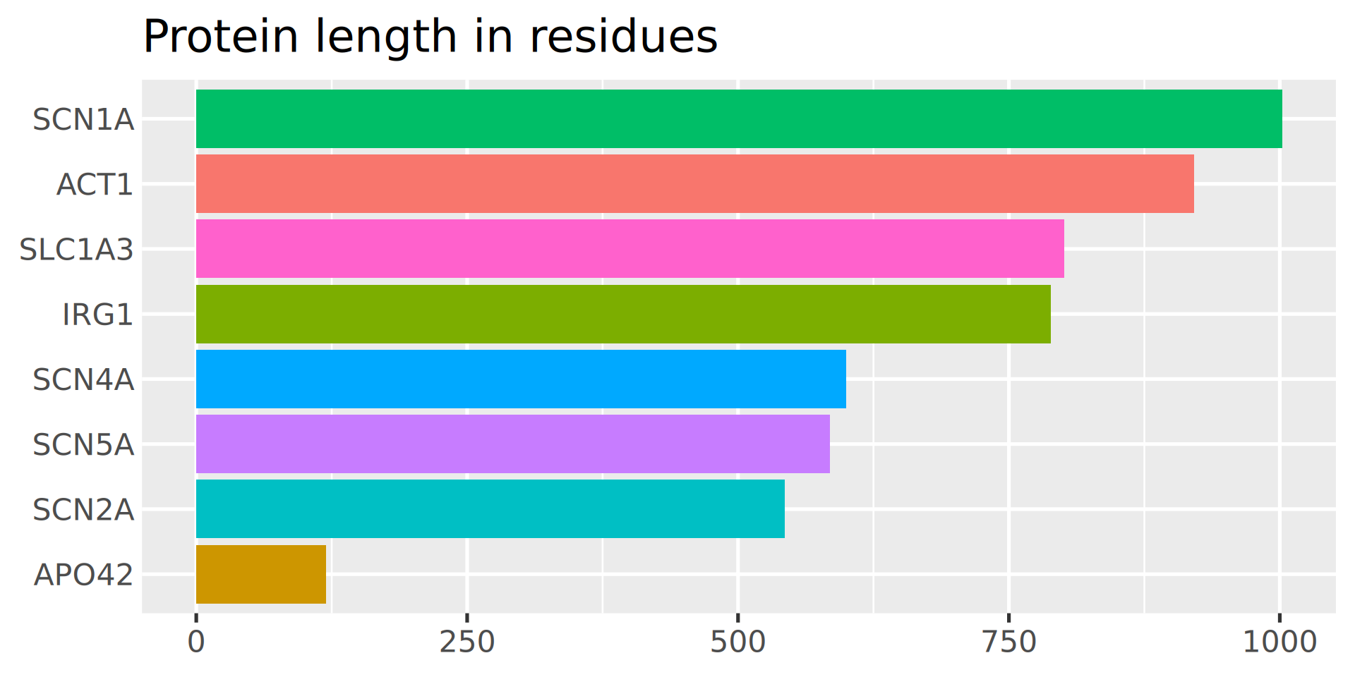
Bar plot with categorical colors
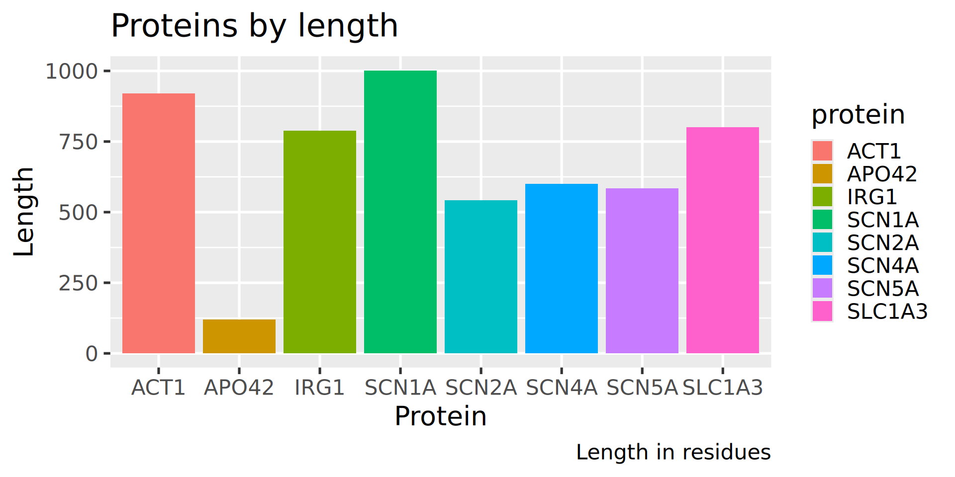
What is wrong here?
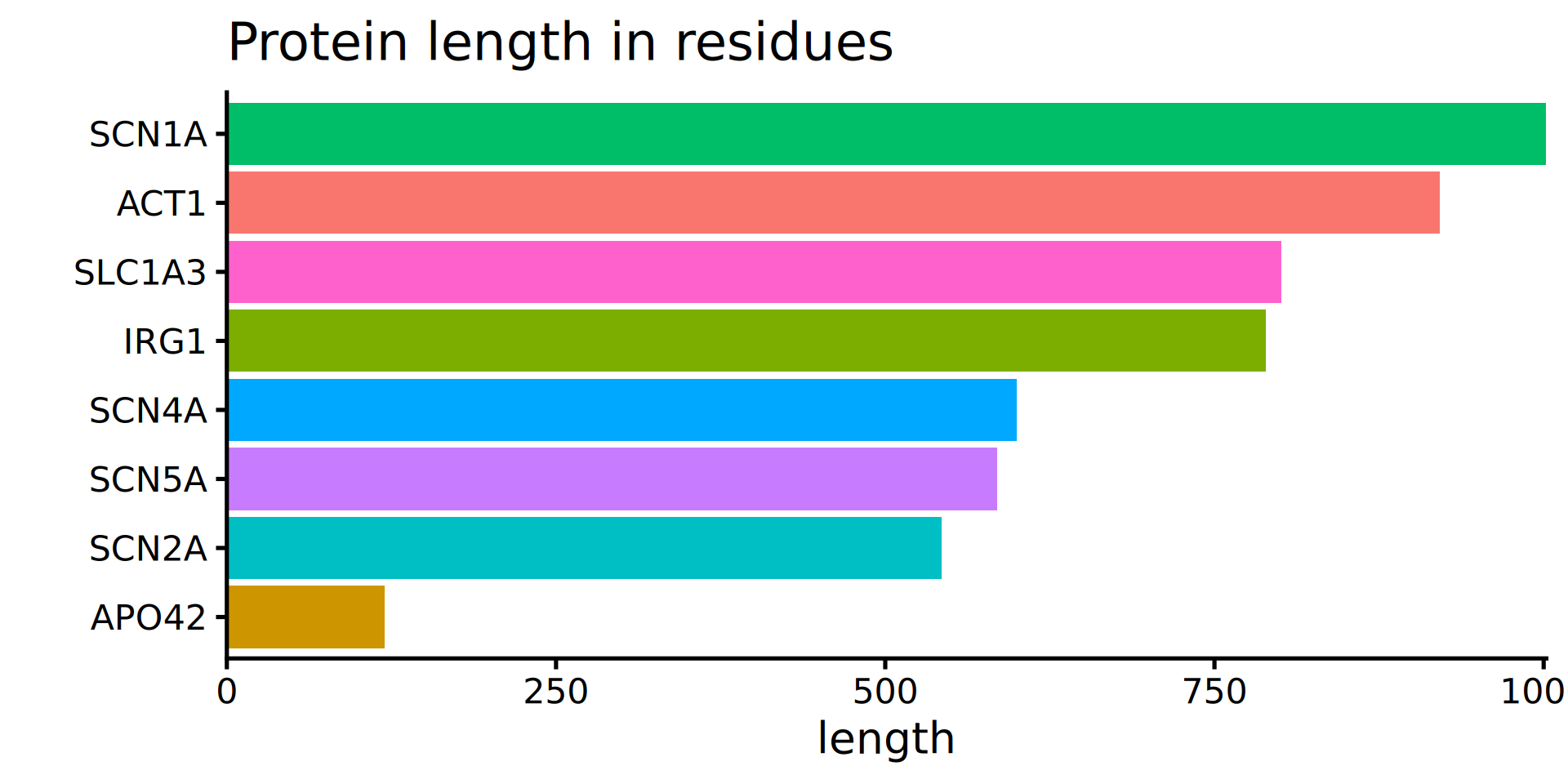
Sorted bars, rotated
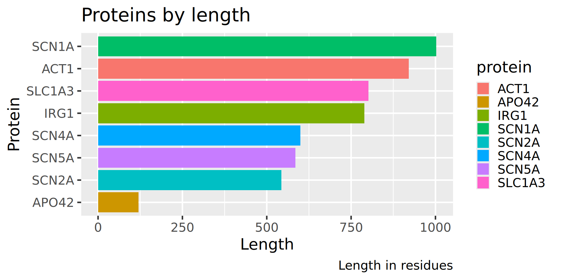
What is wrong here?
New plot title, no surplus legend
How to increase data to ink ratio?
White background, better spacing
How to increase data to ink ratio?
Minimal display: numbers in bars, colour not needed
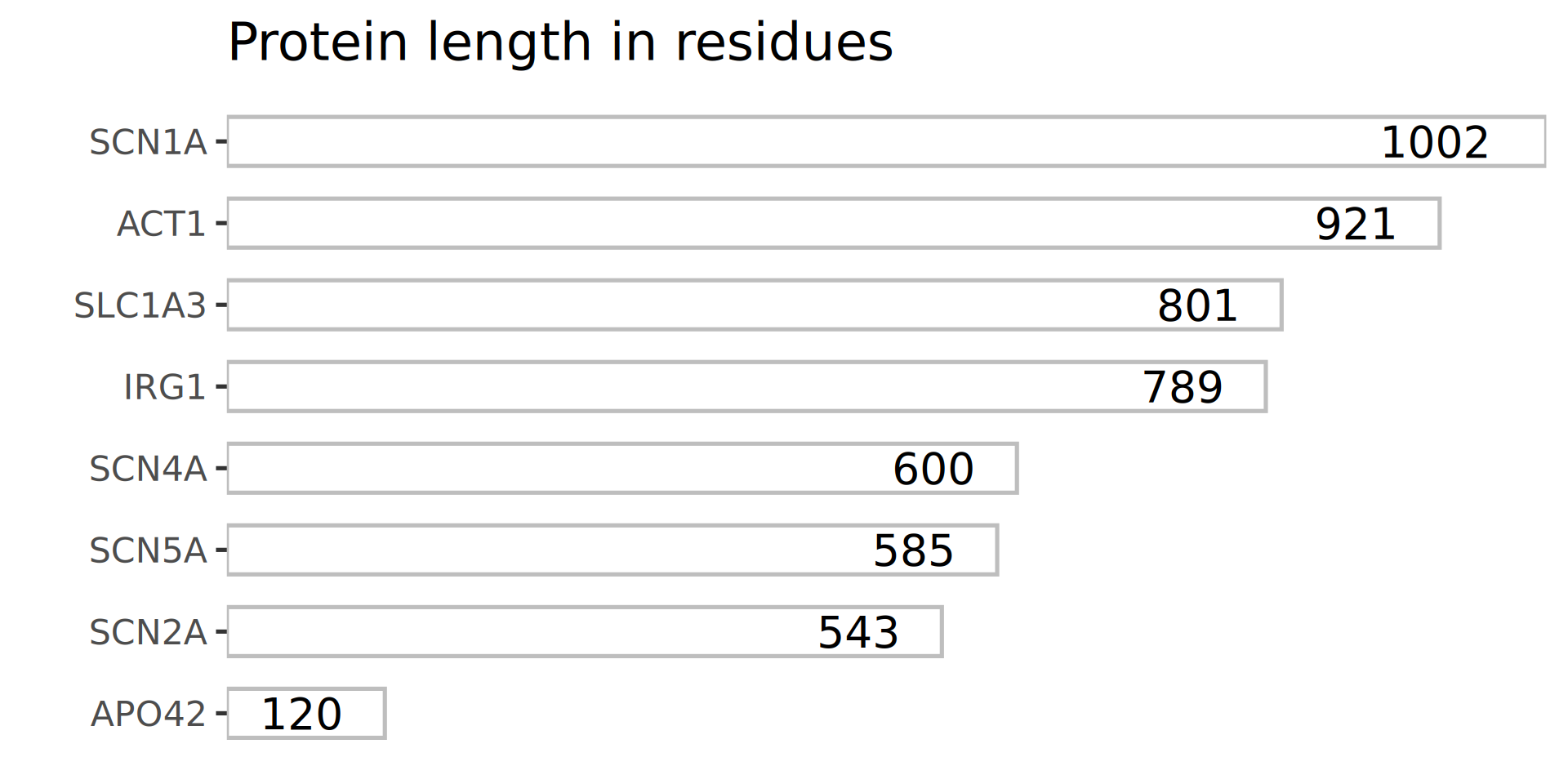
Did we gain anything?
| protein | length |
|---|---|
| SCN1A | 1002 |
| ACT1 | 921 |
| SLC1A3 | 801 |
| IRG1 | 789 |
| SCN4A | 600 |
| SCN5A | 585 |
| SCN2A | 543 |
| APO42 | 120 |

It depends on the purpose of the diagram and its role in your visual narative.
In my narrative, I wanted to show that:
- sometimes tables are better than diagrams
- ink should be removed in moderation