Code
library(tidyverse)
library(gt)Amounts, small multiples, heatmaps
2026-03-11
library(tidyverse)
library(gt)Aims of exploratory data analysis
Finding the right visualisation for amounts
Trends vs amounts
Small multiples with facets
Exploratory data analysis in R for Data Science (Wickham)
Chapters 6 in Fundamentals of data visualisation by Claus O. Wilke

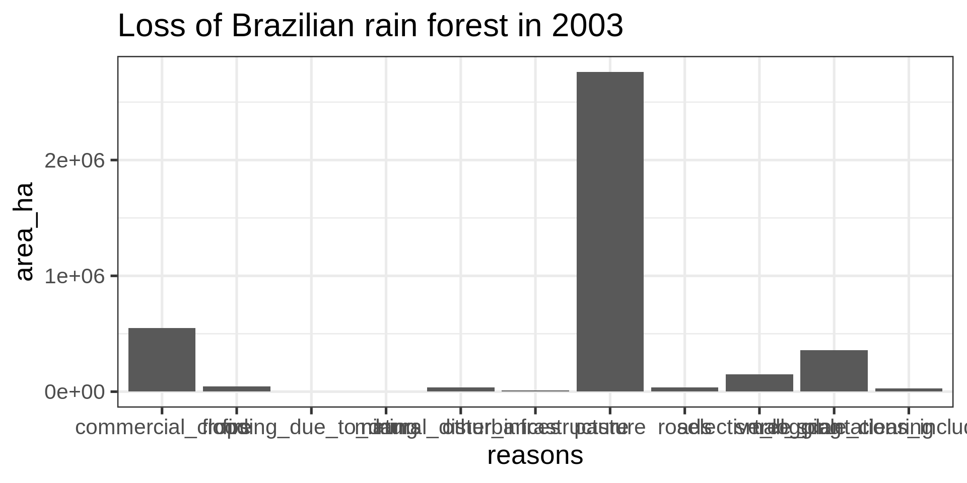
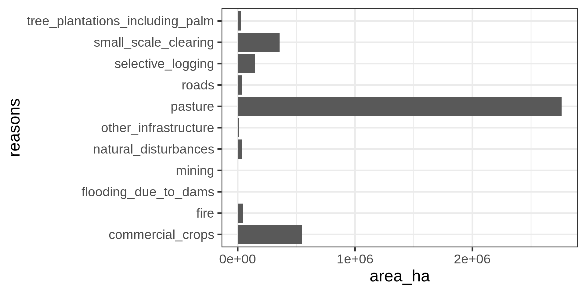
brazil_loss_long |>
ggplot(aes(
x = area_ha, y = reasons)) +
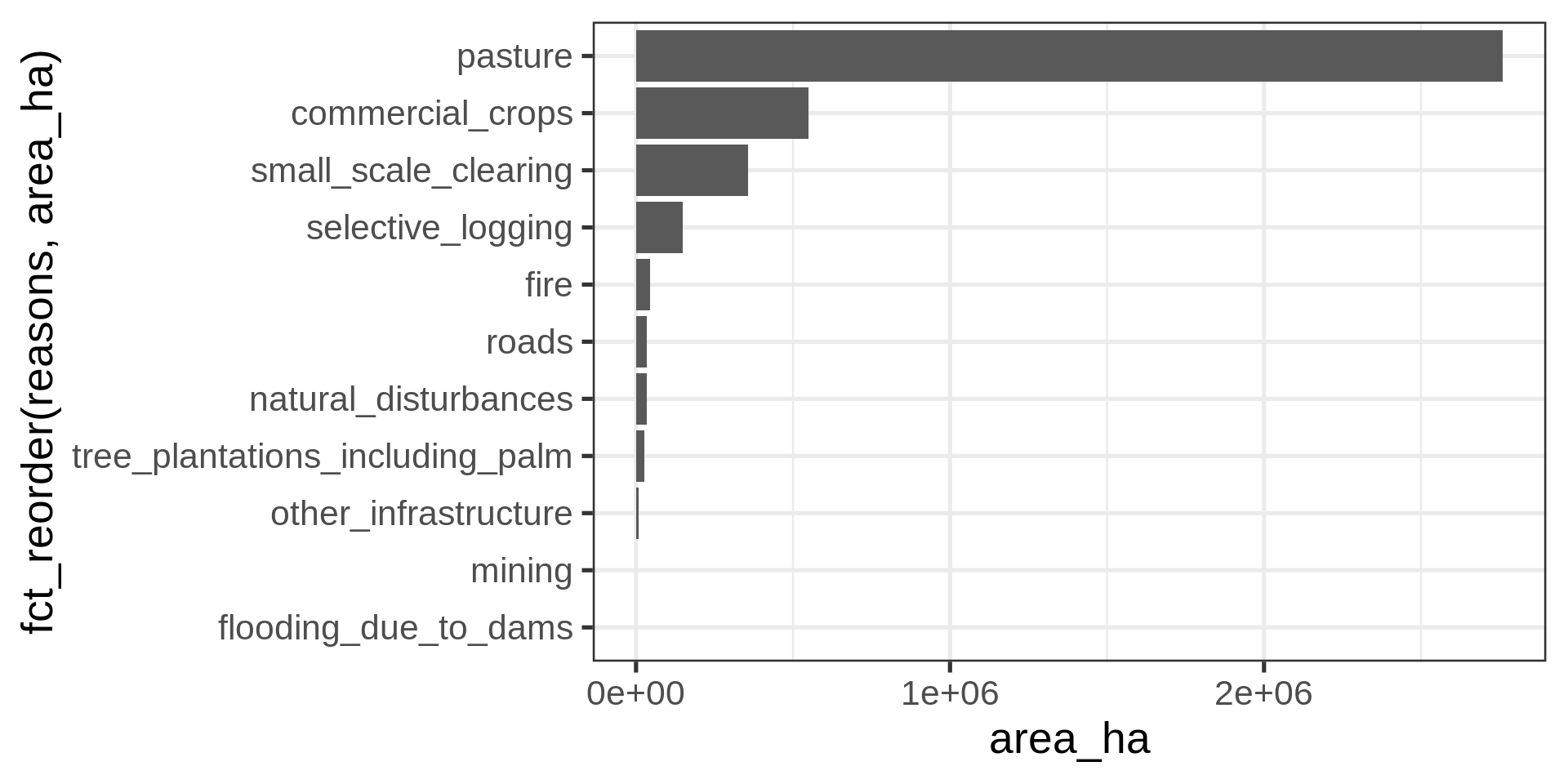
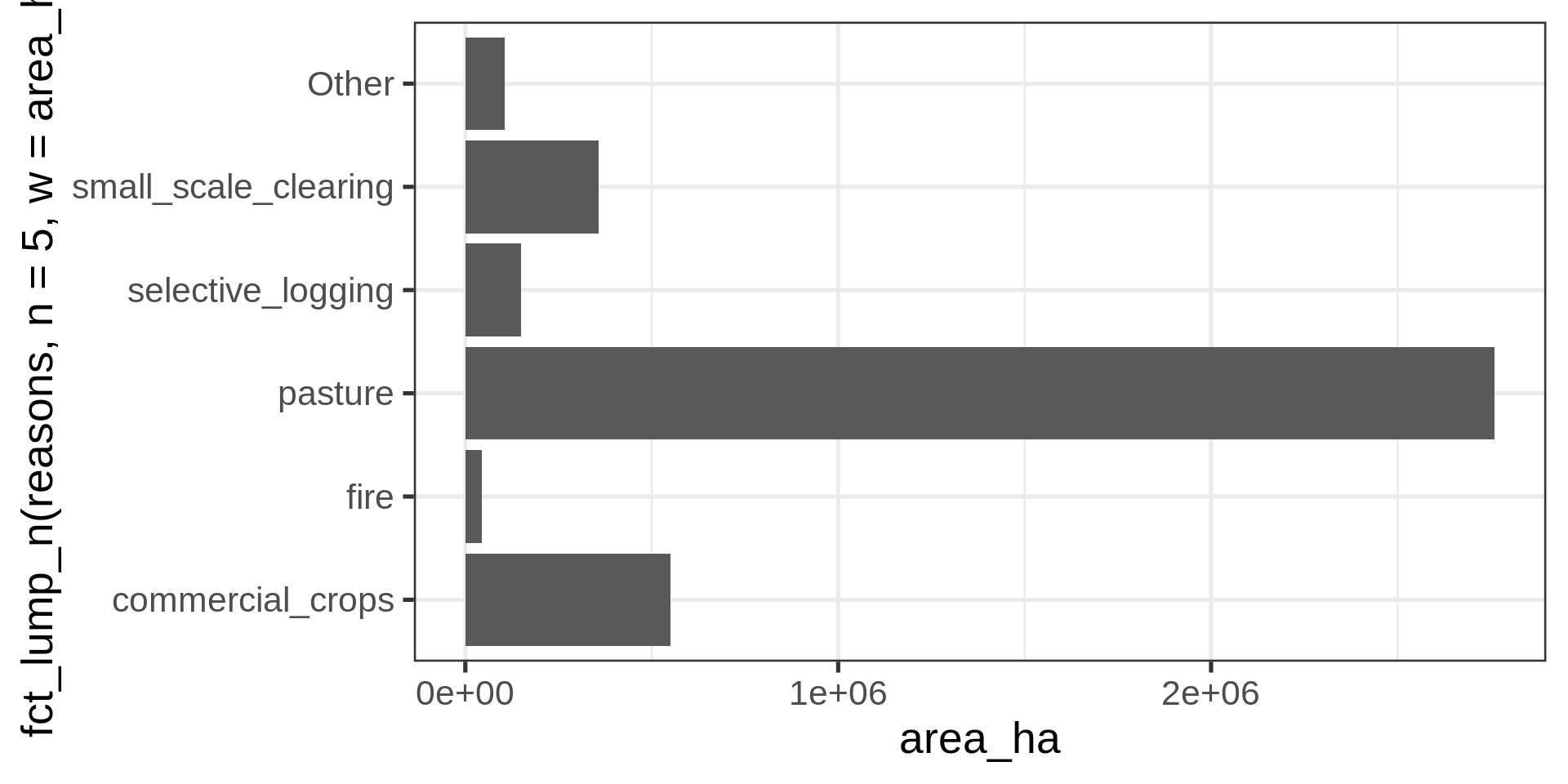
geom_col() brazil_loss_long |>
ggplot(aes(
y =
# Collapsing all but the five most common levels
fct_lump_n(reasons, n = 5, w = area_ha) |>
# Sorting by area
fct_infreq(w = area_ha) |>
# Reverse the sorting
fct_rev(),
x = area_ha,
fill = reasons
)) +
geom_col() +
labs(y = NULL) +
theme(legend.position = "bottom")Legend with all reasons
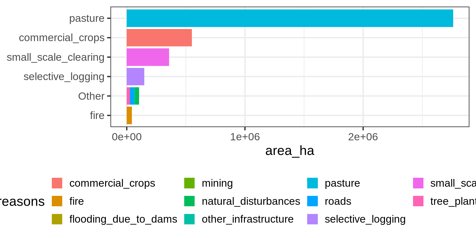
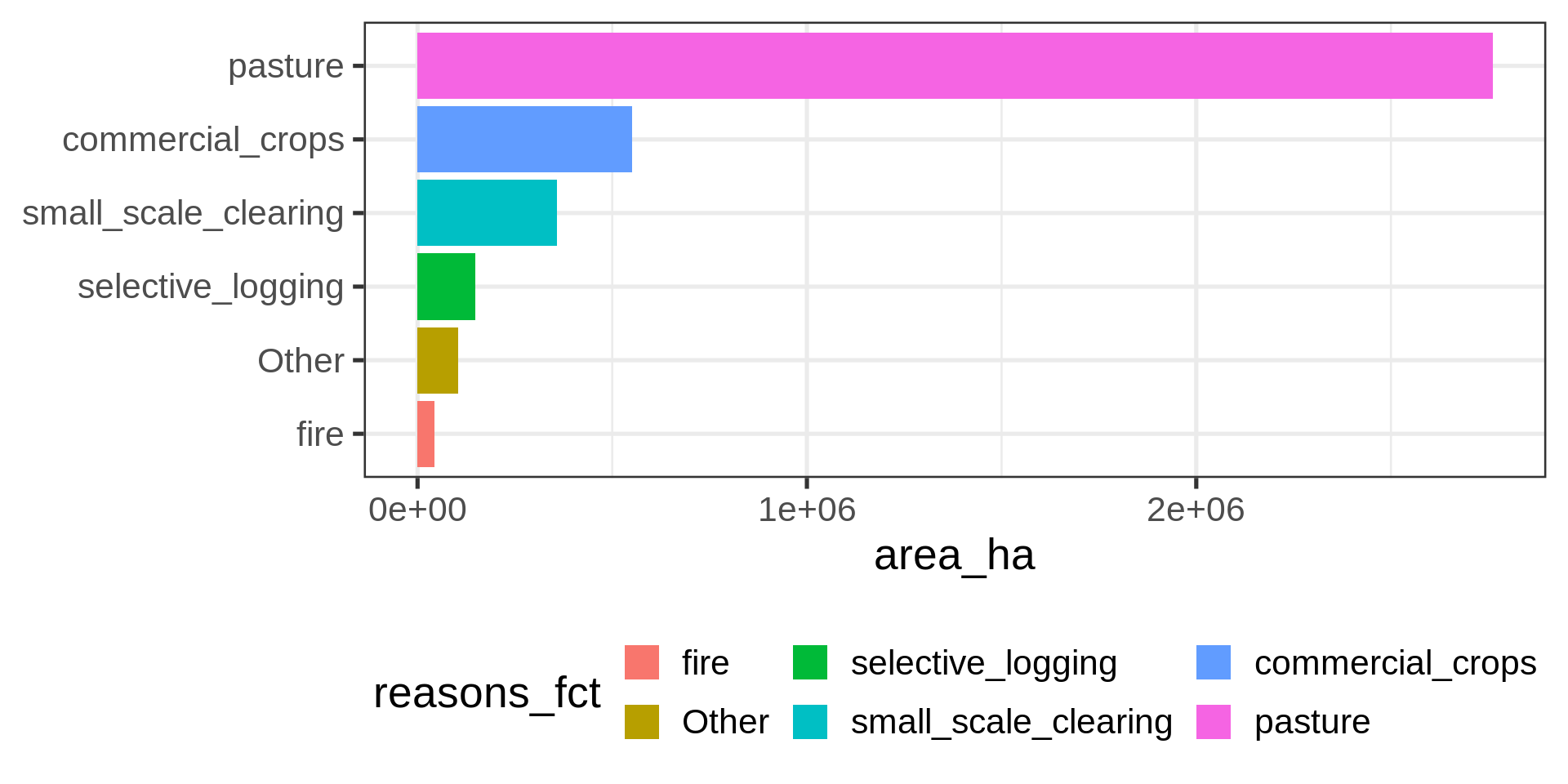
brazil_loss_long |>
  mutate(reasons_fct =
      # Collapsing all but the five most common levels
      fct_lump_n(reasons, n = 5, w = area_ha) |>
      # Sorting by area
      fct_infreq(w = area_ha) |>
      # Reverse the sorting
      fct_rev() ) |>
  ggplot(aes(
    y = reasons_fct,
    x = area_ha,
    fill = reasons_fct
  )) +
  geom_col() +
  labs(y = NULL) +
theme(legend.position = "bottom")brazil_loss |>
ggplot(aes(x = year,
y = pasture)) +
geom_col(fill = "darkgreen")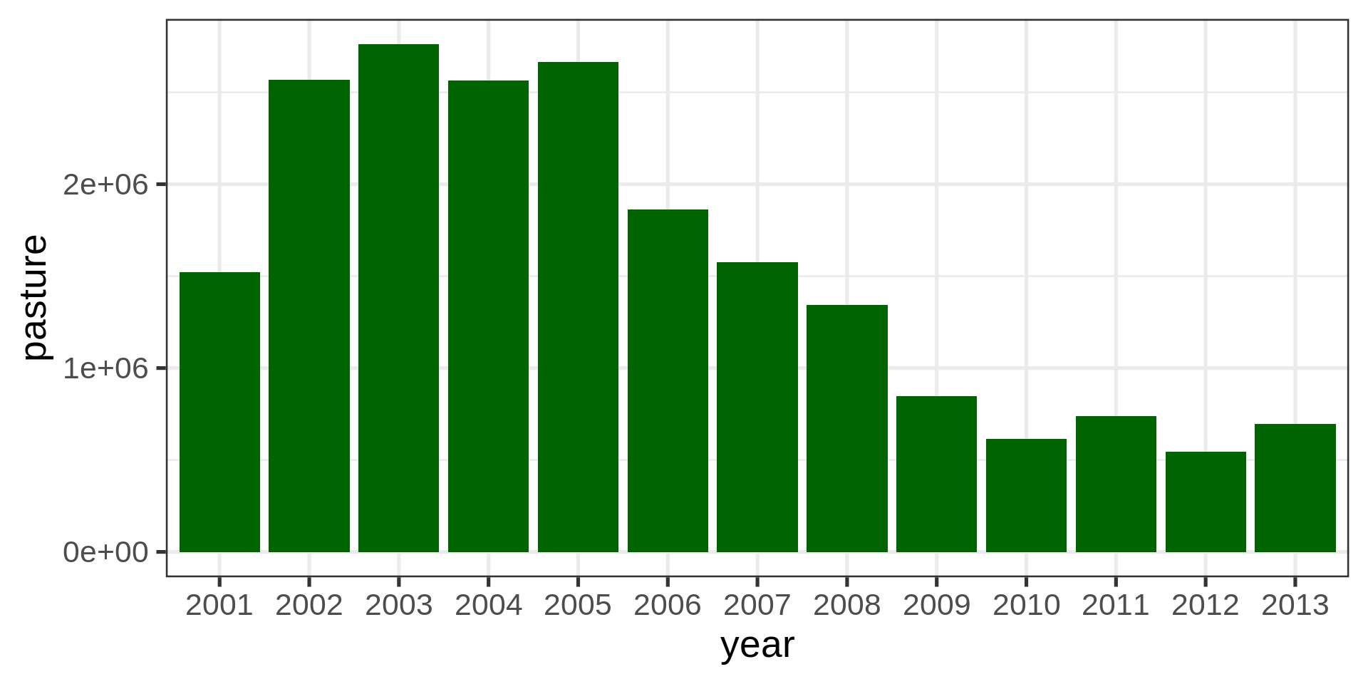
brazil_loss |>
  ggplot(aes( x = year, y = pasture)) +
           geom_col(fill = "darkgreen") +
  coord_cartesian(ylim = c(500000, 3000000))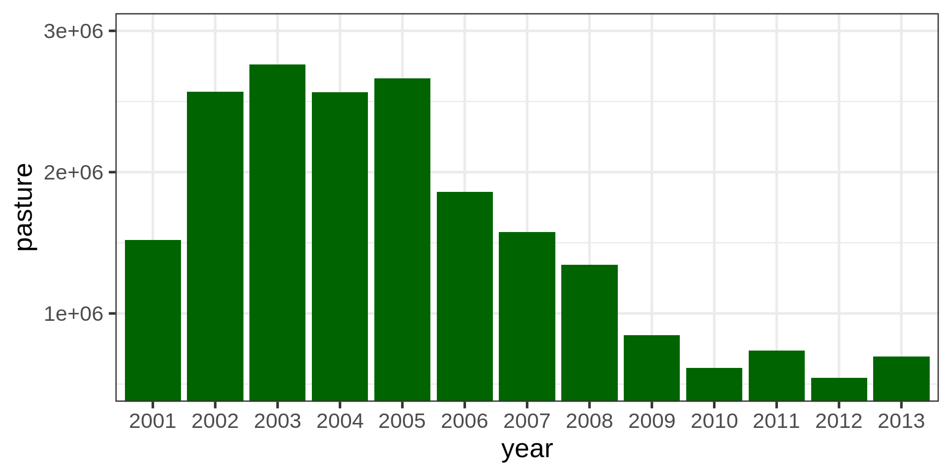
brazil_loss |>
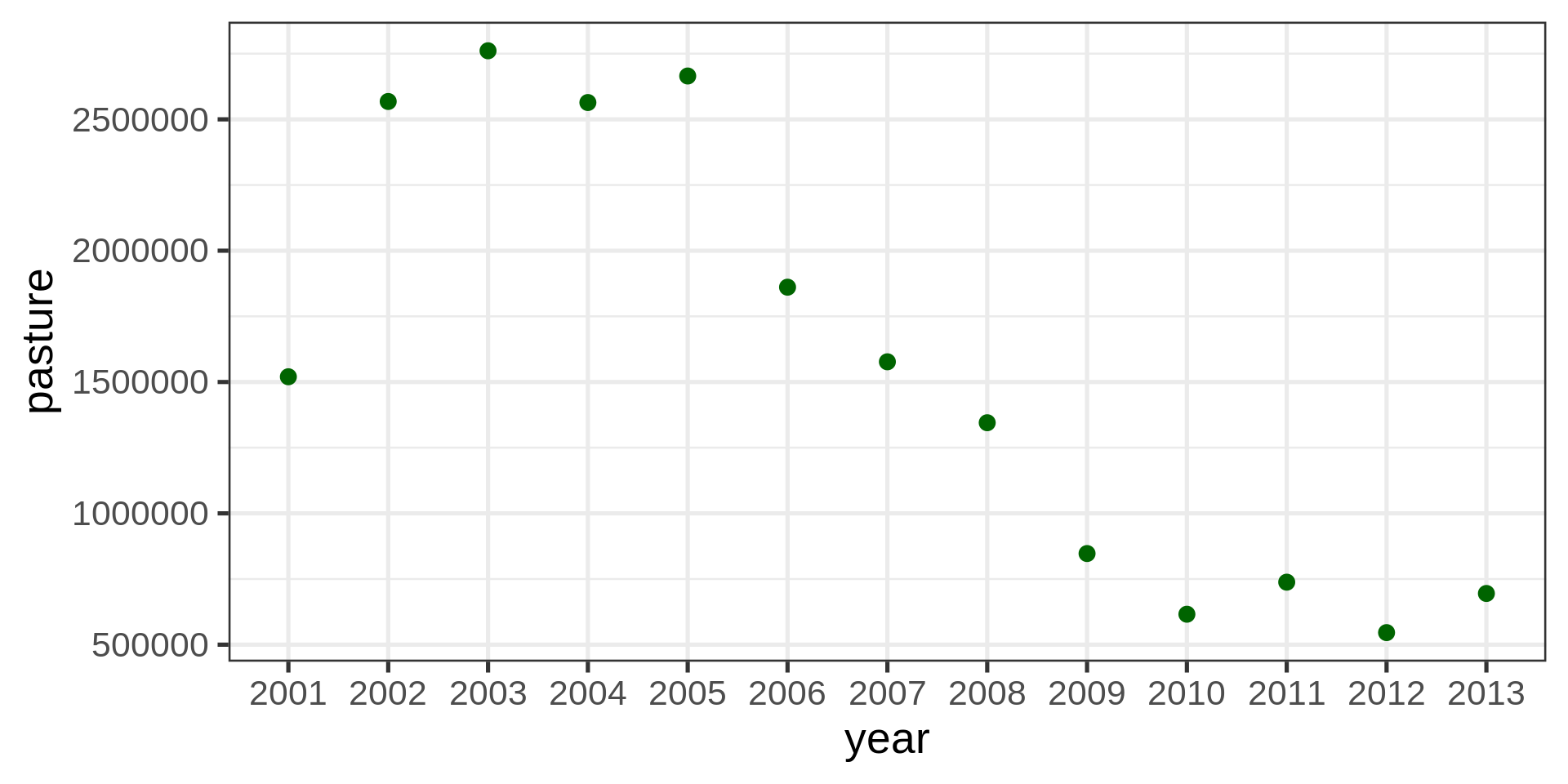
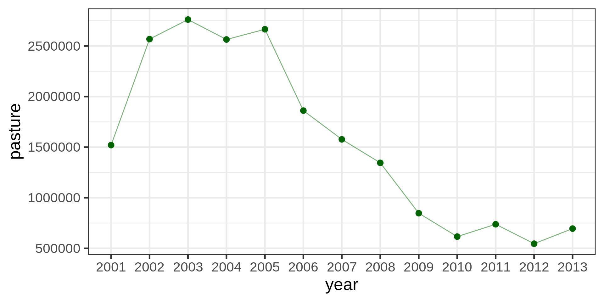
ggplot(aes(x = year, y = pasture)) +
geom_point(color = "darkgreen", size = 3)brazil_loss |>
ggplot(aes(x = year, y = pasture)) +
geom_point(color = "darkgreen", size = 3) +
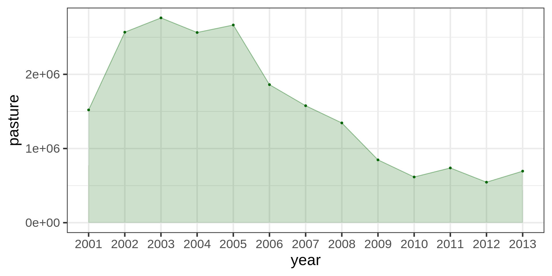
geom_line(aes(group = 1), color = "darkgreen", alpha = 0.5)brazil_loss |>
ggplot(aes(x = year, y = pasture, group = 1)) +
geom_point(color = "darkgreen",
size = 1) +
geom_line(color = "darkgreen",
alpha = 0.4) +
geom_area(fill = "darkgreen",
alpha = 0.2) +
scale_y_continuous(
labels = scales::label_number(scale_cut = scales::cut_short_scale())
)
brazil_loss |>
  ggplot(aes(y = fct_rev(fct_infreq(year, pasture)), x = pasture)) +
  geom_point(color = "red", size = 3)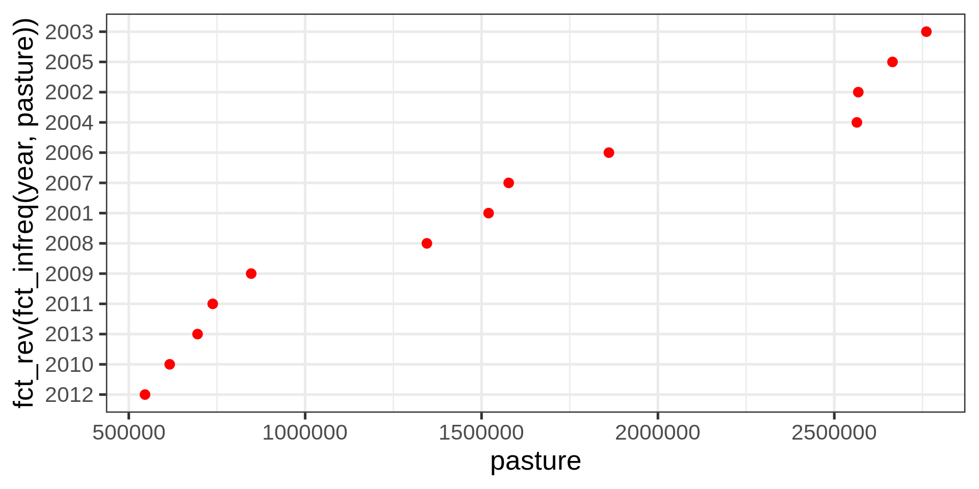
Not ideal with years (ordinal category, technically numeric)
| year | pasture |
|---|---|
| 2001 | 1520000 |
| 2002 | 2568000 |
| 2003 | 2761000 |
| 2004 | 2564000 |
| 2005 | 2665000 |
| 2006 | 1861000 |
| 2007 | 1577000 |
| 2008 | 1345000 |
| 2009 | 847000 |
| 2010 | 616000 |
| 2011 | 738000 |
| 2012 | 546000 |
| 2013 | 695000 |
brazil_loss |>
pivot_longer(
cols = c(fire, small_scale_clearing,
selective_logging, commercial_crops),
names_to = "reasons",
values_to = "area_ha" ) |>
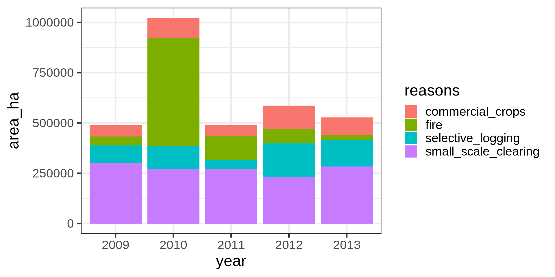
filter(year > 2008) -> brazil_loss_long_select
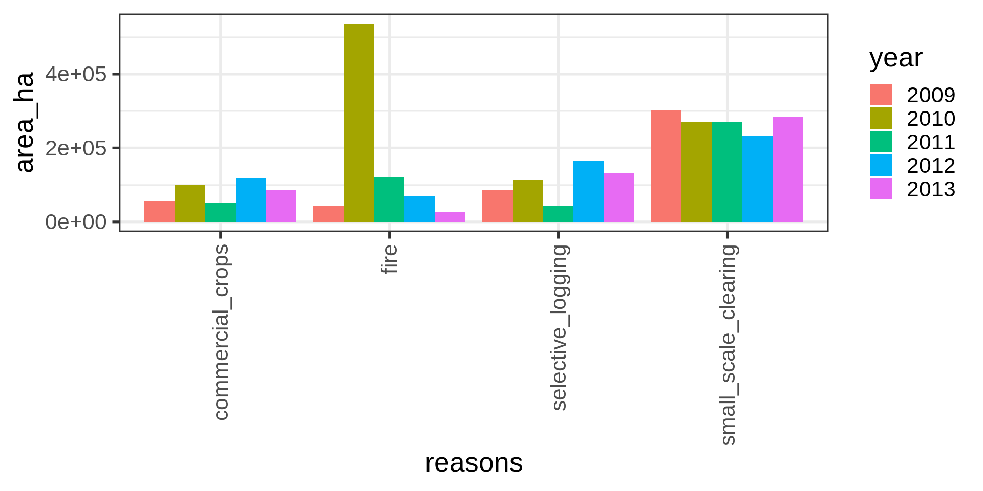
ggplot(brazil_loss_long_select) +
geom_col(aes(x = year,
y = area_ha,
fill = reasons))ggplot(brazil_loss_long_select) +
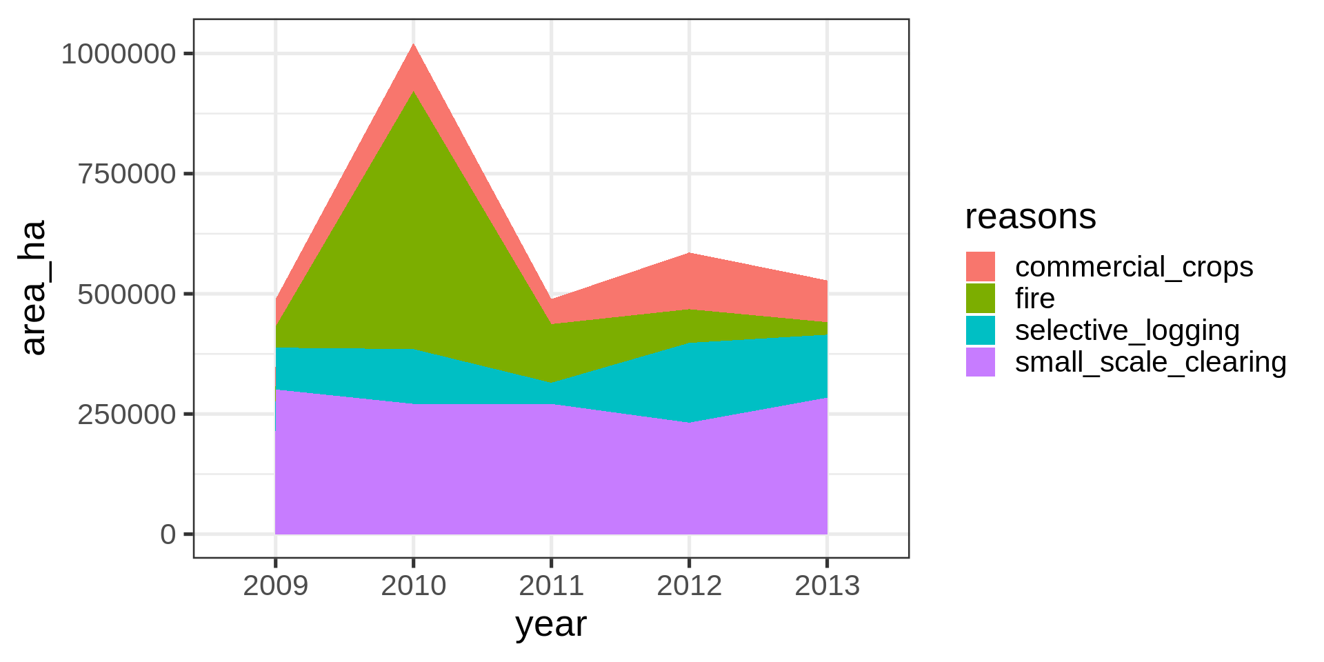
geom_area(aes(x = year,
y = area_ha,
fill = reasons,
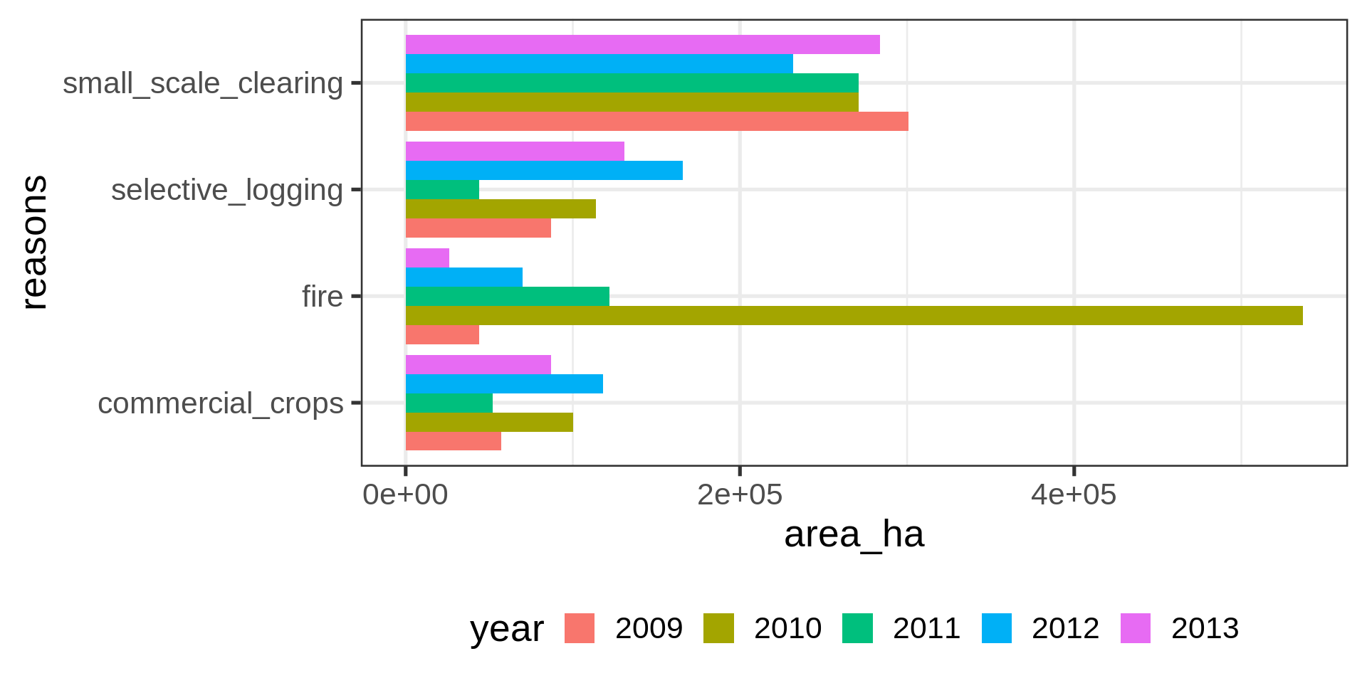
group = reasons))ggplot(brazil_loss_long_select) +
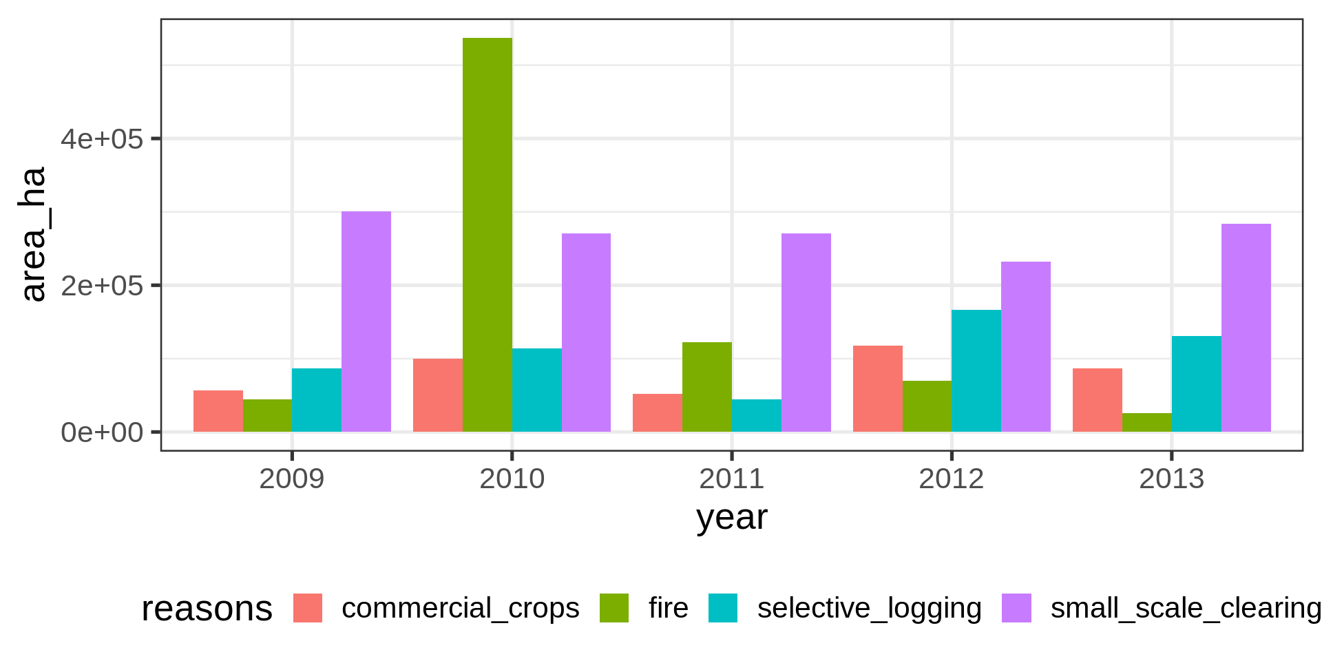
geom_col(aes(x = year,
y = area_ha,
fill = reasons),
position = "dodge") +
theme(legend.position = "bottom")Not fantastic.
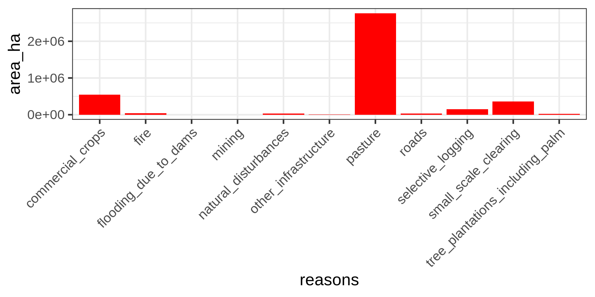
ggplot(brazil_loss_long_select ) +
  geom_col(aes(x = area_ha,
               y = reasons,
               fill = year),
           position = "dodge") +
    theme(legend.position = "bottom")
Meh.
ggplot(brazil_loss_long_select ) +
  geom_col(aes(x = reasons,
               y = area_ha,
               fill = year),
           position = "dodge") +
    theme(legend.position = "right") +
  guides(x =  guide_axis(angle = 90))
Ack!
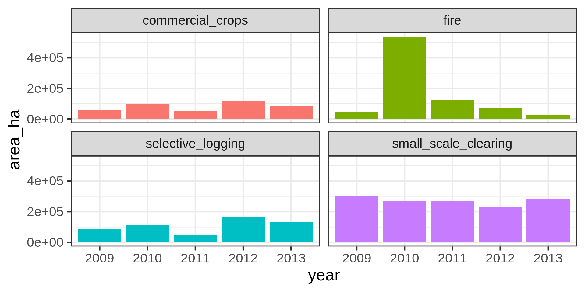
ggplot(brazil_loss_long_select) +
  geom_col(aes(x = year,
               y = area_ha,
               fill = reasons,)) +
  facet_wrap(vars(reasons)) +
  theme(legend.position = "none")

brazil_loss |>
  ggplot(aes(x = pasture)) +
  geom_histogram()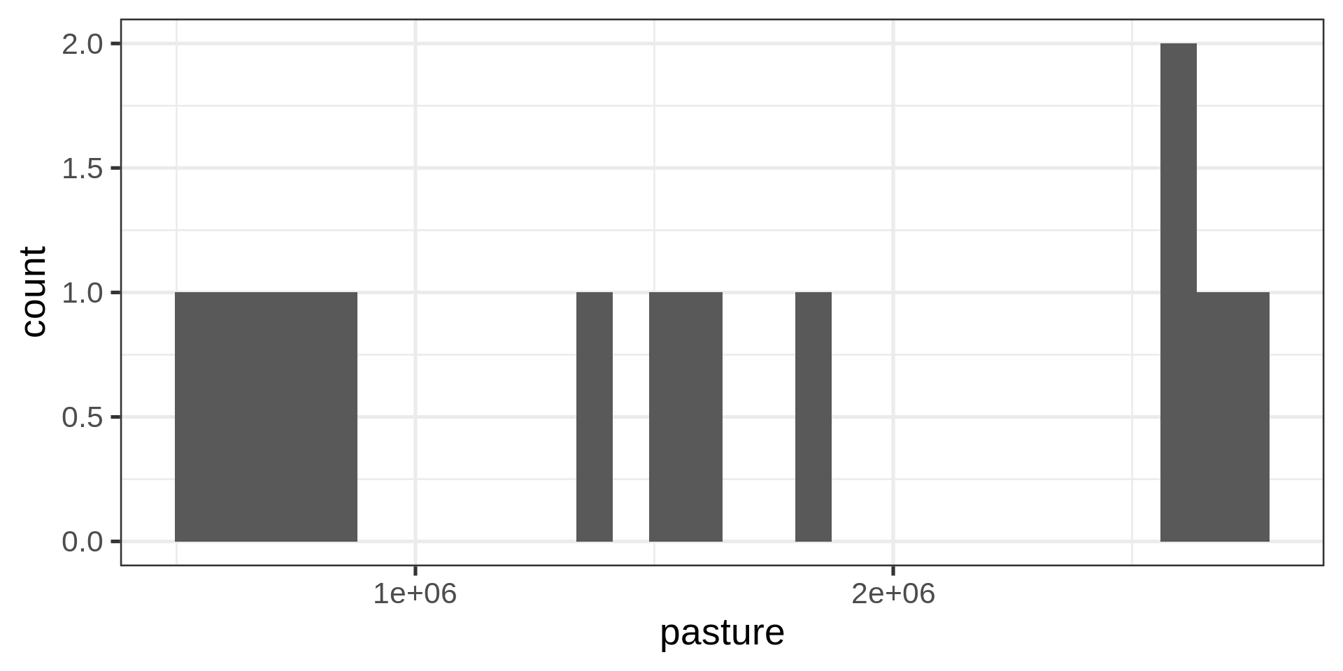
brazil_loss |>
  ggplot(aes(x = pasture)) +
  geom_histogram(binwidth = 500000)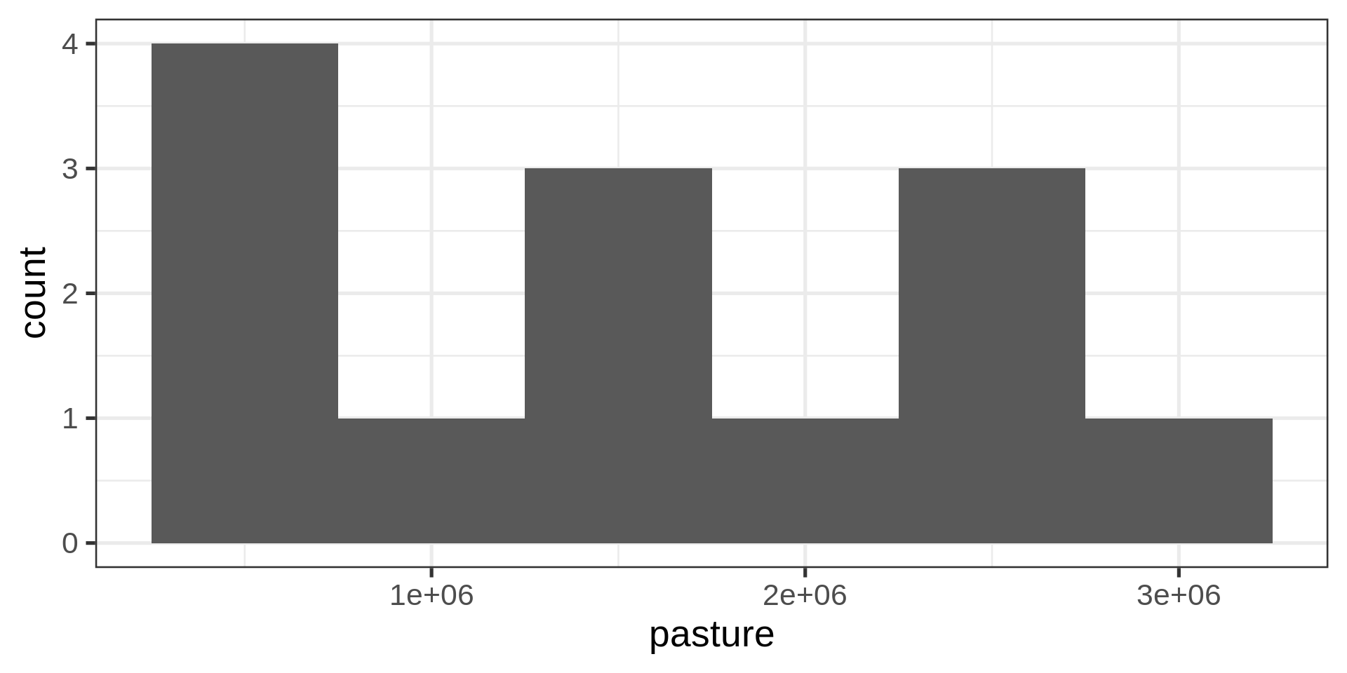
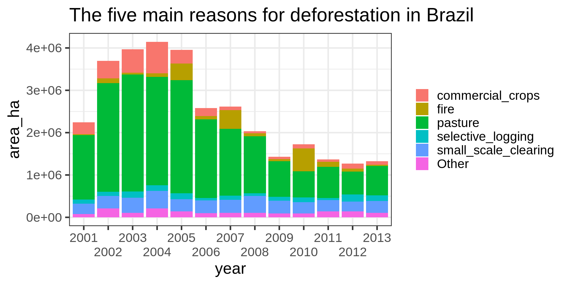
brazil_loss_long_complete |>
  ggplot(aes(x = year, y = area_ha,
             fill = fct_lump(reasons, n = 5, w = area_ha))) +
  geom_col() +
  labs(title = "The five main reasons for deforestation in Brazil",
       fill = NULL) +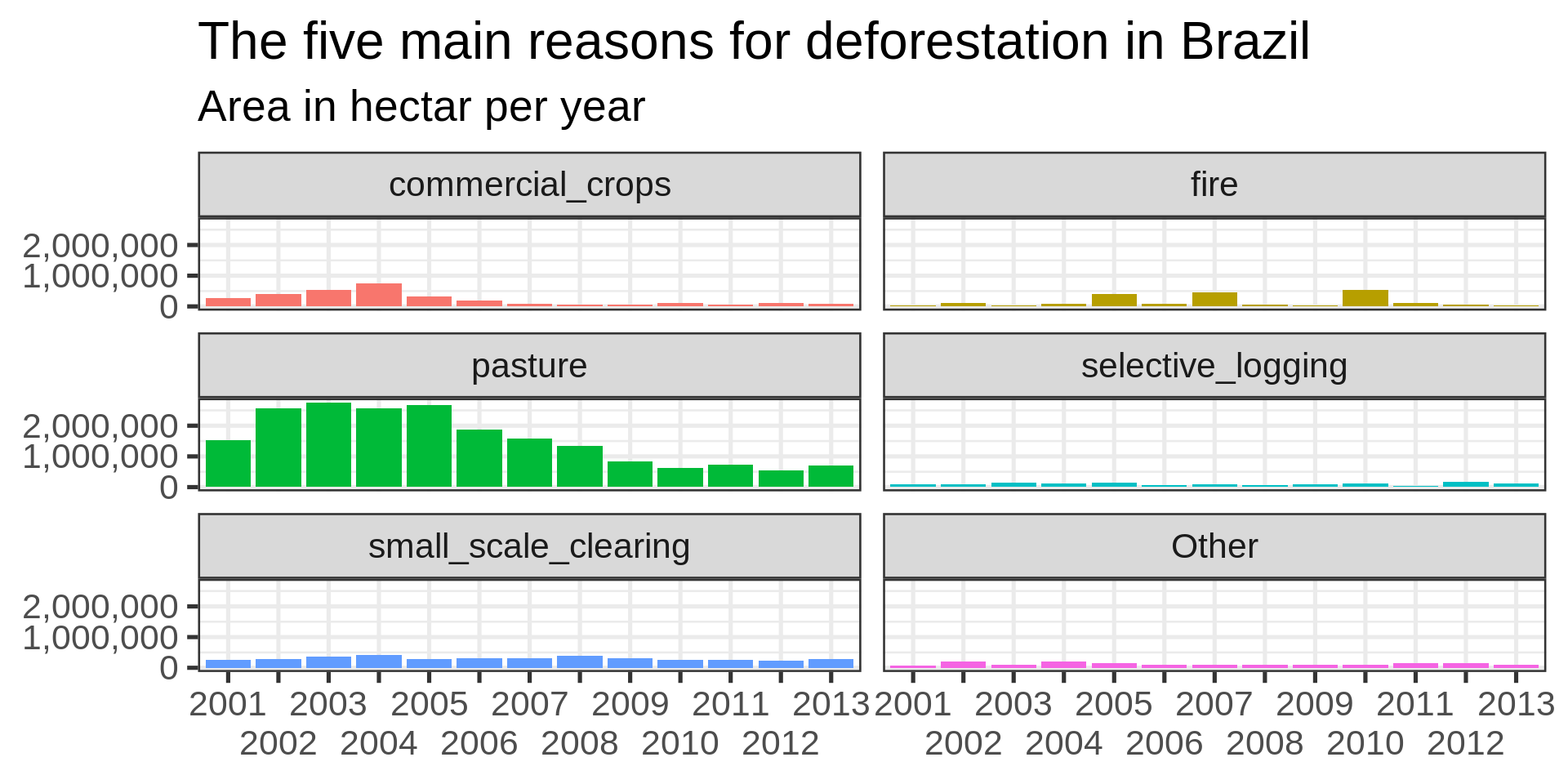
guides(x = guide_axis(n.dodge = 2))brazil_loss_long_complete |>
ggplot(aes(
x = year, y = area_ha,
fill = fct_lump(reasons, n = 5, w = area_ha)
)) +
geom_col() +
labs(
title = "The five main reasons for deforestation in Brazil",
subtitle = "Area in hectar per year",
fill = NULL,
x = NULL,
y = NULL
) +
facet_wrap(vars(fct_lump(reasons, n = 5, w = area_ha)), nrow = 3) +
theme(legend.position = "none") +
guides(x = guide_axis(check.overlap = TRUE)) +
scale_y_continuous(
labels =
scales::label_number(
scale_cut =
scales::cut_short_scale()
)
)
Improvements
Desired improvements missing
reasonsbrazil_loss_long_complete |>
ggplot(aes(x = year, y = reasons)) +
geom_tile(aes(fill = area_ha))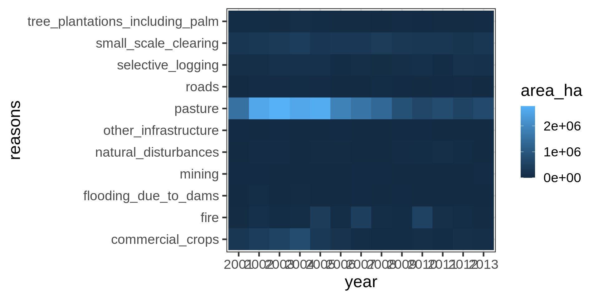
Dodged labels and square root transformation and viridis color scheme
brazil_loss_long_complete |>
  ggplot(aes(x = year, y = reasons)) +
geom_tile(aes(fill = area_ha)) +
scale_fill_continuous(trans = "sqrt", type = "viridis") +
guides(x = guide_axis(n.dodge = 3))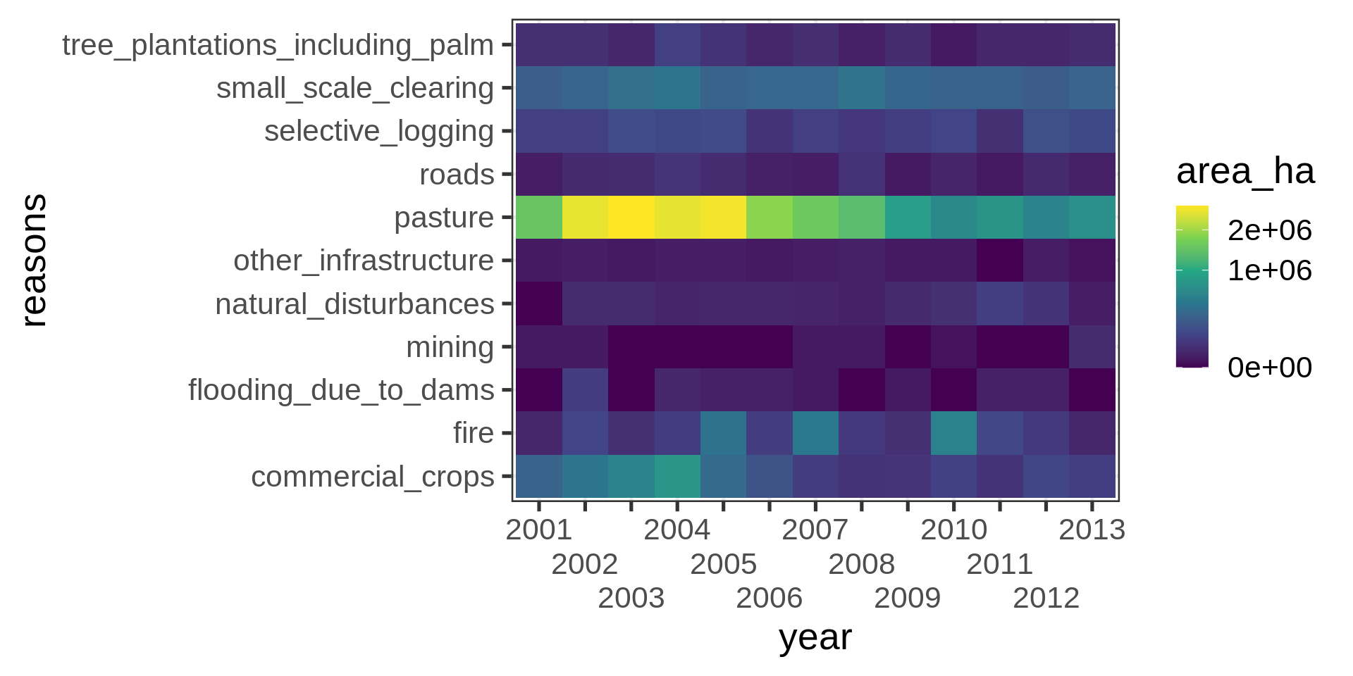
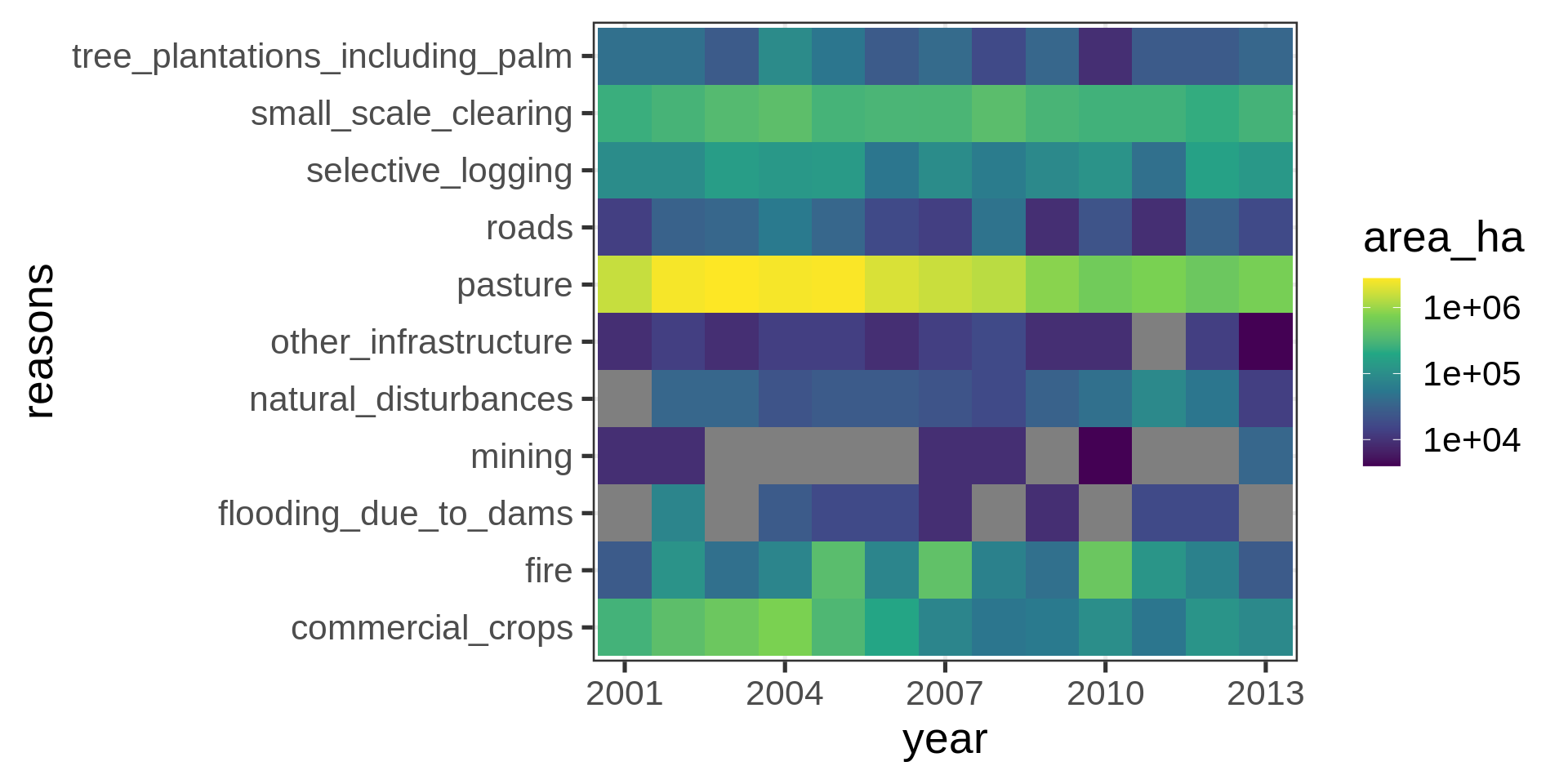
Adding suppressed labels and log-transformation
brazil_loss_long_complete |>
  ggplot(aes(x = year, y = reasons)) +
           geom_tile(aes(fill = area_ha)) +
  scale_fill_continuous(trans = "log10", type = "viridis") +
 scale_x_discrete(
    breaks = seq(from = 2001, to = 2013, by = 3)
  )