Visualisation project
Project set up (TD)
2026-02-18
What is a plot effort?
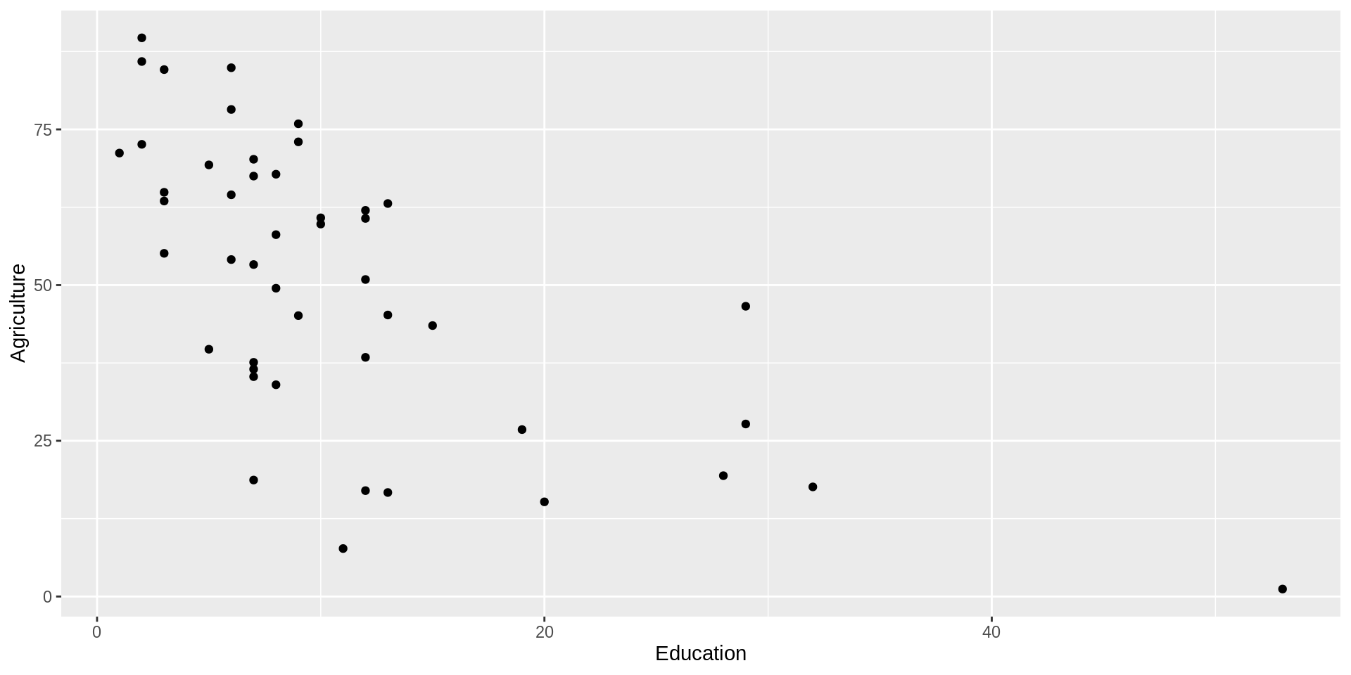
Is this an effort?
- Only two dimensions, default settings, no story!
Or this?
Code
ggplot(swiss |> as_tibble(rownames = "Province")) +
  aes(x = Education, y = Agriculture) +
  geom_point() +
  geom_smooth(method = "lm") +
  labs(subtitle = "Negative relation of agriculture with school education levels in Switzerland ",
title = "Cities provide better education") 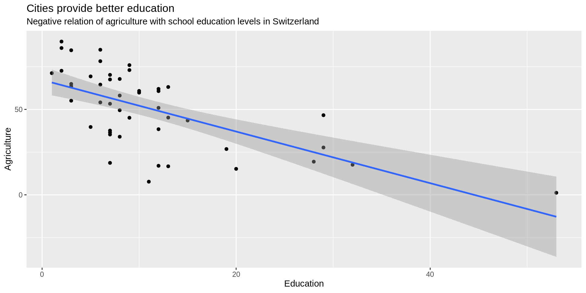
Includes story but missing another dimension
Overplotting
Code
peng <- ggplot(penguins) +
  aes(x = bill_length_mm, y = bill_depth_mm) +
  xlim(20, 80) +
  ylim(10, 25) +
  labs(x = "Length (mm)", y = "Depth (mm)",
       title = "Dimensions of penguin bills") +
  theme_minimal()
peng +
  geom_point(alpha = 0.3)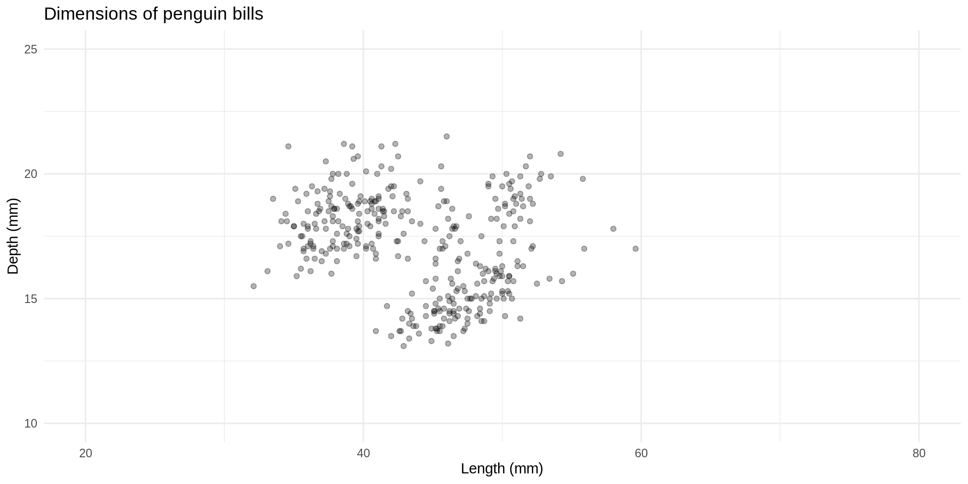
Avoiding overplotting with densities
2D density plot
Code
peng +
  geom_point(size = 0.3, color = "white") +
  geom_density_2d_filled()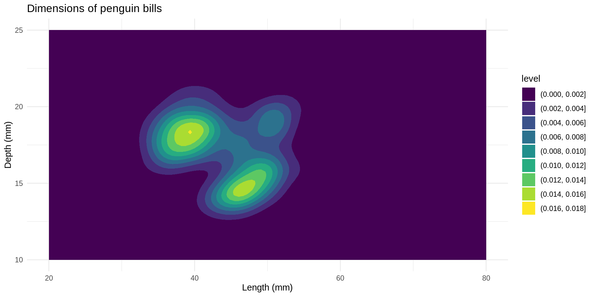
Why are the points not visible?
Plotting order matters
Code
peng +
  geom_density_2d_filled() +
  geom_point(size = 0.3,
             color = "white")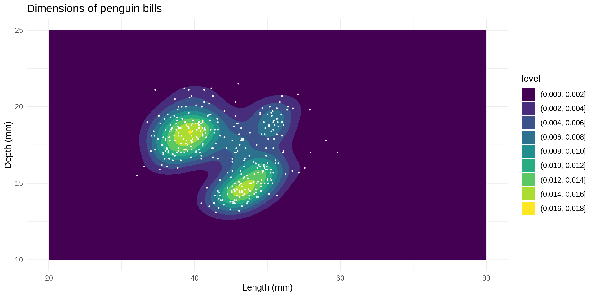
::::
Hexbin
Alternative hex
Code
ggplot(diamonds) +
  aes(carat, price) +
  geom_hex()
Feedback