Data visualisation
Aims of this course
The goal of this course is to explore and eventually produce a production-quality data visualisation on data selected by the learner.
During the course, learners will present their exploratory plots and final, production-quality graphs as you would use them for a presentation to customers or investors, at a conference or for publication in scientific journals and newspapers.
Course material
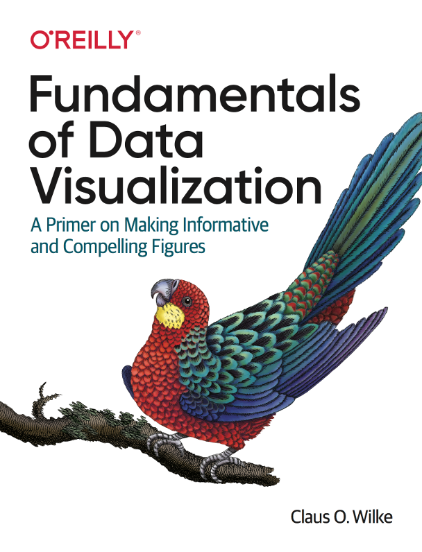
This key reference for how to perform visualisation is Fundamentals of Data Visualisation by Claus O. Wilke.

Project presentation
Every participant of the course will have to present exploratory or work in progress during the class. A list will be submitted once the course is underway.
Presenting during class is strictly required to pass the course but is not graded.
The project has to be submitted in mid-January 2025 and will be presented during the exam weeks.
Grading
Each participant of the course has to present during the semester with exploratory plots and production plots.
The final result must be in publication quality and should be self-explanatory. Ideally, you map at least three dimensions (aesthetics in ggplot) into each plot. Positive points are awarded for meaningful appropriate of the principles discussed in the course - data to ink ratio, show the data, appropriate plot selection, use of colors, etc.